1.Bootstrap4 表单
表单元素?<input>,?<textarea>, 和?<select>?elements 在使用?.form-control?类的情况下,宽度都是
设置为 100%
Bootstrap4 表单布局
1.堆叠表单 (全屏宽度):垂直方向
2.内联表单:水平方向
例如:
<!DOCTYPE html>
<html>
<head>
    <title>Bootstrap 实例</title>
    <meta charset="utf-8">
    <meta name="viewport" content="width=device-width, initial-scale=1">
    <link rel="stylesheet" href="https://cdn.staticfile.org/twitter-bootstrap/4.3.1/css/bootstrap.min.css">
    <script src="https://cdn.staticfile.org/jquery/3.2.1/jquery.min.js"></script>
    <script src="https://cdn.staticfile.org/popper.js/1.15.0/umd/popper.min.js"></script>
    <script src="https://cdn.staticfile.org/twitter-bootstrap/4.3.1/js/bootstrap.min.js"></script>
</head>
<body>
    <div class="container">
        <h2>堆叠表单</h2>
        <form>
            <div class="form-group">
                <label for="email">Email:</label>
                <input type="email" class="form-control" id="email" placeholder="Enter email">
            </div>
            <div class="form-group">
                <label for="pwd">Password:</label>
                <input type="password" class="form-control" id="pwd" placeholder="Enter password">
            </div>
            <div class="form-check">
                <label class="form-check-label">
                    <input class="form-check-input" type="checkbox"> Remember me
                </label>
            </div>
            <button type="submit" class="btn btn-primary">Submit</button>
        </form>
        <h2>内联表单</h2>
        <p>屏幕宽度在大于等于 576px 时才会水平显示。如果小于 576px 则会生成堆叠表单。</p>
        <form class="form-inline">
            <label for="email">Email:</label>
            <input type="email" class="form-control" id="email" placeholder="Enter email">
            <label for="pwd">Password:</label>
            <input type="password" class="form-control" id="pwd" placeholder="Enter password">
            <div class="form-check">
                <label class="form-check-label">
                    <input class="form-check-input" type="checkbox"> Remember
                </label>
            </div>
            <button type="submit" class="btn btn-primary">Submit</button>
        </form>
    </div>
</body>
</html>
2.Bootstrap4 表单控件
Bootstrap4 支持以下表单控件:input / textarea / checkbox / radio / select
Bootstrap Input
Bootstrap 支持所有的 HTML5 输入类型: text, password, datetime, datetime-local, date, month,
time, week, number, email, url, search, tel, 以及 color
注意::?如果 input 的 type 属性未正确声明,输入框的样式将不会显示
例如:
<!DOCTYPE?html>
<html>
<head>
??<title>Bootstrap?实例</title>
??<meta?charset="utf-8">
??<meta?name="viewport"?content="width=device-width,?initial-scale=1">
??<link?rel="stylesheet"?href="https://cdn.staticfile.org/twitter-bootstrap/4.3.1/css/bootstrap.min.css">
??<script?src="https://cdn.staticfile.org/jquery/3.2.1/jquery.min.js"></script>
??<script?src="https://cdn.staticfile.org/popper.js/1.15.0/umd/popper.min.js"></script>
??<script?src="https://cdn.staticfile.org/twitter-bootstrap/4.3.1/js/bootstrap.min.js"></script>
</head>
<body>
    <div class="container">
      <h2>表单控件</h2>
        <div>
            <label for="usr">用户名:</label>
            <input type="text" class="form-control" id="usr">
        </div>
        <div class="form-group">
            <label for="pwd">密码:</label>
            <input type="password" class="form-control" id="pwd">
        </div>
    </div>
</body>
</html>
Bootstrap textarea
例如:
<!DOCTYPE?html>
<html>
<head>
??<title>Bootstrap?实例</title>
??<meta?charset="utf-8">
??<meta?name="viewport"?content="width=device-width,?initial-scale=1">
??<link?rel="stylesheet"?href="https://cdn.staticfile.org/twitter-bootstrap/4.3.1/css/bootstrap.min.css">
??<script?src="https://cdn.staticfile.org/jquery/3.2.1/jquery.min.js"></script>
??<script?src="https://cdn.staticfile.org/popper.js/1.15.0/umd/popper.min.js"></script>
??<script?src="https://cdn.staticfile.org/twitter-bootstrap/4.3.1/js/bootstrap.min.js"></script>
</head>
<body>
    <div class="container">
    <h2>表单控件---textarea</h2>
    <form>
        <div class="form-group">
            <label form="com">评论:</label>
            <textarea class="form-control" rows="5" id="com"></textarea>
        </div>
    </form>
</body>
</html>
Bootstrap 复选框(checkbox)
复选框用于让用户从一系列预设置的选项中进行选择,可以选一个或多个。
使用?.form-check-inline?类可以让选项显示在同一行上
例如:
<!DOCTYPE?html>
<html>
<head>
??<title>Bootstrap?实例</title>
??<meta?charset="utf-8">
??<meta?name="viewport"?content="width=device-width,?initial-scale=1">
??<link?rel="stylesheet"?href="https://cdn.staticfile.org/twitter-bootstrap/4.3.1/css/bootstrap.min.css">
??<script?src="https://cdn.staticfile.org/jquery/3.2.1/jquery.min.js"></script>
??<script?src="https://cdn.staticfile.org/popper.js/1.15.0/umd/popper.min.js"></script>
??<script?src="https://cdn.staticfile.org/twitter-bootstrap/4.3.1/js/bootstrap.min.js"></script>
</head>
<body>
    <div class="container">
    <h2>表单控件---checkbox</h2>
    <form>
        <div class="form-check">
            <label class="form-check-label">
                <input type="checkbox" value="" class="form-check-inline">checkbox 1
            </label>
        </div>
        <div class="form-check">
            <label class="form-check-label">
                <input type="checkbox" value="" class="form-check-inline">checkbox 2
            </label>
        </div>
        <div class="form-check disabled">
            <label class="form-check-label">
                <input type="checkbox" value="" class="form-check-inline" disabled>checkbox 3
            </label>
        </div>
    </form>
</body>
</html>
Bootstrap 单选框(Radio)
单选框用于让用户从一系列预设置的选项中进行选择,只能选一个。
使用?.radio-inline?类可以让选项显示在同一行上
例如:
<!DOCTYPE?html>
<html>

<head>
    ??<title>Bootstrap?实例</title>
    ??
    <meta?charset="utf-8">
    ??
    <meta?name="viewport"?content="width=device-width,?initial-scale=1">
    ??
    <link?rel="stylesheet"?href="https: //cdn.staticfile.org/twitter-bootstrap/4.3.1/css/bootstrap.min.css">
    ??
    <script?src="https: //cdn.staticfile.org/jquery/3.2.1/jquery.min.js"></script>
    ??
    <script?src="https: //cdn.staticfile.org/popper.js/1.15.0/umd/popper.min.js"></script>
    ??
    <script?src="https: //cdn.staticfile.org/twitter-bootstrap/4.3.1/js/bootstrap.min.js"></script>
</head>

<body>
    <div class="container">
        <h2>表单控件---radio</h2>
        <from>
            <label class="radio-inline"><input type="radio" name="radio"> radio 1</label>
            <label class="radio-inline"><input type="radio" name="radio"> radio 2</label>
            <label class="radio-inline"><input type="radio" name="radio" disabled> radio 3</label>
        </from>
    </div>
</body>

</html>
Bootstrap select 下拉菜单
当您想让用户从多个选项中进行选择,但是默认情况下只能选择一个选项时,则使用选择框
例如:
<!DOCTYPE?html>
<html>

<head>
    ??<title>Bootstrap?实例</title>
    ??
    <meta?charset="utf-8">
    ??
    <meta?name="viewport"?content="width=device-width,?initial-scale=1">
    ??
    <link?rel="stylesheet"?href="https: //cdn.staticfile.org/twitter-bootstrap/4.3.1/css/bootstrap.min.css">
    ??
    <script?src="https: //cdn.staticfile.org/jquery/3.2.1/jquery.min.js"></script>
    ??
    <script?src="https: //cdn.staticfile.org/popper.js/1.15.0/umd/popper.min.js"></script>
    ??
    <script?src="https: //cdn.staticfile.org/twitter-bootstrap/4.3.1/js/bootstrap.min.js"></script>
</head>

<body>
    <div class="container">
        <h2>表单控件---select</h2>
        <form>
            <div class="form-group">
                <label for="1"单选下拉菜单></label>
                <select class="form-control" id="1">
                    <option>1</option>
                    <option>2</option>
                    <option>3</option>
                </select>
            </div>
            <br>
                <label for="2"多选下拉菜单></label>
                <select multiple class="form-control" id="2">
                    <option>1</option>
                    <option>2</option>
                    <option>3</option>
                    <option>4</option>
                </select>
        </form>
    </div>
</body>

</html>
3.Bootstrap4 输入框组
?.input-group?类来向表单输入框中添加更多的样式,如图标、文本或者按钮
使用?.input-group-prepend?类可以在输入框的的前面添加文本信息,?.input-group-append?类添加
在输入框的后面
例如:
<!DOCTYPE html>
<html>
<head>
  <title>Bootstrap 实例</title>
  <meta charset="utf-8">
  <meta name="viewport" content="width=device-width, initial-scale=1">
  <link rel="stylesheet" href="https://cdn.staticfile.org/twitter-bootstrap/4.3.1/css/bootstrap.min.css">
  <script src="https://cdn.staticfile.org/jquery/3.2.1/jquery.min.js"></script>
  <script src="https://cdn.staticfile.org/popper.js/1.15.0/umd/popper.min.js"></script>
  <script src="https://cdn.staticfile.org/twitter-bootstrap/4.3.1/js/bootstrap.min.js"></script>
</head>
<body>
    <div class="container">
        <h2>输入框组</h2>
        <form action="/action_page.php">
            <div class="input-group md-3">
                <div class="input-group-prepend">
                    <span class="input-group-text">@</span>
                </div>
                <input type="text" id="usr" name="username" placeholder="Username" class="form-control">
            </div>
            <div class="input-group mb-3">
                <input type="text" placeholder="Your Email" id="mail" name="email" class="form-control">
                <div class="input-group-append">
                    <span class="input-group-text">@163.com</span>
                </div>
            </div>
            <button type="submit" class="btn btn-primary">submit</button>
        </form>
</div>
</body>
</html>
输入框大小
?.input-group-sm?类来设置小的输入框,?.input-group-lg?类设置大的输入框
例如:
<!DOCTYPE html>
<html>
<head>
  <title>Bootstrap 实例</title>
  <meta charset="utf-8">
  <meta name="viewport" content="width=device-width, initial-scale=1">
  <link rel="stylesheet" href="https://cdn.staticfile.org/twitter-bootstrap/4.3.1/css/bootstrap.min.css">
  <script src="https://cdn.staticfile.org/jquery/3.2.1/jquery.min.js"></script>
  <script src="https://cdn.staticfile.org/popper.js/1.15.0/umd/popper.min.js"></script>
  <script src="https://cdn.staticfile.org/twitter-bootstrap/4.3.1/js/bootstrap.min.js"></script>
</head>
<body>
    <div class="container">
        <h2>输入框大小</h2>
        <form>
            <div class="input-group md-3 input-group-sm">
                <div class="input-group-prepend">
                    <span class="input-group-text">small</span>
                </div>
                <input type="text" class="form-control">
            </div>
        </form>
        <form>
            <div class="input-group md-3">
                <div class="input-group-prepend">
                    <span class="input-group-text">middle</span>
                </div>
                <input type="text" class="form-control">
            </div>
        </form>
        <form>
            <div class="input-group md-3 input-group-lg">
                <div class="input-group-prepend">
                    <span class="input-group-text">Large</span>
                </div>
                <input type="text" class="form-control">
            </div>
        </form>
  </div>
</body>
</html>
多个输入框和文本
例如:
<!DOCTYPE html>
<html>
<head>
  <title>Bootstrap 实例</title>
  <meta charset="utf-8">
  <meta name="viewport" content="width=device-width, initial-scale=1">
  <link rel="stylesheet" href="https://cdn.staticfile.org/twitter-bootstrap/4.3.1/css/bootstrap.min.css">
  <script src="https://cdn.staticfile.org/jquery/3.2.1/jquery.min.js"></script>
  <script src="https://cdn.staticfile.org/popper.js/1.15.0/umd/popper.min.js"></script>
  <script src="https://cdn.staticfile.org/twitter-bootstrap/4.3.1/js/bootstrap.min.js"></script>
</head>
<body>
    <div class="container">
        <h2>多个输入框和文本</h2>
        <form>
            <div class="input-group mb-3">
                <div class="inout-group-prepend">
                    <span class="input-group-text">Person</span>
                </div>
                <input type="text" placeholder="first name" class="form-control">
                <input type="text" placeholder="last name" class="form-control">
            </div>
        </form>
    </div>
</body>
</html>
复选框与单选框
例如:
<!DOCTYPE html>
<html>
<head>
  <title>Bootstrap 实例</title>
  <meta charset="utf-8">
  <meta name="viewport" content="width=device-width, initial-scale=1">
  <link rel="stylesheet" href="https://cdn.staticfile.org/twitter-bootstrap/4.3.1/css/bootstrap.min.css">
  <script src="https://cdn.staticfile.org/jquery/3.2.1/jquery.min.js"></script>
  <script src="https://cdn.staticfile.org/popper.js/1.15.0/umd/popper.min.js"></script>
  <script src="https://cdn.staticfile.org/twitter-bootstrap/4.3.1/js/bootstrap.min.js"></script>
</head>
<body>
    <div class="container">
        <h2>复选框与单选框</h2>
        <form>
            <div class="input-group mb-3">
                <div class="input-group-prepend">
                    <div class="input-group-text">
                        <input type="checkbox">
                    </div>
                </div>
                <input type="text" class="from-control" placeholder="BAIDU">
            </div>
        </form>
        <form>
            <div class="input-group mb-3">
                <div class="input-group-prepend">
                    <div class="input-group-text">
                        <input type="radio">
                    </div>
                </div>
                <input type="text"placeholder="GOOGLE"class="input-control">
            </div>
        </form>
    </div>
</body>
</html>
输入框添加按钮组
例如:
<!DOCTYPE html>
<html>
<head>
  <title>Bootstrap 实例</title>
  <meta charset="utf-8">
  <meta name="viewport" content="width=device-width, initial-scale=1">
  <link rel="stylesheet" href="https://cdn.staticfile.org/twitter-bootstrap/4.3.1/css/bootstrap.min.css">
  <script src="https://cdn.staticfile.org/jquery/3.2.1/jquery.min.js"></script>
  <script src="https://cdn.staticfile.org/popper.js/1.15.0/umd/popper.min.js"></script>
  <script src="https://cdn.staticfile.org/twitter-bootstrap/4.3.1/js/bootstrap.min.js"></script>
</head>
<body>
    <div class="container">
        <h2>输入框添加按钮组</h2>
        <div class="input-group mb-3">
            <div class="input-group-prepend">
                    <button type="button" class="btn btn-outline-secondary">Basic Button</button>
            </div>
            <input type="text" placeholder="Some text" class="input-control">
        </div>
        <div class="input-group mb-3">
            <input type="text" placeholder="Search" class="input-control">
            <div class="input-group-prepend">
                    <button type="submit" class="btn btn-success">Go</button>
            </div>
         </div>
         <div class="input-group mb-3">
            <input type="text" placeholder="Something clever." class="input-control">
            <div class="input-group-prepend">
                <button type="button" class="btn btn-success">OK</button>
                <button type="button" class="btn btn-danger">Cancel</button>
            </div>
         </div>
    </div>
</body>
</html>
设置下拉菜单
例如:
<!DOCTYPE html>
<html>
<head>
  <title>Bootstrap 实例</title>
  <meta charset="utf-8">
  <meta name="viewport" content="width=device-width, initial-scale=1">
  <link rel="stylesheet" href="https://cdn.staticfile.org/twitter-bootstrap/4.3.1/css/bootstrap.min.css">
  <script src="https://cdn.staticfile.org/jquery/3.2.1/jquery.min.js"></script>
  <script src="https://cdn.staticfile.org/popper.js/1.15.0/umd/popper.min.js"></script>
  <script src="https://cdn.staticfile.org/twitter-bootstrap/4.3.1/js/bootstrap.min.js"></script>
</head>
<body>
    <div class="container">
         <h2>下拉菜单</h2>
         <div class="input-group mb-3">
            <input type="text" placeholder="Something clever" class="input-control">
            <div class="input-group-prepend">
                <button type="button" class="btn btn-outline-secondary dropdown-toggle" data-toggle="dropdown">选择</button>
                <div class="dropdown-menu">
                    <a href="https://www.google.com" class="dropdown-item">GOOGLE</a>
                    <a href="https://www.baidu.com" class="dropdown-item">BAIDU</a>
                    <a href="https://www.taobao.com" class="dropdown-item">TAOBAO</a>
                </div>
            </div>
            <input type="text" placeholder="网站地址" class="form-control">
         </div>
    </div>
</body>
</html>
输入框组标签
在输入框组通过在输入框组外围的 label 来设置标签,标签的 for 属性需要与输入框组的 id 对应,
点击标签后可以聚焦输入框
例如:
<!DOCTYPE html>
<html>
<head>
  <title>Bootstrap 实例</title>
  <meta charset="utf-8">
  <meta name="viewport" content="width=device-width, initial-scale=1">
  <link rel="stylesheet" href="https://cdn.staticfile.org/twitter-bootstrap/4.3.1/css/bootstrap.min.css">
  <script src="https://cdn.staticfile.org/jquery/3.2.1/jquery.min.js"></script>
  <script src="https://cdn.staticfile.org/popper.js/1.15.0/umd/popper.min.js"></script>
  <script src="https://cdn.staticfile.org/twitter-bootstrap/4.3.1/js/bootstrap.min.js"></script>
</head>
<body>
    <div class="container">
         <h2>输入框组标签</h2>
         <form>
             <label>这里输入您的邮箱</label>
          <div class="input-group mb-3">
            <input type="text" placeholder="Email" id="demo" name="email" class="form-control">
             <div class="input-group-prepend">
                 <span class="input-group-text">@163.com</span>
             </div>
          </div>
        </form>
    </div>
</body>
</html>
5.Bootstrap4 轮播
轮播是一个循环的幻灯片
创建轮播
例如:
<!DOCTYPE html>
<html>
<head>
  <title>Bootstrap 实例</title>
  <meta charset="utf-8">
  <meta name="viewport" content="width=device-width, initial-scale=1">
  <link rel="stylesheet" href="https://cdn.staticfile.org/twitter-bootstrap/4.3.1/css/bootstrap.min.css">
  <script src="https://cdn.staticfile.org/jquery/3.2.1/jquery.min.js"></script>
  <script src="https://cdn.staticfile.org/popper.js/1.15.0/umd/popper.min.js"></script>
  <script src="https://cdn.staticfile.org/twitter-bootstrap/4.3.1/js/bootstrap.min.js"></script>
  <style>
      .carousel-inner img {
      width: 100%;
      height: 100%;
      }
  </style>
</head>
<body>
    <div class="container">
    <div id="demo" class="carousel slide" data-ride="carousel">
        <!--指示符-->
        <ul class="carousel-indicators">
            <li data-target="#demo" data-slide-to="0" class="active"></li>
            <li data-target="#demo" data-slide-to="1"></li>
            <li data-target="#demo" data-slide-to="2"></li>
        </ul>
        <!--轮播图片-->
        <div class="carousel-inner">
            <div class="carousel-item active" >
                <img src="../img/1.jpg">
            </div>
            <div class="carousel-item">
                <img src="../img/2.jpg">
            </div>
            <div class="carousel-item">
                <img src="../img/3.jpg">
            </div>
        </div>
        <!--左右切换-->
        <a class="carousel-control-prev" href="#demo" data-slide="prev">
            <span class="carousel-control-prev-icon"></span>
        </a>
        <a class="carousel-control-next" href="#demo" data-slide="next">
            <span class="carousel-control-next-icon"></span>
        </a>
    </div>
</div>
</body>
</html>
以上实例中使用的类说明
| 类 | 描述 |
| .carousel | 创建一个轮播 |
| .carousel-indicators | 为轮播添加一个指示符,就是轮播图底下的一个个小点,轮播的过程可以显示目前是第几张图。 |
| .carousel-inner | 添加要切换的图片 |
| .carousel-item | 指定每个图片的内容 |
| .carousel-control-prev | 添加左侧的按钮,点击会返回上一张。 |
| .carousel-control-next | 添加右侧按钮,点击会切换到下一张。 |
| .carousel-control-prev-icon | 与 .carousel-control-prev 一起使用,设置左侧的按钮 |
| .carousel-control-next-icon | 与 .carousel-control-next 一起使用,设置右侧的按钮 |
| .slide | 切换图片的过渡和动画效果,如果你不需要这样的效果,可以删除这个类。 |
6.Bootstrap4 模态框
创建模态框
例如:
<!DOCTYPE html>
<html>
<head>
<title>Bootstrap 实例</title>
<meta charset="utf-8">
<meta name="viewport" content="width=device-width, initial-scale=1">
<link rel="stylesheet" href="https://cdn.staticfile.org/twitter-bootstrap/4.3.1/css/bootstrap.min.css">
<script src="https://cdn.staticfile.org/jquery/3.2.1/jquery.min.js"></script>
<script src="https://cdn.staticfile.org/popper.js/1.15.0/umd/popper.min.js"></script>
<script src="https://cdn.staticfile.org/twitter-bootstrap/4.3.1/js/bootstrap.min.js"></script>
</head>
<body>
<div class="container">
<h2>模态框实例</h2>
<!-- 按钮:用于打开模态框 -->
<button type="button" class="btn btn-primary" data-toggle="modal" data-target="#myModal">打开模态框</button>
<!-- 模态框 -->
<div class="modal fade" id="myModal">
<div class="modal-dialog">
<div class="modal-content">
<!-- 模态框头部 -->
<div class="modal-header">
<h4 class="modal-title">模态框头部</h4>
<button type="button" class="close" data-dismiss="modal">×</button>
</div>
<!-- 模态框主体 -->
<div class="modal-body">
模态框内容
</div>
<!-- 模态框底部 -->
<div class="modal-footer">
<button type="button" class="btn btn-secondary" data-dismiss="modal">关闭</button>
</div>
</div>
</div>
</div>
</div>
</body>
</html>模态框尺寸
?.modal-sm?类来创建一个小模态框,.modal-lg?类可以创建一个大模态框。
尺寸类放在?<div>元素的?.modal-dialog?类后
例如:
<!DOCTYPE html>
<html>
<head>
<title>Bootstrap 实例</title>
<meta charset="utf-8">
<meta name="viewport" content="width=device-width, initial-scale=1">
<link rel="stylesheet" href="https://cdn.staticfile.org/twitter-bootstrap/4.3.1/css/bootstrap.min.css">
<script src="https://cdn.staticfile.org/jquery/3.2.1/jquery.min.js"></script>
<script src="https://cdn.staticfile.org/popper.js/1.15.0/umd/popper.min.js"></script>
<script src="https://cdn.staticfile.org/twitter-bootstrap/4.3.1/js/bootstrap.min.js"></script>
</head>
<body>
<div class="container">
<h2>模态框实例2</h2>
<!-- 按钮:用于打开模态框 -->
<button type="button" class="btn btn-primary" data-toggle="modal" data-target="#myModal">打开模态框</button>
<!-- 模态框 -->
<div class="modal fade" id="myModal">
<div class="modal-dialog modal-lg">
<div class="modal-content">
<!-- 模态框头部 -->
<div class="modal-header">
<h4 class="modal-title">模态框头部</h4>
<button type="button" class="close" data-dismiss="modal">×</button>
</div>
<!-- 模态框主体 -->
<div class="modal-body">
模态框内容
</div>
<!-- 模态框底部 -->
<div class="modal-footer">
<button type="button" class="btn btn-secondary" data-dismiss="modal">关闭</button>
</div>
</div>
</div>
</div>
</div>
</body>
</html>7.Bootstrap4 提示框
提示框是一个小小的弹窗,在鼠标移动到元素上显示,鼠标移到元素外就消失
创建提示框
通过向元素添加?data-toggle="tooltip"?来来创建提示框
title?属性的内容为提示框显示的内容
注意:?提示框要写在 jQuery 的初始化代码里: 然后在指定的元素上调用?tooltip()?方法
例如:
<!DOCTYPE html>
<html>
<head>
  <title>Bootstrap 实例</title>
  <meta charset="utf-8">
  <meta name="viewport" content="width=device-width, initial-scale=1">
  <link rel="stylesheet" href="https://cdn.staticfile.org/twitter-bootstrap/4.3.1/css/bootstrap.min.css">
  <script src="https://cdn.staticfile.org/jquery/3.2.1/jquery.min.js"></script>
  <script src="https://cdn.staticfile.org/popper.js/1.15.0/umd/popper.min.js"></script>
  <script src="https://cdn.staticfile.org/twitter-bootstrap/4.3.1/js/bootstrap.min.js"></script>
</head>
<body>
    <div class="container">
        <h3>提示框实例</h3>
        <a href="#" data-toggle="tooltip" title="我是提示内容">鼠标移动到我这里</a>
    </div>
    <script>
        $(document).ready(function(){
            $('[data-toggle="tooltip"]').tooltip();
        });
        </script>
</body>
</html>
指定提示框的位置
默认情况下提示框显示在元素上方。
可以使用?data-placement?属性来设定提示框显示的方向: top, bottom, left 或 right
例如:
<!DOCTYPE html>
<html>
<head>
  <title>Bootstrap 实例</title>
  <meta charset="utf-8">
  <meta name="viewport" content="width=device-width, initial-scale=1">
  <link rel="stylesheet" href="https://cdn.staticfile.org/twitter-bootstrap/4.3.1/css/bootstrap.min.css">
  <script src="https://cdn.staticfile.org/jquery/3.2.1/jquery.min.js"></script>
  <script src="https://cdn.staticfile.org/popper.js/1.15.0/umd/popper.min.js"></script>
  <script src="https://cdn.staticfile.org/twitter-bootstrap/4.3.1/js/bootstrap.min.js"></script>
</head>
<body>
    <div class="container">
        <h3>提示框实例</h3>
        <a href="#" data-toggle="tooltip" title="我是提示内容">鼠标移动到我这里</a>

         <h3>提示框实例</h3>
         <a href="#" data-toggle="tooltip" data-placement="top" title="我是提示内容">鼠标移动到我这里</a>
         <a href="#" data-toggle="tooltip" data-placement="bottom" title="我是提示内容">鼠标移动到我这里</a>
         <a href="#" data-toggle="tooltip" data-placement="left" title="我是提示内容">鼠标移动到我这里</a>
         <a href="#" data-toggle="tooltip" data-placement="right" title="我是提示内容">鼠标移动到我这里</a>
    </div>
    <script>
        $(document).ready(function(){
            $('[data-toggle="tooltip"]').tooltip();
        });
        </script>
</body>
</html>
在按钮中使用提示框
例如:
<!DOCTYPE html>
<html>
<head>
  <title>Bootstrap 实例</title>
  <meta charset="utf-8">
  <meta name="viewport" content="width=device-width, initial-scale=1">
  <link rel="stylesheet" href="https://cdn.staticfile.org/twitter-bootstrap/4.3.1/css/bootstrap.min.css">
  <script src="https://cdn.staticfile.org/jquery/3.2.1/jquery.min.js"></script>
  <script src="https://cdn.staticfile.org/popper.js/1.15.0/umd/popper.min.js"></script>
  <script src="https://cdn.staticfile.org/twitter-bootstrap/4.3.1/js/bootstrap.min.js"></script>
</head>
<body>
    <div class="container">
         <h3>在按钮中使用提示框</h3>
         <button type="button" class="btn btn-secondary" data-toggle="tooltip" data-placement="top" title="我是提示内容">鼠标移动到我这里</button>
         <button type="button" class="btn btn-secondary" data-toggle="tooltip" data-placement="bottom" title="我是提示内容">鼠标移动到我这里</button>
         <button type="button" class="btn btn-secondary" data-toggle="tooltip" data-placement="left" title="我是提示内容">鼠标移动到我这里</button>
         <button type="button" class="btn btn-secondary" data-toggle="tooltip" data-placement="right" title="我是提示内容">鼠标移动到我这里</button>
    </div>
      <script>
        $(document).ready(function(){
            $('[data-toggle="tooltip"]').tooltip();
        });
      </script>
</body>
</html>
提示内容添加 HTML 标签,设置 data-html="true",内容放在 title 标签里头
例如:
<!DOCTYPE html>
<html>
<head>
  <title>Bootstrap 实例</title>
  <meta charset="utf-8">
  <meta name="viewport" content="width=device-width, initial-scale=1">
  <link rel="stylesheet" href="https://cdn.staticfile.org/twitter-bootstrap/4.3.1/css/bootstrap.min.css">
  <script src="https://cdn.staticfile.org/jquery/3.2.1/jquery.min.js"></script>
  <script src="https://cdn.staticfile.org/popper.js/1.15.0/umd/popper.min.js"></script>
  <script src="https://cdn.staticfile.org/twitter-bootstrap/4.3.1/js/bootstrap.min.js"></script>
</head>
<body>
    <div class="container">
        <h3>提示框实例</h3>
        <a href="#" data-toggle="tooltip" title="我是提示内容">鼠标移动到我这里</a>
         <h3>提示框实例</h3>
         <a href="#" data-toggle="tooltip" data-placement="top" title="我是提示内容">鼠标移动到我这里</a>
         <a href="#" data-toggle="tooltip" data-placement="bottom" title="我是提示内容">鼠标移动到我这里</a>
         <a href="#" data-toggle="tooltip" data-placement="left" title="我是提示内容">鼠标移动到我这里</a>
         <a href="#" data-toggle="tooltip" data-placement="right" title="我是提示内容">鼠标移动到我这里</a>
         <h3>在按钮中使用提示框</h3>
         <button type="button" class="btn btn-secondary" data-toggle="tooltip" data-placement="top" title="我是提示内容">鼠标移动到我这里</button>
         <button type="button" class="btn btn-secondary" data-toggle="tooltip" data-placement="bottom" title="我是提示内容">鼠标移动到我这里</button>
         <button type="button" class="btn btn-secondary" data-toggle="tooltip" data-placement="left" title="我是提示内容">鼠标移动到我这里</button>
         <button type="button" class="btn btn-secondary" data-toggle="tooltip" data-placement="right" title="我是提示内容">鼠标移动到我这里</button>
         <h3>提示内容添加 HTML 标签,设置 data-html="true",内容放在 title 标签里头</h3>
         <button type="button" class="btn btn-secondary" data-toggle="tooltip" data-html="true" title="我是提示内容"> Tooltip with HTML</button>
         <h3>禁用按钮</h3>
         <span class="d-inlink-block" tabindex="0" data-toggle="tooltip" title="Disabled tooltip"></span>
         <button type="button" class="btn btn-primary" style="pointer-events: none;" disabled> Tooltip with HTML</button>
    </div>
      <script>
        $(document).ready(function(){
            $('[data-toggle="tooltip"]').tooltip();
        });
      </script>
</body>
</html>
禁用按钮
<!DOCTYPE html>
<html>
<head>
  <title>Bootstrap 实例</title>
  <meta charset="utf-8">
  <meta name="viewport" content="width=device-width, initial-scale=1">
  <link rel="stylesheet" href="https://cdn.staticfile.org/twitter-bootstrap/4.3.1/css/bootstrap.min.css">
  <script src="https://cdn.staticfile.org/jquery/3.2.1/jquery.min.js"></script>
  <script src="https://cdn.staticfile.org/popper.js/1.15.0/umd/popper.min.js"></script>
  <script src="https://cdn.staticfile.org/twitter-bootstrap/4.3.1/js/bootstrap.min.js"></script>
</head>
<body>
    <div class="container">
        <h3>提示框实例</h3>
        <a href="#" data-toggle="tooltip" title="我是提示内容">鼠标移动到我这里</a>
         <h3>提示框实例</h3>
         <a href="#" data-toggle="tooltip" data-placement="top" title="我是提示内容">鼠标移动到我这里</a>
         <a href="#" data-toggle="tooltip" data-placement="bottom" title="我是提示内容">鼠标移动到我这里</a>
         <a href="#" data-toggle="tooltip" data-placement="left" title="我是提示内容">鼠标移动到我这里</a>
         <a href="#" data-toggle="tooltip" data-placement="right" title="我是提示内容">鼠标移动到我这里</a>
         <h3>在按钮中使用提示框</h3>
         <button type="button" class="btn btn-secondary" data-toggle="tooltip" data-placement="top" title="我是提示内容">鼠标移动到我这里</button>
         <button type="button" class="btn btn-secondary" data-toggle="tooltip" data-placement="bottom" title="我是提示内容">鼠标移动到我这里</button>
         <button type="button" class="btn btn-secondary" data-toggle="tooltip" data-placement="left" title="我是提示内容">鼠标移动到我这里</button>
         <button type="button" class="btn btn-secondary" data-toggle="tooltip" data-placement="right" title="我是提示内容">鼠标移动到我这里</button>
         <h3>提示内容添加 HTML 标签,设置 data-html="true",内容放在 title 标签里头</h3>
         <button type="button" class="btn btn-secondary" data-toggle="tooltip" data-html="true" title="我是提示内容"> Tooltip with HTML</button>
         <h3>禁用按钮</h3>
         <span class="d-inlink-block" tabindex="0" data-toggle="tooltip" title="Disabled tooltip"></span>
         <button type="button" class="btn btn-primary" style="pointer-events: none;" disabled> Tooltip with HTML</button>
    </div>
      <script>
        $(document).ready(function(){
            $('[data-toggle="tooltip"]').tooltip();
        });
      </script>
</body>
</html>
8.Bootstrap4 弹出框
弹出框控件类似于提示框,它在鼠标点击到元素后显示,与提示框不同的是它可以显示更多的内
容
创建弹出框
通过向元素添加?data-toggle="popover"?来来创建弹出框
title?属性的内容为弹出框的标题,data-content?属性显示了弹出框的文本内容
注意:?弹出框要写在 jQuery 的初始化代码里: 然后在指定的元素上调用?popover()?方法
例如:
<!DOCTYPE html>
<html>

<head>
    <title>Bootstrap 实例</title>
    <meta charset="utf-8">
    <meta name="viewport" content="width=device-width, initial-scale=1">
    <link rel="stylesheet" href="https://cdn.staticfile.org/twitter-bootstrap/4.3.1/css/bootstrap.min.css">
    <script src="https://cdn.staticfile.org/jquery/3.2.1/jquery.min.js"></script>
    <script src="https://cdn.staticfile.org/popper.js/1.15.0/umd/popper.min.js"></script>
    <script src="https://cdn.staticfile.org/twitter-bootstrap/4.3.1/js/bootstrap.min.js"></script>
</head>

<body>
    <div class="container">
        <h3>弹出实例</h3>
        <a href="#" data-toggle="popover" title="弹出框标题" data-content="弹出框内容">点我</a>
        <h3>弹出框的位置</h3>
        <a href="#" data-toggle="popover" title="弹出框标题" data-placement="bottom">点我</a>
        <a href="#" data-toggle="popover" title="弹出框标题" data-placement="top">点我</a>
        <a href="#" data-toggle="popover" title="弹出框标题" data-placement="left">点我</a>
        <a href="#" data-toggle="popover" title="弹出框标题" data-placement="right">点我</a>
        <h3>弹出框的位置</h3>
        <button type="button" class="btn btn-secondary" data-container="body" data-toggle="popover" data-placement="top"
            data-content="Vivamus sagittis lacus vel augue laoreet rutrum faucibus.">
            Popover on top
        </button>
        <button type="button" class="btn btn-secondary" data-container="body" data-toggle="popover"
            data-placement="right" data-content="Vivamus sagittis lacus vel augue laoreet rutrum faucibus.">
            Popover on right
        </button>
        <button type="button" class="btn btn-secondary" data-container="body" data-toggle="popover"
            data-placement="bottom" data-content="Vivamus
          sagittis lacus vel augue laoreet rutrum faucibus.">
            Popover on bottom
        </button>
        <button type="button" class="btn btn-secondary" data-container="body" data-toggle="popover"
            data-placement="left" data-content="Vivamus sagittis lacus vel augue laoreet rutrum faucibus.">
            Popover on left
        </button>
        <h3>弹出框实例</h3> <br>
        <a href="#" title="取消弹出框" data-toggle="popover" data-trigger="focus" data-content="点击文档的其他地方关闭我">点我</a>
        <h3>弹出框实例</h3> <br>
        <a href="#" title="Header" data-toggle="popover" data-trigger="hover" data-content="一些内容">鼠标移动到我这</a>

    </div>
    <script>
        $(document).ready(function () {
            $('[data-toggle="popover"]').popover();
        });
    </script>
</body>

</html>
9.Bootstrap 滚动监听(Scrollspy)
滚动监听(Scrollspy)插件,即自动更新导航插件,会根据滚动条的位置自动更新对应的导航
标。其基本的实现是随着您的滚动
创建滚动监听
例如:
<!DOCTYPE html>
<html>
<head>
  <title>Bootstrap 实例</title>
  <meta charset="utf-8">
  <meta name="viewport" content="width=device-width, initial-scale=1">
  <link rel="stylesheet" href="https://cdn.staticfile.org/twitter-bootstrap/4.3.1/css/bootstrap.min.css">
  <script src="https://cdn.staticfile.org/jquery/3.2.1/jquery.min.js"></script>
  <script src="https://cdn.staticfile.org/popper.js/1.15.0/umd/popper.min.js"></script>
  <script src="https://cdn.staticfile.org/twitter-bootstrap/4.3.1/js/bootstrap.min.js"></script>
  <style>
    body {
        position: relative;
    }
    </style>
</head>
<body data-spy="scroll" data-target=".navbar" data-offset="50">
    <nav class="navbar navbar-expand-sm bg-dark navbar-dark fixed-top">
      <ul class="navbar-nav">
        <li class="nav-item">
          <a class="nav-link" href="#section1">Section 1</a>
        </li>
        <li class="nav-item">
          <a class="nav-link" href="#section2">Section 2</a>
        </li>
        <li class="nav-item">
          <a class="nav-link" href="#section3">Section 3</a>
        </li>
        <li class="nav-item dropdown">
          <a class="nav-link dropdown-toggle" href="#" id="navbardrop" data-toggle="dropdown">
            Section 4
          </a>
          <div class="dropdown-menu">
            <a class="dropdown-item" href="#section41">Link 1</a>
            <a class="dropdown-item" href="#section42">Link 2</a>
          </div>
        </li>
      </ul>
    </nav>
    <div id="section1" class="container-fluid bg-success" style="padding-top:70px;padding-bottom:70px">
      <h1>Section 1</h1>
      <p>Try to scroll this section and look at the navigation bar while scrolling! Try to scroll this section and look at the navigation bar while scrolling!</p>
      <p>Try to scroll this section and look at the navigation bar while scrolling! Try to scroll this section and look at the navigation bar while scrolling!</p>
    </div>
    <div id="section2" class="container-fluid bg-warning" style="padding-top:70px;padding-bottom:70px">
      <h1>Section 2</h1>
      <p>Try to scroll this section and look at the navigation bar while scrolling! Try to scroll this section and look at the navigation bar while scrolling!</p>
      <p>Try to scroll this section and look at the navigation bar while scrolling! Try to scroll this section and look at the navigation bar while scrolling!</p>
    </div>
    <div id="section3" class="container-fluid bg-secondary" style="padding-top:70px;padding-bottom:70px">
      <h1>Section 3</h1>
      <p>Try to scroll this section and look at the navigation bar while scrolling! Try to scroll this section and look at the navigation bar while scrolling!</p>
      <p>Try to scroll this section and look at the navigation bar while scrolling! Try to scroll this section and look at the navigation bar while scrolling!</p>
    </div>
    <div id="section41" class="container-fluid bg-danger" style="padding-top:70px;padding-bottom:70px">
      <h1>Section 4 Submenu 1</h1>
      <p>Try to scroll this section and look at the navigation bar while scrolling! Try to scroll this section and look at the navigation bar while scrolling!</p>
      <p>Try to scroll this section and look at the navigation bar while scrolling! Try to scroll this section and look at the navigation bar while scrolling!</p>
    </div>
    <div id="section42" class="container-fluid bg-info" style="padding-top:70px;padding-bottom:70px">
      <h1>Section 4 Submenu 2</h1>
      <p>Try to scroll this section and look at the navigation bar while scrolling! Try to scroll this section and look at the navigation bar while scrolling!</p>
      <p>Try to scroll this section and look at the navigation bar while scrolling! Try to scroll this section and look at the navigation bar while scrolling!</p>
    </div>
    </body>
    </html>
向您想要监听的元素(通常是 body)添加?data-spy="scroll"?
然后添加?data-target?属性,它的值为导航栏的 id 或 class (.navbar)。这样就可以联系上可滚动区
域
注意可滚动项元素上的 id (<div id="section1">) 必须匹配导航栏上的链接选项 (<a
href="#section1">)
可选项data-offset?属性用于计算滚动位置时,距离顶部的偏移像素。 默认为 10 px
设置相对定位:?使用 data-spy="scroll" 的元素需要将其 CSS?position?属性设置为 "relative" 才能起
作用
例如:
<!DOCTYPE html>
<html>

<head>
    <title>Bootstrap 实例</title>
    <meta charset="utf-8">
    <meta name="viewport" content="width=device-width, initial-scale=1">
    <link rel="stylesheet" href="https://cdn.staticfile.org/twitter-bootstrap/4.3.1/css/bootstrap.min.css">
    <script src="https://cdn.staticfile.org/jquery/3.2.1/jquery.min.js"></script>
    <script src="https://cdn.staticfile.org/popper.js/1.15.0/umd/popper.min.js"></script>
    <script src="https://cdn.staticfile.org/twitter-bootstrap/4.3.1/js/bootstrap.min.js"></script>
    <style>
        body {
            position: relative;
        }

        ul.nav-pills {
            top: 20px;
            position: fixed;
        }

        div.col-8 div {
            height: 500px;
        }
    </style>

</head>

<body data-spy="scroll" data-target="#myScrollspy" data-offset="1">
    <div class="container-fluid">
        <div class="row">
            <nav class="col-sm-3 col-4" id="myScrollspy">
                <ul class="nav nav-pills flex-column">
                    <li class="nav-item">
                        <a class="nav-link active" href="#section1">Section 1</a>
                    </li>
                    <li class="nav-item">
                        <a class="nav-link" href="#section2">Section 2</a>
                    </li>
                    <li class="nav-item">
                        <a class="nav-link" href="#section3">Section 3</a>
                    </li>
                    <li class="nav-item dropdown">
                        <a class="nav-link dropdown-toggle" data-toggle="dropdown" href="#">Section 4</a>
                        <div class="dropdown-menu">
                            <a class="dropdown-item" href="#section41">Link 1</a>
                            <a class="dropdown-item" href="#section42">Link 2</a>
                        </div>
                    </li>
                </ul>
            </nav>
            <div class="col-sm-9 col-8">
                <div id="section1" class="bg-success">
                    <h1>Section 1</h1>
                    <p>Try to scroll this section and look at the navigation list while scrolling!</p>
                </div>
                <div id="section2" class="bg-warning">
                    <h1>Section 2</h1>
                    <p>Try to scroll this section and look at the navigation list while scrolling!</p>
                </div>
                <div id="section3" class="bg-secondary">
                    <h1>Section 3</h1>
                    <p>Try to scroll this section and look at the navigation list while scrolling!</p>
                </div>
                <div id="section41" class="bg-danger">
                    <h1>Section 4-1</h1>
                    <p>Try to scroll this section and look at the navigation list while scrolling!</p>
                </div>
                <div id="section42" class="bg-info">
                    <h1>Section 4-2</h1>
                    <p>Try to scroll this section and look at the navigation list while scrolling!</p>
                </div>
            </div>
        </div>
    </div>
</body>

</html>
10.盒子(Flex Box)
弹性盒子是 CSS3 的一种新的布局模式
CSS3 弹性盒( Flexible Box 或 flexbox),是一种当页面需要适应不同的屏幕大小以及设备类型
时确保元素拥有恰当的行为的布局方式
引入弹性盒布局模型的目的是提供一种更加有效的方式来对一个容器中的子元素进行排列、对齐和
分配空白空间
CSS3 弹性盒子内容
弹性盒子由弹性容器(Flex container)和弹性子元素(Flex item)组成
弹性容器通过设置 display 属性的值为 flex 或 inline-flex将其定义为弹性容器。
弹性容器内包含了一个或多个弹性子元素
注意:?弹性容器外及弹性子元素内是正常渲染的。弹性盒子只定义了弹性子元素如何在弹性容器
内布局
弹性子元素通常在弹性盒子内一行显示。默认情况每个容器只有一行。
下表列出了在弹性盒子中常用到的属性:
| 属性 | 描述 |
| 指定 HTML 元素盒子类型。 | |
| 指定了弹性容器中子元素的排列方式 | |
| 设置弹性盒子元素在主轴(横轴)方向上的对齐方式。 | |
| 设置弹性盒子元素在侧轴(纵轴)方向上的对齐方式。 | |
| 设置弹性盒子的子元素超出父容器时是否换行。 | |
| 修改 flex-wrap 属性的行为,类似 align-items, 但不是设置子元素对齐,而是设置行对齐 | |
| flex-direction 和 flex-wrap 的简写 | |
| 设置弹性盒子的子元素排列顺序。 | |
| 在弹性子元素上使用。覆盖容器的 align-items 属性。 | |
| 设置弹性盒子的子元素如何分配空间。 |
例如:
<!DOCTYPE html>
<html>

<head>
    <meta charset="utf-8">
    <title></title>
    <style>
        .flex-container {
            display: -webkit-flex;
            display: flex;
            width: 400px;
            height: 250px;
            background-color: lightgrey;
        }

        .flex-item {
            background-color: cornflowerblue;
            width: 100px;
            height: 100px;
            margin: 10px;
        }
    </style>
</head>

<body>
    <div class="flex-container">
        <div class="flex-item">flex item 1</div>
        <div class="flex-item">flex item 2</div>
        <div class="flex-item">flex item 3</div>
    </div>
</body>

</html>
当然我们可以修改排列方式。如果我们设置?direction?属性为?rtl?(right-to-left),弹性子元素的排列方
式也会改变,页面布局也跟着改变
例如:
<!DOCTYPE html>
<html>

<head>
    <meta charset="utf-8">
    <title></title>
    <style>
        body {
            direction: rtl;
        }

        .flex-container {
            display: -webkit-flex;
            display: flex;
            width: 400px;
            height: 250px;
            background-color: lightgrey;
        }

        .flex-item {
            background-color: cornflowerblue;
            width: 100px;
            height: 100px;
            margin: 10px;
        }
    </style>
</head>

<body>
    <div class="flex-container">
        <div class="flex-item">flex item 1</div>
        <div class="flex-item">flex item 2</div>
        <div class="flex-item">flex item 3</div>
    </div>
</body>

</html>
flex-direction
flex-direction?属性指定了弹性子元素在父容器中的位置
1.row:横向从左到右排列(左对齐),默认的排列方式
2.row-reverse:反转横向排列(右对齐,从后往前排,最后一项排在最前面
3.column:纵向排列
4.column-reverse:反转纵向排列,从后往前排,最后一项排在最上面
例如:
<!DOCTYPE html>
<html>
<head>
<meta charset="utf-8">
<title></title>
<style>
.flex-container {
display: -webkit-flex;
display: flex;
-webkit-flex-direction: row-reverse;
flex-direction: row-reverse;
width: 400px;
height: 250px;
background-color: lightgrey;
}
.flex-item {
background-color: cornflowerblue;
width: 100px;
height: 100px;
margin: 10px;
}
</style>
</head>
<body>
<div class="flex-container">
<div class="flex-item">flex item 1</div>
<div class="flex-item">flex item 2</div>
<div class="flex-item">flex item 3</div>
</div>
</body>
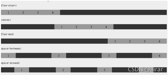
</html>justify-content 属性
内容对齐(justify-content)属性应用在弹性容器上,把弹性项沿着弹性容器的主轴线(main
axis)对齐
1.flex-start:弹性项目向行头紧挨着填充。这个是默认值。第一个弹性项的main-start外边距边线被
放置在该行的main-start边线,而后续弹性项依次平齐摆放
放置在该行的main-start边线,而后续弹性项依次平齐摆放
2.flex-end:弹性项目向行尾紧挨着填充。第一个弹性项的main-end外边距边线被放置在该行的
main-end边线,而后续弹性项依次平齐摆放
3.center:弹性项目居中紧挨着填充。(如果剩余的自由空间是负的,则弹性项目将在两个方向上
同时溢出)
4.space-between:弹性项目平均分布在该行上。如果剩余空间为负或者只有一个弹性项,则该值
等同于flex-start。否则,第1个弹性项的外边距和行的main-start边线对齐,而最后1个弹性项的外
边距和行的main-end边线对齐,然后剩余的弹性项分布在该行上,相邻项目的间隔相等
5.space-around:弹性项目平均分布在该行上,两边留有一半的间隔空间。如果剩余空间为负或者
只有一个弹性项,则该值等同于center。否则,弹性项目沿该行分布,且彼此间隔相等(比如是
20px),同时首尾两边和弹性容器之间留有一半的间隔(1/2*20px=10px)
例如:
<!DOCTYPE html>
<html>

<head>
  <meta charset="utf-8">
  <title></title>
  <style>
    .flex-container {
      display: -webkit-flex;
      display: flex;
      -webkit-justify-content: flex-end;
      justify-content: flex-end;
      width: 400px;
      height: 250px;
      background-color: lightgrey;
    }

    .flex-item {
      background-color: cornflowerblue;
      width: 100px;
      height: 100px;
      margin: 10px;
    }
  </style>
</head>

<body>

  <div class="flex-container">
    <div class="flex-item">flex item 1</div>
    <div class="flex-item">flex item 2</div>
    <div class="flex-item">flex item 3</div>
  </div>
</body>

</html>
align-items 属性
align-items?设置或检索弹性盒子元素在侧轴(纵轴)方向上的对齐方式
1.flex-start:弹性盒子元素的侧轴(纵轴)起始位置的边界紧靠住该行的侧轴起始边界
2.flex-end:弹性盒子元素的侧轴(纵轴)起始位置的边界紧靠住该行的侧轴结束边。
3.center:弹性盒子元素在该行的侧轴(纵轴)上居中放置。(如果该行的尺寸小于弹性盒子元素
的尺寸,则会向两个方向溢出相同的长度)
4.baseline:如弹性盒子元素的行内轴与侧轴为同一条,则该值与'flex-start'等效。其它情况下,该
值将参与基线对齐
5.stretch:如果指定侧轴大小的属性值为'auto',则其值会使项目的边距盒的尺寸尽可能接近所在
行的尺寸,但同时会遵照'min/max-width/height'属性的限制
例如:
<!DOCTYPE html>
<html>

<head>
    <meta charset="utf-8">
    <title></title>
    <style>
        .flex-container {
            display: -webkit-flex;
            display: flex;
            -webkit-align-items: stretch;
            align-items: stretch;
            width: 400px;
            height: 250px;
            background-color: lightgrey;
        }

        .flex-item {
            background-color: cornflowerblue;
            width: 100px;
            margin: 10px;
        }
    </style>
</head>

<body>
    <div class="flex-container">
        <div class="flex-item">flex item 1</div>
        <div class="flex-item">flex item 2</div>
        <div class="flex-item">flex item 3</div>
    </div>
</body>

</html>
flex-wrap 属性
flex-wrap?属性用于指定弹性盒子的子元素换行方式
1.nowrap?- 默认, 弹性容器为单行,该情况下弹性子项可能会溢出容器
2.wrap?- 弹性容器为多行。该情况下弹性子项溢出的部分会被放置到新行,子项内部会发生断行
3.wrap-reverse?-反转 wrap 排列
例如:
<!DOCTYPE html>
<html>

<head>
    <meta charset="utf-8">
    <title></title>
    <style>
        .flex-container {
            display: -webkit-flex;
            display: flex;
            -webkit-flex-wrap: nowrap;
            flex-wrap: nowrap;
            width: 300px;
            height: 250px;
            background-color: lightgrey;
        }

        .flex-item {
            background-color: cornflowerblue;
            width: 100px;
            height: 100px;
            margin: 10px;
        }
    </style>
</head>

<body>
    <div class="flex-container">
        <div class="flex-item">flex item 1</div>
        <div class="flex-item">flex item 2</div>
        <div class="flex-item">flex item 3</div>
    </div>
</body>

</html>
align-content 属性
align-content?属性用于修改?flex-wrap?属性的行为。类似于?align-items, 但它不是设置弹性子元素
的对齐,而是设置各个行的对齐
1.stretch?- 默认。各行将会伸展以占用剩余的空间
2.flex-start?- 各行向弹性盒容器的起始位置堆叠
3.flex-end?- 各行向弹性盒容器的结束位置堆叠
4.center?-各行向弹性盒容器的中间位置堆叠
5.space-between?-各行在弹性盒容器中平均分布
6.space-around?- 各行在弹性盒容器中平均分布,两端保留子元素与子元素之间间距大小
的一半
例如:
<!DOCTYPE html>
<html>

<head>
    <meta charset="utf-8">
    <title></title>
    <style>
        .flex-container {
            display: -webkit-flex;
            display: flex;
            -webkit-flex-wrap: wrap;
            flex-wrap: wrap;
            -webkit-align-content: center;
            align-content: center;
            width: 300px;
            height: 300px;
            background-color: lightgrey;
        }

        .flex-item {
            background-color: cornflowerblue;
            width: 100px;
            height: 100px;
            margin: 10px;
        }
    </style>
</head>

<body>
    <div class="flex-container">
        <div class="flex-item">flex item 1</div>
        <div class="flex-item">flex item 2</div>
        <div class="flex-item">flex item 3</div>
    </div>
</body>

</html>order:弹性子元素排序属性
整数数字:用整数值来定义排列顺序,数值小的排在前面。可以为负值
例如:
<!DOCTYPE html>
<html>

<head>
    <meta charset="utf-8">
    <title></title>
    <style>
        .flex-container {
            display: -webkit-flex;
            display: flex;
            width: 400px;
            height: 250px;
            background-color: lightgrey;
        }

        .flex-item {
            background-color: cornflowerblue;
            width: 100px;
            height: 100px;
            margin: 10px;
        }

        .first {
            -webkit-order: -1;
            order: -1;
        }
    </style>
</head>

<body>
    <div class="flex-container">
        <div class="flex-item">flex item 1</div>
        <div class="flex-item first">flex item 2</div>
        <div class="flex-item">flex item 3</div>
    </div>
</body>

</html>
对齐
设置"margin"值为"auto"值,自动获取弹性容器中剩余的空间。所以设置垂直方向margin值
为"auto",可以使弹性子元素在弹性容器的两上轴方向都完全居中
例如:
<!DOCTYPE html>
<html>

<head>
    <meta charset="utf-8">
    <title></title>
    <style>
        .flex-container {
            display: -webkit-flex;
            display: flex;
            width: 400px;
            height: 250px;
            background-color: lightgrey;
        }

        .flex-item {
            background-color: cornflowerblue;
            width: 75px;
            height: 75px;
            margin: 10px;
        }

        .flex-item:first-child {
            margin-right: auto;
        }
    </style>
</head>

<body>
    <div class="flex-container">
        <div class="flex-item">flex item 1</div>
        <div class="flex-item">flex item 2</div>
        <div class="flex-item">flex item 3</div>
    </div>
</body>

</html>
完美的居中
使用弹性盒子,居中变的很简单,只需要设置?margin: auto;?可以使得弹性子元素在两上轴方向上
完全居中
例如:
<!DOCTYPE html>
<html>

<head>
    <meta charset="utf-8">
    <title></title>
    <style>
        .flex-container {
            display: -webkit-flex;
            display: flex;
            width: 400px;
            height: 250px;
            background-color: lightgrey;
        }

        .flex-item {
            background-color: cornflowerblue;
            width: 75px;
            height: 75px;
            margin: auto;
        }
    </style>
</head>

<body>
    <div class="flex-container">
        <div class="flex-item">Perfect centering!</div>
    </div>
</body>

</html>
align-self
align-self?属性用于设置弹性元素自身在侧轴(纵轴)方向上的对齐方式
1.auto:如果'align-self'的值为'auto',则其计算值为元素的父元素的'align-items'值,如果其没有父
元素,则计算值为'stretch'
2.flex-start:弹性盒子元素的侧轴(纵轴)起始位置的边界紧靠住该行的侧轴起始边界
3.flex-end:弹性盒子元素的侧轴(纵轴)起始位置的边界紧靠住该行的侧轴结束边界
4.center:弹性盒子元素在该行的侧轴(纵轴)上居中放置。(如果该行的尺寸小于弹性盒子元素
的尺寸,则会向两个方向溢出相同的长度)
5.baseline:如弹性盒子元素的行内轴与侧轴为同一条,则该值与'flex-start'等效。其它情况下,该
值将参与基线对齐
6.stretch:如果指定侧轴大小的属性值为'auto',则其值会使项目的边距盒的尺寸尽可能接近所在
行的尺寸,但同时会遵照'min/max-width/height'属性的限制
例如:
<!DOCTYPE html>
<html>

<head>
    <meta charset="utf-8">
    <title></title>
    <style>
        .flex-container {
            display: -webkit-flex;
            display: flex;
            width: 400px;
            height: 250px;
            background-color: lightgrey;
        }

        .flex-item {
            background-color: cornflowerblue;
            width: 60px;
            min-height: 100px;
            margin: 10px;
        }

        .item1 {
            -webkit-align-self: flex-start;
            align-self: flex-start;
        }

        .item2 {
            -webkit-align-self: flex-end;
            align-self: flex-end;
        }

        .item3 {
            -webkit-align-self: center;
            align-self: center;
        }

        .item4 {
            -webkit-align-self: baseline;
            align-self: baseline;
        }

        .item5 {
            -webkit-align-self: stretch;
            align-self: stretch;
        }
    </style>
</head>

<body>
    <div class="flex-container">
        <div class="flex-item item1">flex-start</div>
        <div class="flex-item item2">flex-end</div>
        <div class="flex-item item3">center</div>
        <div class="flex-item item4">baseline</div>
        <div class="flex-item item5">stretch</div>
    </div>
</body>

</html>flex属性用于指定弹性子元素如何分配空间。
1.auto: 计算值为 1 1 auto
2.initial: 计算值为 0 1 auto
3.none:计算值为 0 0 auto
4.inherit:从父元素继承
5.[?flex-grow?]:定义弹性盒子元素的扩展比率
6.[?flex-shrink?]:定义弹性盒子元素的收缩比率
7.[?flex-basis?]:定义弹性盒子元素的默认基准值
例如:
<!DOCTYPE html>
<html>

<head>
    <meta charset="utf-8">
    <title></title>
    <style>
        .flex-container {
            display: -webkit-flex;
            display: flex;
            width: 400px;
            height: 250px;
            background-color: lightgrey;
        }

        .flex-item {
            background-color: cornflowerblue;
            margin: 10px;
        }

        .item1 {
            -webkit-flex: 2;
            flex: 2;
        }

        .item2 {
            -webkit-flex: 1;
            flex: 1;
        }

        .item3 {
            -webkit-flex: 1;
            flex: 1;
        }
    </style>
</head>

<body>
    <div class="flex-container">
        <div class="flex-item item1">flex item 1</div>
        <div class="flex-item item2">flex item 2</div>
        <div class="flex-item item3">flex item 3</div>
    </div>
</body>

</html>
块元素垂直居中问题采用 flex 解决
行内元素垂直居中问题解决如下:
1.单行
该元素 css 属性 line-height 的值与该元素的父级元素 css 属性 height 一致即可
2.多行
设置该元素 css 属性:display: table-cell; vertical-align: middle;,还需设置该元素的父级元素 css
属性:display: table;