vue项目之echarts的整理汇总(持续更新中)
vue项目之echarts的整理汇总(持续更新中)
echarts安装
这里不多说,npm安装和按需加载可看官网
npm install echarts -S
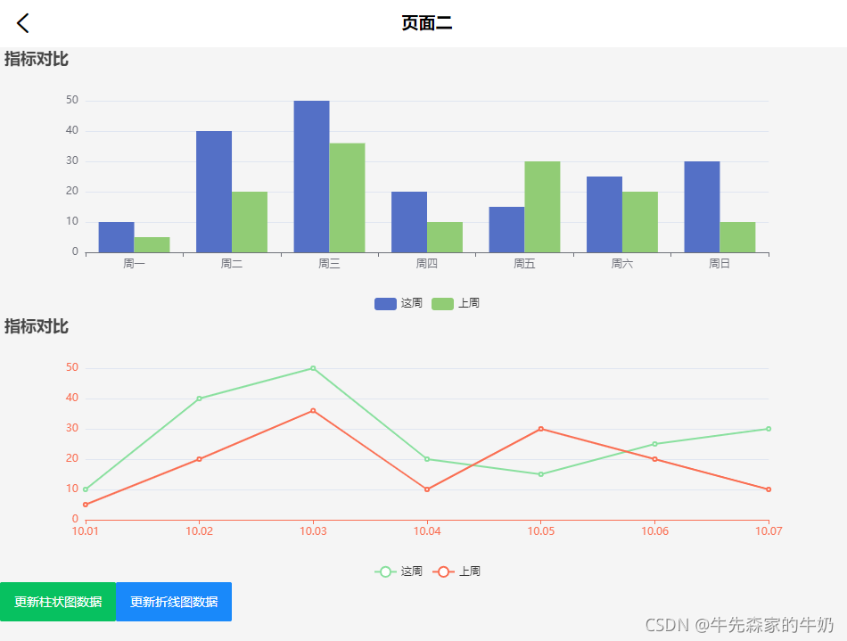
柱状图和折线图
上手先看效果,不然无法继续进行下去,代码如下
<template>
  <div class="page-two">
    <baseTitleBar
      backgroundColor="#FFF"
      :leftEle="leftEle"
      :title="title"
      titleColor="#000"
    ></baseTitleBar>
    <div id="histogram"></div>
    <div id="linechart"></div>
    <van-button type="primary" @click="handleHistogramData">更新柱状图数据</van-button>
    <van-button type="info" @click="handleLinechartData">更新折线图数据</van-button>
  </div>
</template>

<script>
import baseTitleBar from '@/components/titleBar/baseTitleBar'
import * as echarts from 'echarts'

export default {
  name: 'index',
  components: {
    baseTitleBar
  },
  props: {},
  data() {
    return {
      leftEle: {
        iconName: 'iconback',
        color: '#000',
        fontSize: '.36rem',
        method: this.back
      },
      title: '页面二',
      histogram: null,
      linechart: null,
      fontSize: 0,
      dataNewWeek: [10, 40, 50, 20, 15, 25,30],
      dataLastWeek: [5, 20, 36, 10, 30, 20, 10]
    }
  },
  methods: {
    // 用于处理自适应时元素的宽高比例大小
    handleFontSize(res) {
      let clientWidth =
        window.innerWidth ||
        document.documentElement.clientWidth ||
        document.body.clientWidth
      if (!clientWidth) return
      this.fontSize = 100 * (clientWidth / 1920)
      // console.log(this.fontSize)
      return res * this.fontSize
    },
    // 返回上一层
    back() {
      if (this.$getUserAgent() == 0) {
        try {
          u.native.onBack()
        } catch (e) {
          this.$router.go(-1)
        }
      } else {
        try {
          window.webkit.messageHandlers.onFinish.postMessage('close')
        } catch (e) {
          this.$router.go(-1)
        }
      }
    },
    // 柱状图
    initHistogram() {
      // 这里的判断是打印台 There is a chart instance already initialized on the dom!警告
      if (this.histogram != null &&  this.histogram != "" &&  this.histogram != undefined){
        this.histogram.dispose()
      }
      // 基于准备好的dom,初始化echarts实例
      this.histogram = echarts.init(document.getElementById('histogram'))
      // 绘制图表
      this.histogram.setOption({
        title: {
          text: '指标对比'
        },
        legend: {
          orient: 'vertical',
          left: 'center',
          bottom: 'bottom',
          //设置区分(哪条线属于什么)
          data: ['这周', '上周']
        },
        tooltip: {},
        xAxis: {
          data: ['周一', '周二', '周三', '周四', '周五', '周六', '周日']
        },
        yAxis: {},
        series: [
          {
            name: '这周',
            type: 'bar',
            data: this.dataNewWeek,
            barGap: '0%',
            barWidth: this.handleFontSize(0.8) // 柱图宽度
            // barWidth : 20, // 柱图宽度
          },
          {
            name: '上周',
            type: 'bar',
            data: this.dataLastWeek,
            barGap: '0%',
            // barWidth : this.fontSize(20), // 柱图宽度
            barWidth: this.handleFontSize(0.8) // 柱图宽度
            // barWidth : 20, // 柱图宽度
          }
        ]
      }, true)
    },

    // 折线图
    initLinechart() {
      // 这里的判断是打印台 There is a chart instance already initialized on the dom!警告
      if (this.linechart != null &&  this.linechart != "" &&  this.linechart != undefined){
        this.linechart.dispose()
      }
      // 基于准备好的dom,初始化echarts实例
      this.linechart = echarts.init(document.getElementById('linechart'))
      // 指定图表的配置项和数据
      let option = {
        title: {
          text: '指标对比'
        },
        tooltip: {
          //设置tip提示
          trigger: 'axis'
        },
        legend: {
          orient: 'vertical',
          left: 'center',
          bottom: 'bottom',
          //设置区分(哪条线属于什么)
          data: ['这周', '上周']
        },
        color: ['#8AE09F', '#FA6F53'], //设置区分(每条线是什么颜色,和 legend 一一对应)
        xAxis: {
          //设置x轴
          type: 'category',
          boundaryGap: false, //坐标轴两边不留白
          data: ['10.01', '10.02', '10.03', '10.04', '10.05', '10.06', '10.07'],
          // name: 'DATE', //X轴 name
          nameTextStyle: {
            //坐标轴名称的文字样式
            color: '#FA6F53',
            fontSize: 14,
            padding: [0, 0, 0, 10]
          },
          axisLine: {
            //坐标轴轴线相关设置。
            lineStyle: {
              color: '#FA6F53'
            }
          },
          axisLabel: {
            interval: 0
            // rotate: 50
          }
        },
        yAxis: {
          // name: '指标对比',
          nameTextStyle: {
            color: '#FA6F53',
            fontSize: 16,
            padding: [0, 0, 10, 0]
          },
          axisLine: {
            lineStyle: {
              color: '#FA6F53'
            }
          },
          type: 'value'
        },
        series: [
          {
            name: '这周',
            data: this.dataNewWeek,
            type: 'line', // 类型为折线图
            lineStyle: {
              // 线条样式 => 必须使用normal属性
              normal: {
                color: '#8AE09F'
              }
            }
          },
          {
            name: '上周',
            data: this.dataLastWeek,
            type: 'line',
            lineStyle: {
              normal: {
                color: '#FA6F53'
              }
            }
          }
        ]
      }
      // 使用刚指定的配置项和数据显示图表。
      this.linechart.setOption(option, true)
    },
    handleHistogramData(){
      this.dataNewWeek = [20, 50, 80, 60, 75, 85, 100]
      this.dataLastWeek = [10, 40, 40, 20, 15, 25, 60]
    },
    handleLinechartData(){
      this.dataNewWeek = [20, 50, 80, 60, 75, 85, 100]
      this.dataLastWeek = [10, 40, 40, 20, 15, 25, 60]
    },
  },
  mounted() {
    let _this = this
    this.initHistogram()
    this.initLinechart()
    // 用于处理图表的浏览器窗口自适应
    window.onresize = function () {
      _this.linechart.resize()
      _this.histogram.resize() // 若有多个图表变动,可多写
      _this.handleFontSize() // 窗口变化,更新图表大小视图
    }
  },
  watch: {
    fontSize(){
      this.initHistogram()
      this.initLinechart()
    },
    // 数据更新,更新echarts图表
    dataNewWeek(){
      this.initHistogram()
      this.initLinechart()
    },
  }
}
</script>

<style  lang="scss" scoped>
#histogram {
  width: 100%;
  height: 5rem;
}
#linechart {
  width: 100%;
  height: 5rem;
}
</style>
饼状图
上手先看效果,不然无法继续进行下去,代码如下

<template>
  <div class="page-two">
    <baseTitleBar
      backgroundColor="#FFF"
      :leftEle="leftEle"
      :title="title"
      titleColor="#000"
    ></baseTitleBar>
    <div id="piechart"></div>
    <van-button type="primary" @click="handlePiechartData">
      更新饼状图数据
    </van-button>
  </div>
</template>

<script>
import baseTitleBar from '@/components/titleBar/baseTitleBar'
import * as echarts from 'echarts'

export default {
  name: 'index',
  components: {
    baseTitleBar
  },
  props: {},
  data() {
    return {
      leftEle: {
        iconName: 'iconback',
        color: '#000',
        fontSize: '.36rem',
        method: this.back
      },
      title: '页面三',
      piechart: null,
      fontSize: 0,
      pieData: [
        { value: 100, name: '包子' },
        { value: 200, name: '油条' },
        { value: 300, name: '豆浆' },
        { value: 100, name: '胡辣汤' },
        { value: 300, name: '八宝粥' }
      ]
    }
  },
  methods: {
    handleFontSize(res) {
      let clientWidth =
        window.innerWidth ||
        document.documentElement.clientWidth ||
        document.body.clientWidth
      if (!clientWidth) return
      this.fontSize = 100 * (clientWidth / 1920)
      // console.log(this.fontSize)
      return res * this.fontSize
    },
    // 返回上一层
    back() {
      if (this.$getUserAgent() == 0) {
        try {
          u.native.onBack()
        } catch (e) {
          this.$router.go(-1)
        }
      } else {
        try {
          window.webkit.messageHandlers.onFinish.postMessage('close')
        } catch (e) {
          this.$router.go(-1)
        }
      }
    },
    // 饼状图
    initPiechart() {
      // 这里的判断是打印台 There is a chart instance already initialized on the dom!警告
      if (
        this.piechart != null &&
        this.piechart != '' &&
        this.piechart != undefined
      ) {
        this.piechart.dispose()
      }
      // 基于准备好的dom,初始化echarts实例
      this.piechart = echarts.init(document.getElementById('piechart'))
      // 指定图表的配置项和数据
      let option = {
        title: {
          text: '早餐大比拼',
          subtext: '早餐分类',
          left: 'center'
        },
        tooltip: {
          trigger: 'item'
        },
        legend: {
          orient: 'vertical',
          left: 'center',
          bottom:'bottom',
        },
        series: [
          {
            name: 'Access From',
            type: 'pie',
            radius: this.handleFontSize(2), // 饼状图大小
            center: ['50%', '60%'], // 饼状图上下左右的位置
            data: this.pieData,
            emphasis: {
              itemStyle: {
                shadowBlur: 10,
                shadowOffsetX: 0,
                shadowColor: 'rgba(0, 0, 0, 0.5)'
              }
            }
          }
        ]
      }
      // 使用刚指定的配置项和数据显示图表。
      this.piechart.setOption(option, true)
    },
    handlePiechartData() {
      this.pieData = [
        { value: 300, name: '包子' },
        { value: 100, name: '油条' },
        { value: 100, name: '豆浆' },
        { value: 200, name: '胡辣汤' },
        { value: 500, name: '八宝粥' }
      ]
    }
  },
  mounted() {
    let _this = this
    this.initPiechart()
    window.onresize = function () {
      _this.piechart.resize() // 若有多个图表变动,可多写
      _this.handleFontSize() // 窗口变化,更新图表大小视图
    }
  },
  watch: {
    fontSize() {
      this.initPiechart()
    },
    pieData() {
      this.initPiechart()
    }
  }
}
</script>

<style  lang="scss" scoped>
#piechart {
  width: 100%;
  height: 5rem;
}
</style>