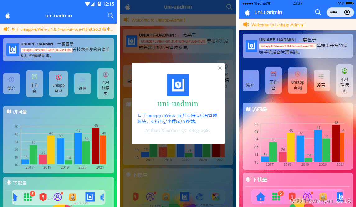
Uni-Uadmin 一款uniapp+uviewUI开发的中后台管理系统模板实例。
全新毛玻璃UI视觉uniapp后台管理系统。使用了
uni-app+uView-ui+uni-ui等技术开发架构,内置了表格/表单/图表/列表及富文本编辑器,支持动态路由权限控制,错误页处理。
功能特性
? 动态毛玻璃底部Dock菜单
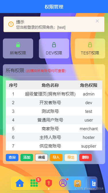
? 支持动态权限管理、错误页处理
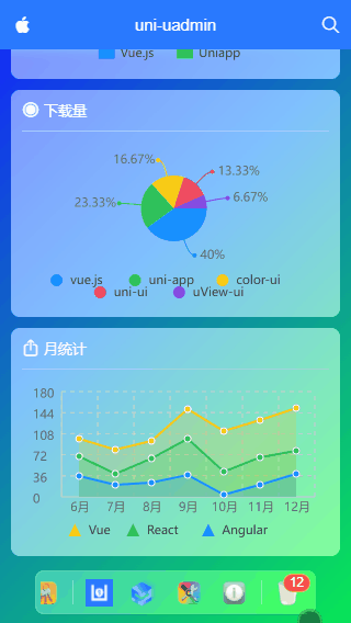
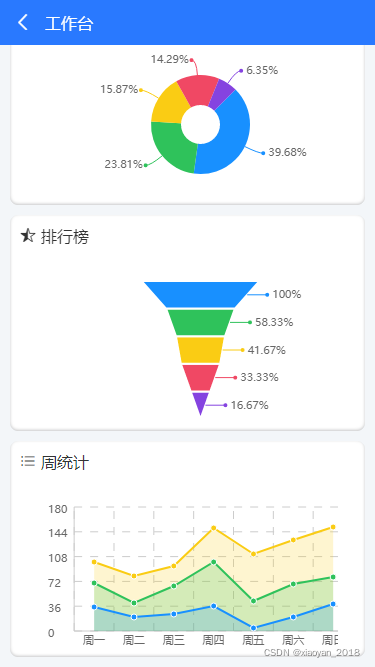
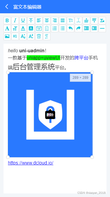
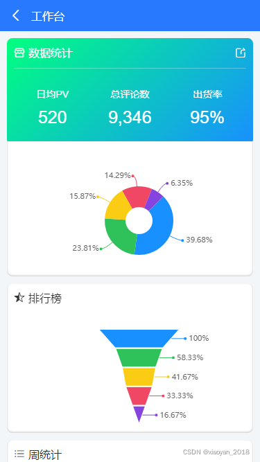
? 内置多图表组件、表格、表单、瀑布流列表及富文本编辑器
? 支持编译h5+APP+小程序端

技术架构
- 编码器:HbuilderX3.3.5
- 框架技术:vue.js+uniapp+vuex+mockjs
- UI组件库:uView-ui+uni-ui
- 弹窗组件:ua-popup(基于uni-app跨端弹框组件)
- 表格组件:ua-table(基于uni-app封装的多功能表格)
- 自定义组件:uaDock全新的dock风格tabbar组件
- 图表组件:u-charts图表库 模拟数据:mock.js
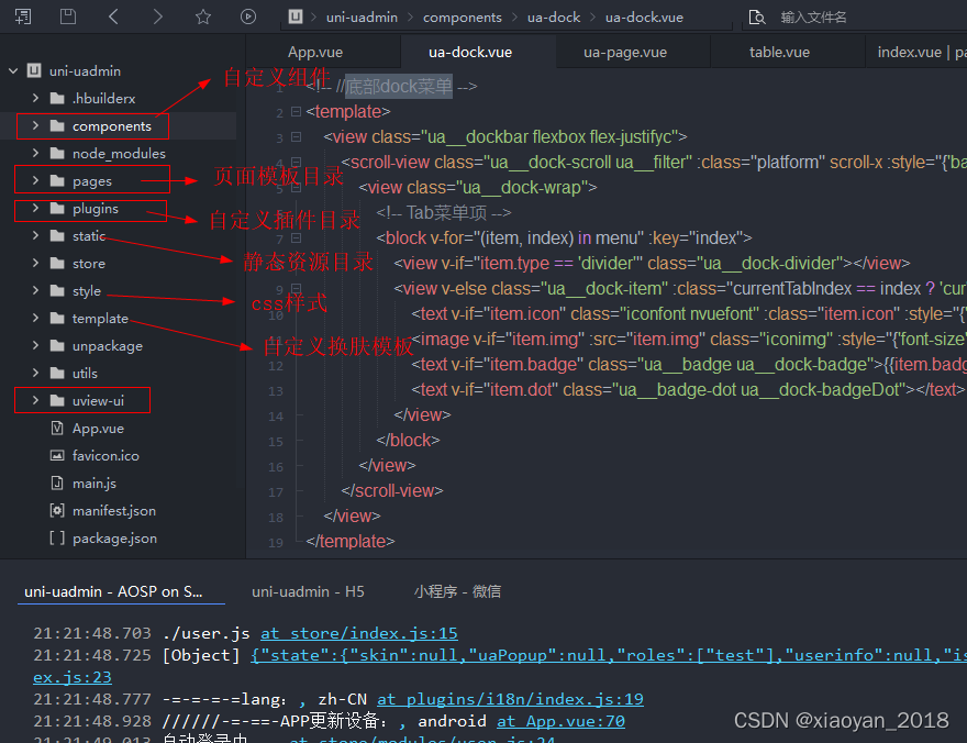
项目结构目录


main.js配置
import Vue from 'vue'
import App from './App'

// 引入vuex状态管理
import store from './store'
Vue.prototype.$store = store

// import i18n from './plugins/i18n'
// Vue.prototype._i18n = i18n

import Plugins from './plugins'
Vue.use(Plugins)

Vue.config.productionTip = false
App.mpType = 'app'

const app = new Vue({
    ...App,
	store,
	// i18n
})
app.$mount()
公共页面模板
<!-- 公共页面模板 -->
<template>
    <view class="ua__pageview flexbox flex-col" :style="{'--SKIN': $store.state.skin, 'background': bgcolor, 'color': color}">
        <slot name="header" />

        <view class="ua__scrollview flex1">
            <slot />
        </view>

        <!-- //底部 -->
        <slot name="footer" />

        <!-- //dock菜单 -->
        <ua-dock v-if="dock && dock != 'false'" @click="handleDockClick" />

        <!-- //函数式弹框 -->
        <ua-popup ref="uapopup" />

        <!-- //换肤模板 -->
        <ua-popup v-model="isVisibleSkin" position="right">
            <Skin />
        </ua-popup>
    </view>
</template>
uni-app实现dock菜单
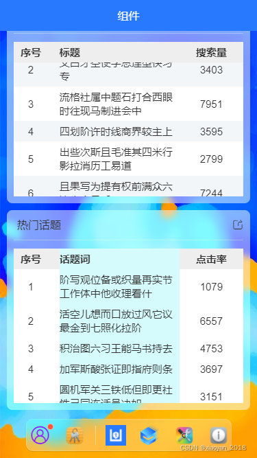
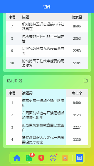
项目中的底部菜单采用了毛玻璃背景模糊效果。替代了系统tabbar组件。可左右丝滑滚动,图标支持iconfont和图片,另外还支持badge圆点数字提示。选项支持切换tabbar页面,跳转新页面

自定义dock菜单模板
<!-- //底部dock菜单 -->
<template>
    <view class="ua__dockbar">
        <scroll-view class="ua__dock-scroll ua__filter" :class="platform" scroll-x :style="{'background': bgcolor}">
            <view class="ua__dock-wrap">
                <!-- Tab菜单项 -->
                <block v-for="(item, index) in menu" :key="index">
                    <view v-if="item.type == 'divider'" class="ua__dock-divider"></view>
                    <view v-else class="ua__dock-item" :class="currentTabIndex == index ? 'cur' : ''" @click="switchTab(index, item)">
                        <text v-if="item.icon" class="iconfont nvuefont" :class="item.icon">{{item.icon}}</text>
                        <image v-if="item.img" :src="item.img" class="iconimg" :style="{'font-size': item.iconSize}" />
                        <text v-if="item.badge" class="ua__badge ua__dock-badge">{{item.badge}}</text>
                        <text v-if="item.dot" class="ua__badge-dot ua__dock-badgeDot"></text>
                    </view>
                </block>
            </view>
        </scroll-view>
    </view>
</template>
组件支持的props自定义参数配置如下
props: {
    // 当前索引
    current: { type: [Number, String], default: 0 },
    // 背景色
    bgcolor: { type: String, default: null },
    /**
     * [ 菜单选项 ]
        type    菜单类型 type: 'tab'支持uni.switchTab切换 type: 'divider'分割线
        path    菜单页面地址
        icon    菜单图标-iconfont图标
        img     菜单图片
        color    菜单图标颜色
        title    标题
        badge    圆点数字
        dot        小红点
     */
    menu: {
        type: Array,
        default: () => [
            /* Tab菜单 */
            {
                type: 'tab',
                path: '/pages/index/index',
                icon: `\ue619`,
                color: '#2979ff',
                title: '首页',
            },
            {
                type: 'tab',
                path: '/pages/component/index',
                icon: 'icon-component',
                color: '#17c956',
                title: '组件',
                badge: 5,
            },
            {
                type: 'tab',
                path: '/pages/permission/index',
                icon: 'icon-auth',
                color: '#f44336',
                title: '权限管理',
            },
            {
                type: 'tab',
                path: '/pages/setting/index',
                icon: 'icon-wo',
                color: '#8d1cff',
                title: '设置',
                dot: true,
            },
            // ...
        ]
    },
},
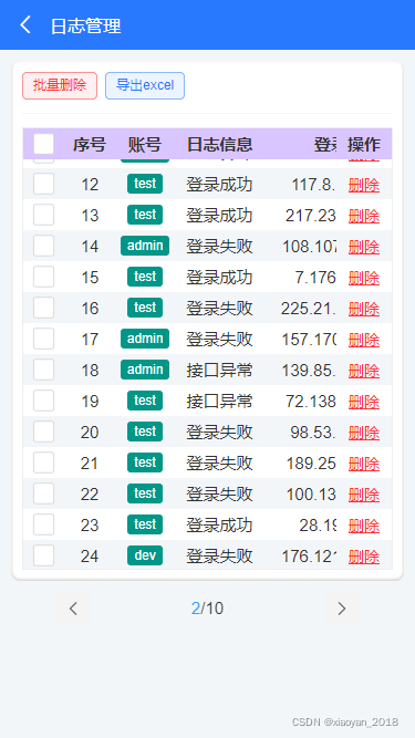
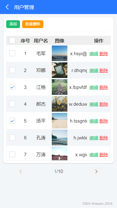
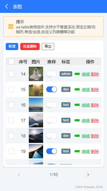
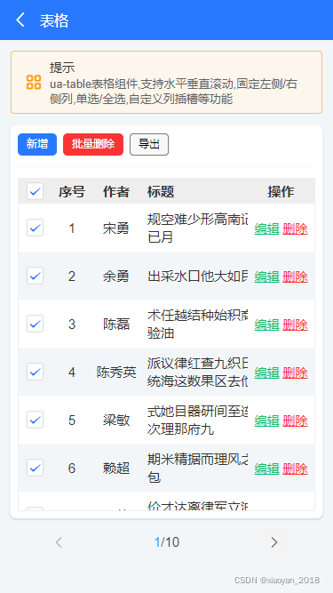
uni-app自定义表格table组件
由于项目中需要用到表格组件,无赖网上的uniapp表格组件过于简单及功能性不全。于是就自己全新开发了一款表格组件ua-table。


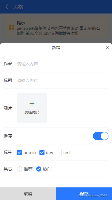

ua-table 支持全选/单选,列宽/居中及可左右、上下滑动固定表头及列,支持点击行返回行数据,返回单选及多选行列数据,自定义slot插槽等功能。能满足多样化表格需求。
调用非常简便,只需如下引入即可。
<ua-table
    :columns="columns"
    headerBgColor="#eee"
    :headerBold="true"
    stripe
    padding="5px 0"
    :data="data.list"
    height="450rpx"
>
</ua-table>
<script>
import Mock from 'mockjs'

export default {
    data() {
        return {
            columns: [
                {type: 'index', align: 'center', width: 100, fixed: true}, // 索引序号
                {prop: 'title', label: '标题', align: 'left', width: '350'},
                {prop: 'num', label: '搜索量', align: 'center', width: 120},
            ],
            data: Mock.mock({
                total: 100,
                page: 1,
                pagesize: 10,
                'list|10': [
                    {
                        id: '@id()',
                        title: '@ctitle(10, 20)',
                        num: '@integer(1000,10000)'
                    }
                ]
            }),
        }
    }
}
</script>
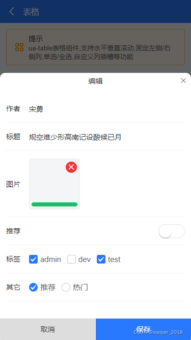
如果想要自定义slot插槽,则可以通过如下方式使用。
<ua-table
    :columns="columns"
    headerBgColor="#eee"
    :headerBold="true"
    :stripe="true"
    :data="data.list"
    @row-click="handleRowClick"
    @select="handleCheck"
    height="750rpx"
    style="border:1px solid #eee"
>
    <template #default="{row, col, index}">
        <block v-if="col.slot == 'image'">
            <u-image :src="row.image" :lazy-load="true" height="100rpx" width="100rpx" @click="previewImage(row.image)" />
        </block>
        <block v-if="col.slot == 'switch'">
            <u-switch v-model="row.switch" inactive-color="#fff" :size="36"></u-switch>
        </block>
        <block v-if="col.slot == 'tags'">
            <u-tag :text="row.tags" bg-color="#607d8b" color="#fff" mode="dark" size="mini" />
        </block>
        <block v-if="col.slot == 'progress'">
            <u-line-progress active-color="#1fb925" :percent="row.progress" :show-percent="false" :height="16"></u-line-progress>
        </block>
        <block v-if="col.slot == 'btns'">
            <view class="ua__link success" @click.stop="handleFormEdit(row)">编辑</view>
            <view class="ua__link error" @click.stop="handleDel(row, index)">删除</view>
        </block>
    </template>
</ua-table>

<script>
/**
 * @Desc     uniapp自定义表格组件
 * @Time     andy by 2022-01
 * @About    Q:282310962  wx:xy190310
 */
import Mock from 'mockjs'

export default {
    data() {
        return {
            columns: [
                {type: 'selection', align: 'center', width: 80, fixed: true}, // 多选
                {type: 'index', align: 'center', width: 80, fixed: true}, // 索引序号
                {prop: 'author', label: '作者', align: 'center', width: 120},
                {prop: 'title', label: '标题', align: 'left', width: 350},
                {slot: 'image', label: '图片', align: 'center', width: 120},
                {slot: 'switch', label: '推荐', align: 'center', width: 100},
                {slot: 'tags', label: '标签', align: 'center', width: 100},
                {slot: 'progress', label: '热度', align: 'center', width: 150},
                {prop: 'date', label: '发布时间', align: 'left', width: 300}, // 时间
                {slot: 'btns', label: '操作', align: 'center', width: 150, fixed: 'right'}, // 操作
            ],
            data: Mock.mock({
                total: 100,
                page: 1,
                pagesize: 10,
                'list|30': [
                    {
                        id: '@id()',
                        author: '@cname()',
                        title: '@ctitle(10, 20)',
                        image: 'https://picsum.photos/400/400?random=' + '@guid()',
                        switch: '@boolean()',
                        'tags|1': ['admin', 'test', 'dev'],
                        progress: '@integer(30, 90)',
                        date: '@datetime()'
                    }
                ]
            }),
        }
    }
}
</script>
以上就是uniapp开发移动端后台管理系统,希望对大家有些帮助~
最后附上两个项目实例
- uni-app+uviewUI仿抖音小视频/直播
https://blog.csdn.net/yanxinyun1990/article/details/120387832 - vite.js+electron仿macOs桌面管理系统
https://blog.csdn.net/yanxinyun1990/article/details/118187205