支持暗色/深色模式,以及“一键换肤” 已经几乎成为了各家系统、应用以及 Web 站点的标配功能。那实现这样的功能的方案都有哪些呢?
首先对概念进行统一:
- 颜色字面量:指样式文件中确定的颜色值,如?
white,?#FFF,?rgb(23,45,0)?等; - 颜色变量:指与颜色相关的 CSS 变量,如?
--color-primary;
1 多套 CSS 样式实现
1.1 原理
实现多套 CSS 样式,根据用户切换操作,通过动态修改 link 标签的 href 或动态添加删除 link 标签来加载不同的模式的样式,主要解决了多个模式被编译到一个文件中导致单个文件过大。
1.2 具体实现
将 css 部分直接拆分成?ligth.css?和?dark.css?两个文件,通过?setTheme 动态切换模式:
function setTheme(theme = 'ligth') {
  let link = document.querySelector('#theme-link')
  let href = "/theme/" + theme + ".css"

  if (!link) {
    let head = document.querySelector('head');
    link = document.createElement('link');
    link.id = '#theme-link';
    link.rel = 'stylesheet';
    link.href = href;
    head.appendChild(link);
  } else {
    link.href = href
  }
}
1.3 优缺点
优点是简单,缺点是维护成本高,具体表现在以下几个方面:
- 需要重复编写和单独修改多份样式文件;
- 没有单独提取出可变的样式部分;
- 需要提前知道打包后的文件路径,否则可能导致模式样式引入错误;
2 CSS 变量实现
2.1 原理
通过?body.style.setProperty(key, value)?动态修改?body?上的 CSS 变量(颜色,字体,宽高等),使得页面上的其他部分可以应用最新的 CSS 变量对应的样式。
2.2 具体实现
在?theme.css?中定义全局的 CSS 变量,其次是在?themeUtil.js?中获取当前对应样式值,以及设置?body?上的 CSS 变量值,有两种具体实现,方式一:
/** theme.css?*/
:root {
  --bg: initial; // 背景色
  --color: initial; // 字体色
  --boder-color: initial; // 边框色
}

const darkTheme = 'rgb(49, 51, 51)'
const lightTheme = '#fff'
const lightBorderTheme = '#d6d6d6'

/** 获取对应的模式的色值 */
export const getThemeMap = (isLight) => {
  const bg = isLight ? lightTheme : darkTheme;
  const color = isLight ? darkTheme : lightTheme;
  const borderColor = isLight ? lightBorderTheme : lightTheme;
  return {
    bg,
    color,
    'boder-color': borderColor,
  }
}

/** 设置模式的色值 */
export const setTheme = (isLight = true) => {
  const themeMap = getThemeMap(isLight)
  const body = document.body;
  Object.keys(themeMap).forEach(key => {
    body.style.setProperty(`--${key}`, themeMap[key])
  })
}
方式二:
/** theme.css?*/
/* 默认值:light */
:root {
  --bg: #fff;
  --color: rgb(51, 50, 50);
  --img-bg: #fff;
  --boder-color: #d6d6d6;
}

/* 暗黑:dark */
[data-theme='dark'] {
  --bg: rgb(49, 51, 51);
  --color: #fff;
  --boder-color: #fff;
}
export const setTheme = (isLight = true) => {
  document.body.style.setProperty('data-theme', isLight ? 'light' : 'dark')
}而使用时通过?var()?在组件中应用对应 CSS 变量:
<style scoped>
.header {
  ...省略
  color: var(--color);
  border-bottom: 1px solid var(--boder-color);
  background-color: var(--bg);
}
...省略
</style>
2.3 优缺点
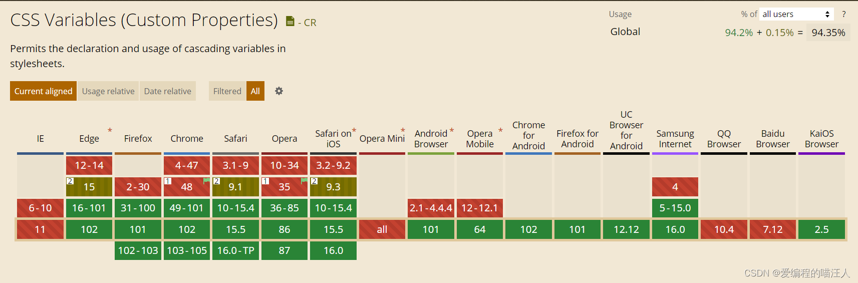
优点是简单,缺点是存在兼容性――CSS 变量的兼容性如下:
可以通过?css-vars-ponyfill?对 CSS 变量进行兼容处理,只需要导入该 ponyfill:
import cssVars from "css-vars-ponyfill";

// ... 省略 ...


export const setTheme = (isLight = true) => {

  // ... 省略 ...

  cssVars({
    watch: true,?//?添加、删除、修改 <link> 或 <style> 元素的禁用或 href 属性时,ponyfill 将自行调用????
    variables: themeMap,?//?variables?自定义属性名/值对的集合
    onlyLegacy: false,?//?false??默认将 css 变量编译为浏览器识别的 css 样式?;true?当浏览器不支持css变量的时候将css变量编译为识别的css??
  });
}
3 CSS 样式覆盖实现
3.1 原理
通过切换?css?选择器的方式实现皮肤/模式样式的切换:
- 在组件中保留不变的样式,将需要变化的样式进行抽离;
- 提供多种样式,给不同的皮肤/模式定义一个对应的 CSS 选择器;
- 根据不同皮肤/模式切换成对应选择器来设置不同的样式。
3.2 具体实现
通过改变在全局存储和控制的模式?state,切换的伪代码如下:
import { setTheme } from '../style/themeUtil';

const checked = false;

const changeTheme = (event) => {
  setTheme(!checked.value);
}

state: {
  theme: 'light'
}

<div className=['header', state.theme]>
  <span>{{title}}</span>
  <input type="checkbox" class="switch" onChange={changeTheme} />
</div>在?theme.css?中通过?.light?和?.dark?两个类选择器来区分日间和夜间模式:?
/* light 默认*/
body.light {
  background-color: #fff;
}

.header.light {
  background-color: #fff;
  border-bottom: 1px solid #d6d6d6;
  color: rgb(49, 51, 51);
}

.list.light .title {
  color: rgb(49, 51, 51);
}
.list.light .describe{
  color: rgb(159, 158, 157);
}

.list.light .left{
  border: 1px solid rgb(49, 51, 51);
}

/* dark 夜间模式 */
body.dark {
  background-color: rgb(49, 51, 51);
}

.header.dark {
  background-color: rgb(49, 51, 51);
  border-bottom: 1px solid #fff;
  color: #fff;
}

.list.dark .title {
  color: #fff;
}
.list.dark .describe{
  color: rgb(199, 200, 200);
}
.list.dark .left{
  border: 1px solid #fff;
  background-color: #fff;
}
3.3 优缺点
缺点很明显:
- 多种皮肤/模式样式都要引入,导致代码量增大;
- 样式不易管理,查找复杂;
- 开发效率低,拓展性差;
4 动态 Style 实现
4.1 原理
通过更改?style 标签里面的内容实现――读取 CSS 文件里的样式,通过?css-color-function?把颜色替换成 json 文件中的关键字并返回 colors 对象,再选择一种颜色将关键字再次替换,再将样式通过?style 标签插入DOM里。
4.2 具体实现
文件目录如下:
├── yarn.lock
├── package.json
├── public
│   └── index.html
├── src
│   ├── color.js // 颜色转换为关键字的工具方法
│   ├── formula.json // 定义颜色与关键字之间的对应关系
│   ├── index.js
│   └── app.jsx
└── webpack.config.js
formula.json:
{
  "bgColor-out": "color(primary contrast(50%))",
  "bgColor-in": "color(primary contrast(50%))",
  "textColor": "color(primary tint(50%))",
  "grey": "color(primary tint(50%))"
}
?color.js:
import color from 'css-color-function';
import formula from './formula.json';

export default function generateColors(primary) {
  let colors = {};
  /** 遍历 formula.json 里的关键字 value,将关键字通过 css-color-function 换成 rgb 颜色 */
  Object.keys(formula).forEach((key) => {
    const value = formula[key].replace(/primary/g, primary);
    /** css-color-function提供的convert转换颜色 */
    colors[key] = color.convert(value);
  })

  return colors;
}
如何使用呢,比如在 app.jsx 中,通过 fetch 发请求来读取CSS文件,然后将颜色转换成关键字,最后生成一个 css 模板,颜色选择器选择一个颜色后,根据 css 模板来修改或生成 style 标签。:
const [styleTemplate, setStyleTemplate] = useState('')
useEffect(() => {
  const colorMap = {
    '#fff': 'bgColorOut',
    '#fff': 'bgColorIn',
    '#333': 'textColor',
    '#1c1f23': 'grey'
  }
  fetch('https://assets.asaki-m.com/template.css')
    .then((r) => r.text())
    .then((data) => {
      let dataText = data
      // 遍历颜色映射表将颜色转换成关键字
      Object.keys(colorMap).forEach((key) => {
        const value = colorMap[key]
        dataText = dataText.replace(new RegExp(key, 'ig'), value)
      })
      // 转换完后设置到变量保存模板
      setStyleTemplate(dataText)
  })
}, [])


const originalStylesheetCount = document.styleSheets.length;
const toggleTheme = useCallback((evt) => {
    let cssText = styleTemplate;
    // 通过input color选择完颜色后,生成关键字与颜色对应的映射
    let colors = generateColors(evt.target.value);
    // 遍历映射表重新将关键字替换成rgb颜色
    Object.keys(colors).forEach((key) => {
      cssText = cssText.replace(
        new RegExp('(:|\\s+)' + key, 'g'),
        '$1' + colors[key]
      )
    })
    // 判断是否已经存在了style标签,不存在就创建一个,存在就直接覆盖里面的内容
    if (originalStylesheetCount === document.styleSheets.length) {
      const style = document.createElement('style');
      style.innerText = cssText;
      document.head.appendChild(style);
    } else {
      document.head.lastChild.innerText = cssText;
    }
})


<div className="content">
  <input type="color" onChange={toggleTheme} />
  <h1>CSS variable</h1>
  <p>abcdefghijklmnopqrstuvwxyz,abcdefghijklmnopqrstuvwxyz</p>
  <button>button</button>
</div>
4.3 优缺点
优点是不存在兼容性问题,缺点是上手较难,维护成本高。
5?Sass/Less变量实现
5.1 原理
与 CSS 变量实现类似,也是通过给根元素添加属性/类名来达成切换模式样式的效果。
5.2?具体实现
文件目录如下:
├── yarn.lock
├── package.json
├── public
│   └── index.html
├── src
│   ├── index.scss
│   ├── _variable.scss
│   ├── _handle.scss
│   ├── index.js
│   └── app.jsx
└── webpack.config.js
app.jsx 文件中编写页面结构以及切换的逻辑:
import { useCallback, useState } from 'react';
import './index.scss';
const App = () => {
  // 定义切换按钮的文案,并且给 html 附上默认模式类型
  const [themeText, setThemeText] = useState(() => {
    document.documentElement.setAttribute('data-theme', 'light');
    return 'light';
  })
  // 切换逻辑
  const toggleTheme = useCallback(() => {
    if (themeText === 'light') {
      document.documentElement.setAttribute('data-theme', 'dark');
      setThemeText('dark');
    } else {
      document.documentElement.setAttribute('data-theme', 'light');
      setThemeText('light');
    }
  })
  return (
    <div className="content">
      <button onClick={toggleTheme}>{themeText}</button>
      <h1>SCSS variable</h1>
      <p>abcdefghijklmnopqrstuvwxyz,abcdefghijklmnopqrstuvwxyz</p>
      <button>button</button>
    </div>
  )
}

export default App;
_variable.scss 文件中定义每个模式的变量 :
$themes: (
    light: (
        bg-color-out: #fff,
        bg-color-in: #fff,
        text-color: #333,
        grey: #1c1f23
    ),
    dark: (
        bg-color-out: #16161a,
        bg-color-in: #35363c,
        text-color: #fff,
        grey: #f9f9f9
    )
);
_handle.scss 定义 mixin 将每个模式的对应颜色 / 字体 / 宽高等等绑定好,然后只要根据某个mixin 传入对应的 key 值即可:
@mixin themeify {

  // 遍历_variable.scss定义的模式
  @each $theme-name,
  $theme-map in $themes {
    // 将每个模式提升为全局变量
    $theme-map: $theme-map !global;

    // 绑定某个模式下的样式内容
    [data-theme="#{$theme-name}"] & {
      @content
    }
  }
}

// 定义一个通过key获取模式变量的值函数
@function themed($key) {
  @return map-get($theme-map, $key)
}

// 下面这些mixin绑定在那个模式就那种颜色
@mixin bgColor($color) {
  @include themeify {
    background-color: themed($color);
  }
}

@mixin textColor($color) {
  @include themeify {
    color: themed($color);
  }
}

@mixin borderColor($color) {
  @include themeify {
    border-color: themed($color);
  }
}将?_variable.scss?和?_handle.scss?两个文件在 webpack 里面配置全局引入,这样就可以在?index.scss 使用 mixin 来绑定:
body {
  margin: 0;
  padding: 0;
  transition: all 0.3s;
  @include bgColor('bg-color-out');
}

.content {
  padding: 20px;
  @include bgColor('bg-color-in');
  @include textColor('text-color');

  button {
    width: 100px;
    height: 30px;
    border: 1px solid;
    outline: none;
    @include bgColor('bg-color-out');
    @include borderColor('grey');
    @include textColor('text-color');

  }
}
5.3?优缺点
优点是不存在兼容性问题,缺点是代码可读性不如CSS,理解成本增加。
6?已有项目支持换肤?
对于已有项目,要支持换肤,若采用颜色变量的方式,需要手动将项目中所有颜色值手动替换为对应颜色变量,工作量巨大,如何自动化实现替换?
6.1 原理
- 首先,使用 PostCSS?或者?Stylelint 解析识别 css/scss/stylus 等样式文件中的颜色字面量,如:
background: white中的white。 - 然后,计算识别的颜色字面量是否可以替换为对应颜色变量,如:var(--bg--color--out)。使用 chorma-js?转换任意颜色格式和计算颜色之间的相似度,比如:
chroma.distance(color1, color2)。如果颜色字面量与颜色变量对应的颜色值相同或相近则认为可以替换。
PostCSS :通过引入插件,可以将样式代码解析为抽象语法树 (AST),并提供了 API 允许分析和转换 CSS 文件的内容。比如?
Sass,?Less,?Stylus以及?JSX?中的样式代码。Stylelint 是针对样式文件的代码审查工具。Stylelint 底层基于 PostCSS,对样式文件进行解析分析,可以对 CSS/Sass/Stylus/Less 等样式文件进行审查。每个规则在 Stylelint 中都是一个插件,插件的输入是样式文件通过 PostCSS 解析后的抽象语法树,插件可以基于?PostCSS API?遍历语法树,分析/修改样式代码。
相比 PostCSS,使用 Stylelint 的好处是:
- 不需要关心样式文件的解析,只需要关注拿到解析结果后如何分析;
- 不需要关心根据不同的样式语言,引入不同的 PostCSS 解析插件;
- StyleLint 有完善的 CLI 工具以及 VS Code 插件,可以直接复用。
CSS 属性值的颜色字面量识别有以下三类:
- 穷举的?颜色关键字,如:
white,blue等等; - ?'#' 开头的RGB 16 进制形式,如:
#FFF; - 名称为
rgb,?rgba,?hsl,?hsla,hwb,gray等的函数形式,如:rgb(255, 255, 0)/rgba(255, 0, 255, 0.5)/?hsl(0deg, 0%, 13%)?/?hsla(0deg, 0%, 13%, 1)?/?hwb(...)/gray(...)。
因此,可以实现一个 Stylelint 插件,分析并识别样式文件中的颜色字面量,并给出提示,针对有对应的颜色变量的,支持自动替换(autofix)。
6.2 具体步骤
可以有以下两种形式进行使用:
- 通过 StyleLint CLI 命令行工具一键查找和替换所有颜色变量;
/** 安装 stylelint 插件 */
npm i -D stylelint @edmi/stylelint-color-autofix
/** 项目根目录 .stylelintrc.json 配置 @edmi/stylelint-color-autofix 与 color-no-literal 规则(颜色不能是字面量)*/
{
"plugins": ["@edmi/stylelint-color-autofix"],
"rules": {
"color-no-literal": [true, { "severity": "warning", "fixExact": false }]
}
}
/** 检查 */
$ npx stylelint "**/*.scss"
/** 替换 */
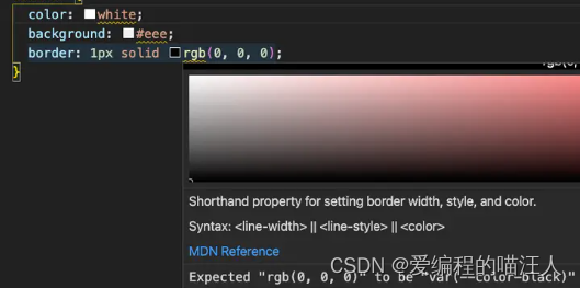
$ npx stylelint "**/*.scss" --fix?比如,替换前:
..edmi-write-btn {
    color: white;
    background: #eee;
    border: 1px solid rgb(0, 0, 0);
}
替换后:
.edmi-write-btn {
    color: var(--color-white);
    background: var(--color-tertiary-light-hover);
    border: 1px solid var(--color-black);
}- 通过 Stylelint VSCode编辑器插件,代码编写过程中提示颜色字面量需要用颜色变量来替代,可设置保存时自动替换;
总结
对于上面提到的实现方案,均不涉及持久化,可将对应的模式保存到本地缓存(localStorage)里,然后每次渲染读取缓存的模式值进行渲染,并且切换的时候对缓存的模式进行修改即可。