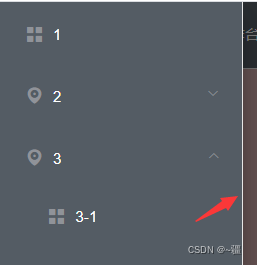
el-menu官方文档:Element - The world's most popular Vue UI frameworkElement,一套为开发者、设计师和产品经理准备的基于 Vue 2.0 的桌面端组件库 https://element.eleme.cn/#/zh-CN/component/menu?参考:vue后台管理系统布局模板_~疆的博客-CSDN博客_vue 后台管理系统模板类似以下这种布局,其中,Aside板块可以展开/收缩结构目录:home.vue:<!--home.vue--><template> <div class="homeContainer"> <div class="header"> <img src="@/assets/logo.png" style="height:70px;width:55px;margin-left:30px;" /> .
https://blog.csdn.net/qq_40323256/article/details/114650131
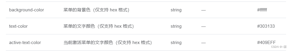
 ??
??
注意:竖着时,要加上样式:class="el-menu-vertical-demo",否则竖着展开时的宽度会设置失败
导航栏垂直时去除右侧白边:
      .el-menu {
        border: 0 !important; //垂直时,去除右侧白边
      }
?导航栏水平时去除底部白边:
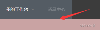
注意:水平时去除底部白边是用的新添加的style标签实现的。其他方式不行,如用::deep,或者直接在原来的style中改,都不行
<style>
/* 水平时,去除底部白边。 */
.el-menu.el-menu--horizontal {
  border-bottom: 0;
}
</style>
注意:如果设置了还是有白边的话,如下:
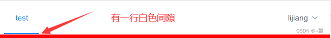
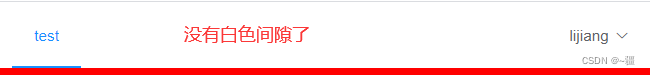
?有可能是右侧的el-dropdown造成的,将el-dropdown样式设置line-height:0即可消除白色间隙
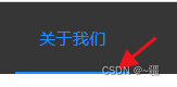
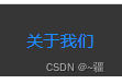
菜单切换时取消过渡效果:
一定要新添加一个style标签!!!!
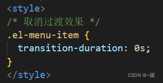
<style>
/* 取消过渡效果 */
.el-menu-item {
  transition-duration: 0s;
}
</style>
?侧边栏展开时宽度:
前提:加上样式?class="el-menu-vertical-demo"?
.el-menu-vertical-demo:not(.el-menu--collapse) {
        width: 256px;
      }
侧边栏折叠时宽度:
//折叠时宽度
.el-menu--collapse {
width: 110px;
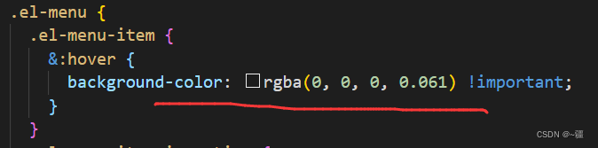
}?菜单选中时设置背景色:
      .el-menu-item.is-active {
        background-color: #1890ff !important;
      }
此外还可设置其他样式,如下:
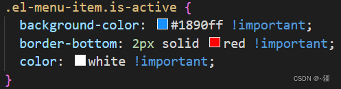
选中时取消显示底部横线:
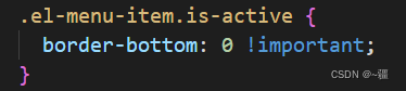
菜单hover时设置字体颜色:
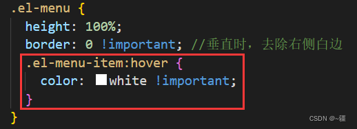
        .el-menu-item:hover {
          color: white !important;
        }
当然也可设置背景色
示例:
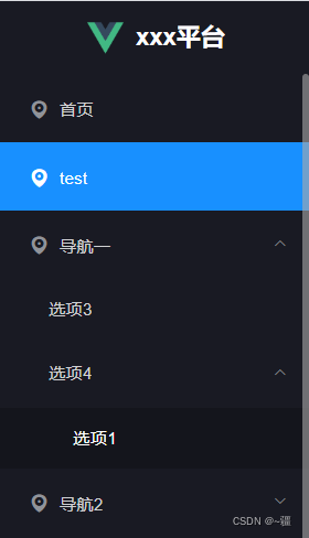
<template>
<div class="aside">
<div class="aside-header">
<img
src="https://lj-common.oss-cn-chengdu.aliyuncs.com/vue.png"
style="width: 30px; height: 30px"
/>
<span
style="
font-size: 20px;
font-weight: 600;
color: white;
margin-left: 10px;
"
>xxx平台</span
>
</div>
<div class="aside-menu">
<perfect-scrollbar>
<el-menu
:default-active="$route.path"
class="el-menu-vertical-demo"
background-color="#191A23"
text-color="#D1D1D3"
active-text-color="white"
unique-opened
>
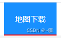
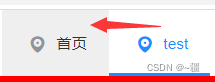
<el-menu-item
index="/download"
@click="$router.push({ path: '/download' })"
>
<i class="el-icon-location"></i>
<span slot="title">首页</span>
</el-menu-item>
<el-menu-item index="/test" @click="$router.push({ path: '/test' })">
<i class="el-icon-location"></i>
<span slot="title">test</span>
</el-menu-item>
<el-submenu index="1">
<template slot="title">
<i class="el-icon-location"></i>
<span>导航一</span>
</template>
<el-menu-item index="1-3">选项3</el-menu-item>
<el-submenu index="1-4">
<template slot="title">选项4</template>
<el-menu-item index="1-4-1">选项1</el-menu-item>
</el-submenu>
</el-submenu>
<el-submenu index="2">
<template slot="title">
<i class="el-icon-location"></i>
<span>导航2</span>
</template>
<el-menu-item index="2-3">选项5</el-menu-item>
</el-submenu>
</el-menu>
</perfect-scrollbar>
</div>
</div>
</template>
<script>
export default {
data() {
return {};
},
methods: {},
watch: {},
};
</script>
<style lang='scss' scoped>
.aside {
height: 100vh;
.aside-header {
height: 60px;
background-color: #191a23;
line-height: 60px;
display: flex;
align-items: center;
justify-content: center;
}
.aside-menu {
height: calc(100vh - 60px);
//perfect-scrollbar默认的类名。自定义滚动条内容区域高度
.ps {
height: 100%;
//展开时宽度
.el-menu-vertical-demo:not(.el-menu--collapse) {
width: 256px;
}
//折叠时宽度
// .el-menu--collapse {
// width: 110px;
// }
.el-menu {
height: 100%;
border: 0 !important; //垂直时,去除右侧白边
.el-menu-item:hover {
color: white !important;
}
}
.el-menu-item.is-active {
background-color: #1890ff !important;
}
}
}
}
</style>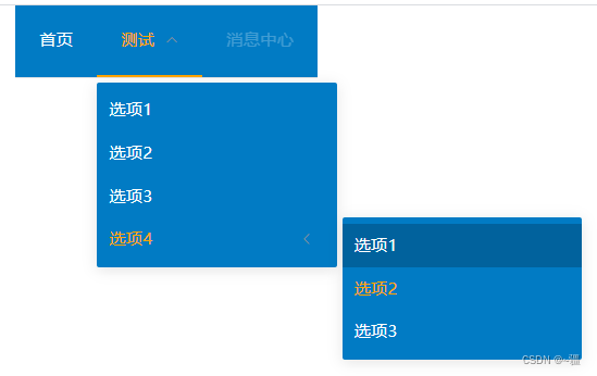
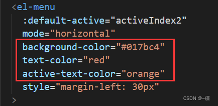
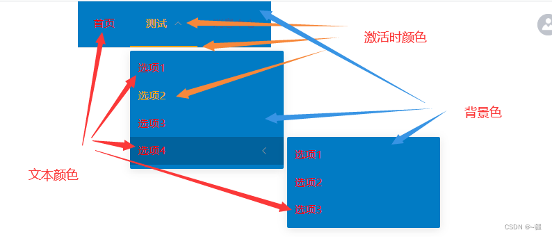
      <el-menu
        default-active="2-4-2"
        mode="horizontal"
        background-color="#017bc4"
        text-color="white"
        active-text-color="orange"
        style="margin-left: 30px"
      >
        <el-menu-item index="1">首页</el-menu-item>
        <el-submenu index="2">
          <template slot="title">测试</template>
          <el-menu-item index="2-1">选项1</el-menu-item>
          <el-menu-item index="2-2">选项2</el-menu-item>
          <el-menu-item index="2-3">选项3</el-menu-item>
          <el-submenu index="2-4">
            <template slot="title">选项4</template>
            <el-menu-item index="2-4-1">选项1</el-menu-item>
            <el-menu-item index="2-4-2">选项2</el-menu-item>
            <el-menu-item index="2-4-3">选项3</el-menu-item>
          </el-submenu>
        </el-submenu>
        <el-menu-item index="3" disabled>消息中心</el-menu-item>
      </el-menu>