目录
跟着自学网的教程,敲的一个自学网的网页。
先上gif图:
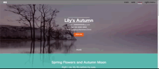
因为原图太大不能上传,压缩了一下清晰度......
有导航栏,内容区,侧边栏,按钮动画,还有回到顶部的小事件。
注意事项
jQuery可以下载好一起放入文件夹里直接引用的,免得网络问题不能用。
看起来挺简单的一个页面还是有很多可以注意到的事项,记录一下:
1.导航栏使用ul同时向右浮动时,可以将标签倒着写,这样不会出错;
2.设置float后,父元素的高度就消失了,如果页面下面还有内容,就会错位,需要将样式清除;
3.span不能设置高宽,需要将其display设置成inline-block后才能设置,最好还是采用其他可以设置的元素,比如div;
4.margin和padding:前者是外边距,后者是内边距,若带有背景色,使用padding可以将背景色一同撑大,margin则会留白;
5.每次写项目前,可以先网上找一份清除浏览器样式的CSS文件复制进去,保证浏览器的样式不会影响自己设置的样式,这里CSS的前30几行就是清除浏览器样式用的;
6.CSS中>,+,~,空格,逗号等符号连着选择器一起使用还挺多,需要大量练习才行;
7.按钮的动画CSS就能完成,CSS3提供了好多动画啊,还有好多参数……
详细解释
实现步骤如下:
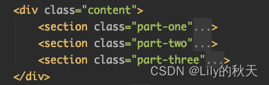
1.整个页面分成了三部分:头部、内容区、尾部
2.整个的包裹id定义为wrap,内容区的class定义为content,尾部的class定义为footer
3.紧跟着的mask为整个页面设置遮罩:当右侧菜单栏弹出时,整个页面加上遮罩
4.slider为侧边栏菜单
5.top为右下角"回到顶部"的按钮
最后面有源码,前面截图的为了讲解用的,复制部分代码太烦了,要不停改格式,我懒得改。
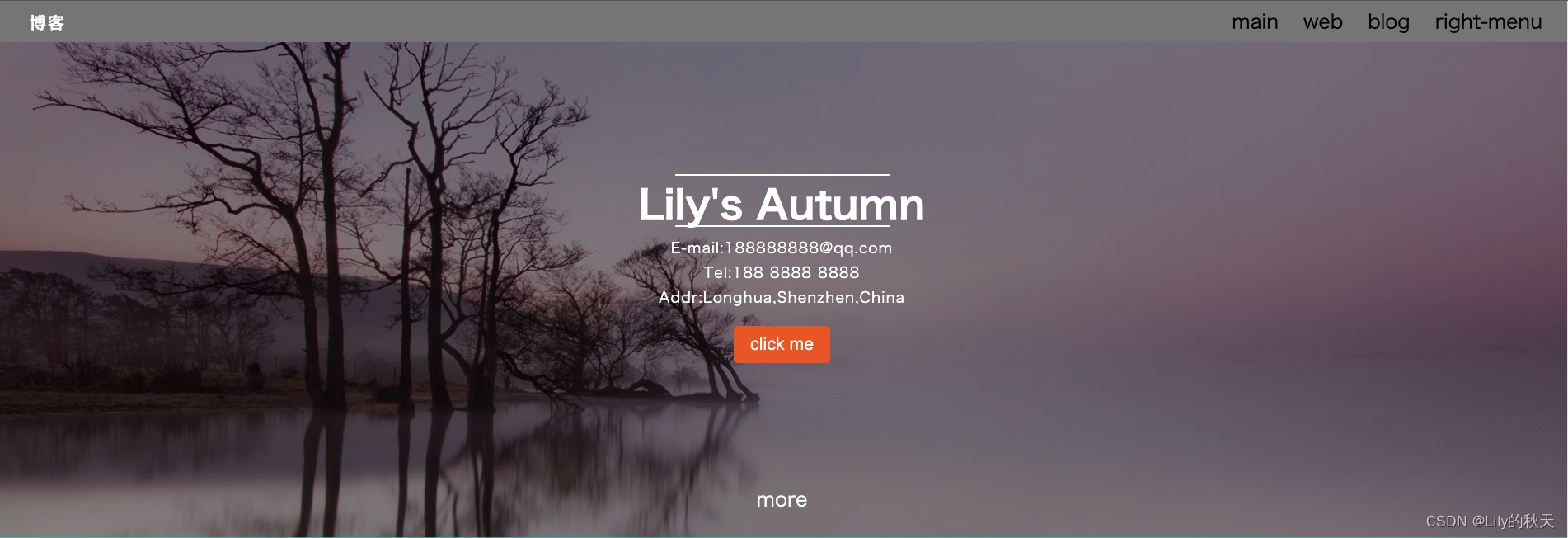
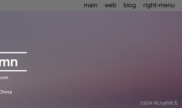
先来讲头部header。?
头部包括导航栏和第0个透明介绍部分:
按钮是有动画的,我做了个GIF图,不能浪费,这里生硬的放进来。
?如图显示,整个的背景为wrap,
/*整个页面最外层的包裹*/
#wrap {
    /*背景使用banner的图片,不重复的显示,居中,固定在页面上,就可以不随滚动条而变化*/
    /*同时设置整个页面的文字*/
    background: url("./img/banner.jpeg") no-repeat;
    background-position: center center;
    background-attachment: fixed;
    background-size: cover;
    font-family: "Microsoft Yahei","Hiragino Sans GB","Helvetica Neue",Helvetica,tahoma,arial,"WenQuanYi Micro Hei",Verdana,sans-serif,"\5B8B\4F53";
}
整个header如下,包括导航栏和第0个透明介绍部分:?
?导航栏样式如下:
/*logo单独设置靠左的li元素,可以单独添加样式*/
.logo {
float: left;
margin-left: 40px;
}
/*class为logo的li元素下的a标签样式----即"博客"二字*/
.logo a {
font-size: 20px;
color: white;
font-weight: 700;
/*文字中间的空隙*/
letter-spacing: 2px;
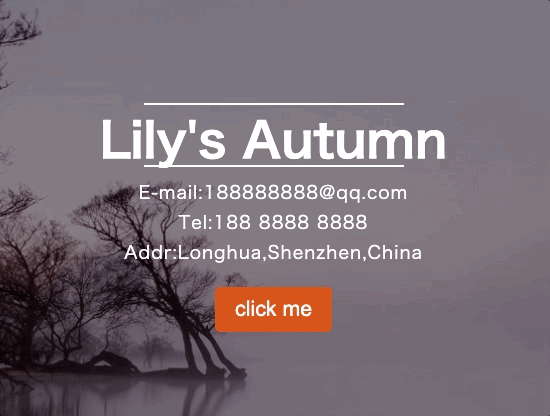
}第0部分样式如下:
.banner {
height: 600px;
}
/*设置第0部分的内容样式*/
.banner .inner {
/*全部使用白色,居中对齐,并设置一个最大的宽度*/
color: white;
text-align: center;
margin: 0 auto;
max-width: 400px;
/*设置relative就会随着鼠标上下滚动,fixed就会固定在页面上,跟背景图一样*/
position: relative;
top:160px;
}
/*设置文本上下的线条的样式*/
.line {
/*这个宽度为父元素inner的宽度400px*/
width: 100%;
/*设置了一个高度为2px的白色背景作为线条*/
height: 5px;
background: white;
margin: 10px 10px;
}
/*inner里面的p元素设置样式*/
.banner .inner p {
line-height: 30px;
font-size: 18px;
letter-spacing: 1px;
}
/*给按钮设置样式*/
.banner .inner button {
margin-top: 20px;
/*使用margin会留白,padding会带着背景色一起撑开*/
padding: 10px 20px;
background: #e85e17;
/*设置圆角*/
border-radius: 5px;
/*去除按钮的边框*/
border: none;
color: white;
/*去掉按钮点击时的边框*/
outline: none;
}
/*鼠标悬浮到按钮上时,按钮的动作*/
.banner .inner button:hover {
/*鼠标经过时,开始旋转720°动画,并放大2倍,持续时间2s*/
transform: rotate(720deg) scale(2);
transition: 2s;
}
.banner .inner .more {
margin-top: 140px;
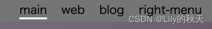
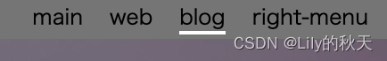
}再给导航栏设置个active的样式,选中当前标签时,下方出现白色加粗的横线,right-menu除外。样式如下:
选中main:
选中blog:?
网页一打开默认选中的是main。
样式如下:
.active {
    position: relative;
}
/*同样设置了4px高度的白色背景框作为短横线*/
/*因为4个标签中main、web、blog都添加了span标签*/
/*right-menu没有添加*/
.active span {
    position: absolute;
    height: 4px;
    background: white;
    bottom: 5px;
    left: 0;
    width: 100%;
}
添加点击动作:
 // 1.鼠标移到标签上时,当前标签有一个白色的下划线,其他的兄弟标签样式取消
    $('.nav-ul li').click(function () {
        $(this).addClass('active')
        $(this).siblings().removeClass('active')
    })
?当然你也修改为其他动作,随你开心。?
?最后还有个side-bar的class放到后面解释。
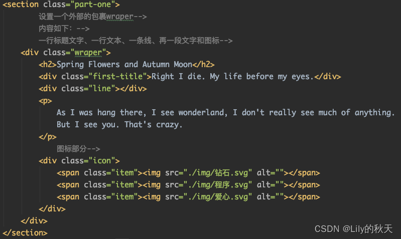
?第二部分为内容content区,分了三块:
?先看part-one:
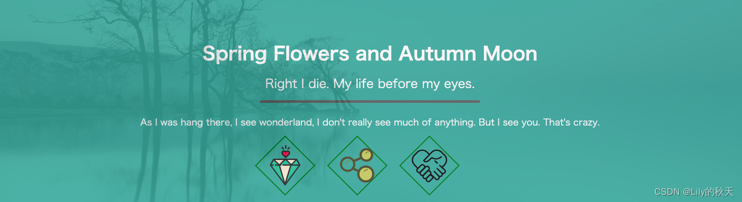
几行文字和一条线,还有几个图片+旋转的边框,背景色记得设置透明度:
?
?CSS样式如下:
/*中间的内容整个设置为透明度0.9,保证滚动条滑动时,主背景可以透出来,*/
/*同时主背景用的是fixed,不随滚动条而移动*/
.content{
opacity: .9;
}
/*设置第一部分整体的样式*/
.part-one {
text-align: center;
color: white;
background: rgba(67,178,165,1);
padding-top: 65px;
opacity: 0.95;
}
.wraper {
/*margin这样设置可以居中*/
margin: 0 auto;
max-width: 1080px;
}
.wraper h2 {
padding: 15px 0;
}
.wraper .line {
/*居中可以这样设置margin*/
margin: 15px auto;
width: 40%;
height: 5px;
background-color: #666666;
}
.wraper p {
margin: 25px 0;
font-size: 18px;
}
.icon {
margin: 30px auto;
margin-bottom: 0;
padding-bottom: 30px;
}
/*给3个图标设置边框*/
/*宽度2px实线、绿色,80*80px,旋转45°*/
.icon .item{
border: 2px solid green;
/*因为span不可以调整宽高,所以先将display设置成如下*/
display: inline-block;
height: 80px;
width: 80px;
margin-right: 50px;
transform: rotate(45deg);
}
/*设置宽和高为100%,适应父元素item的宽和高,就不会超出item的border,
同时img继承了item的旋转,需要纠正回来*/
.icon .item img{
width: 100%;
height: 100%;
transform: rotate(-45deg);
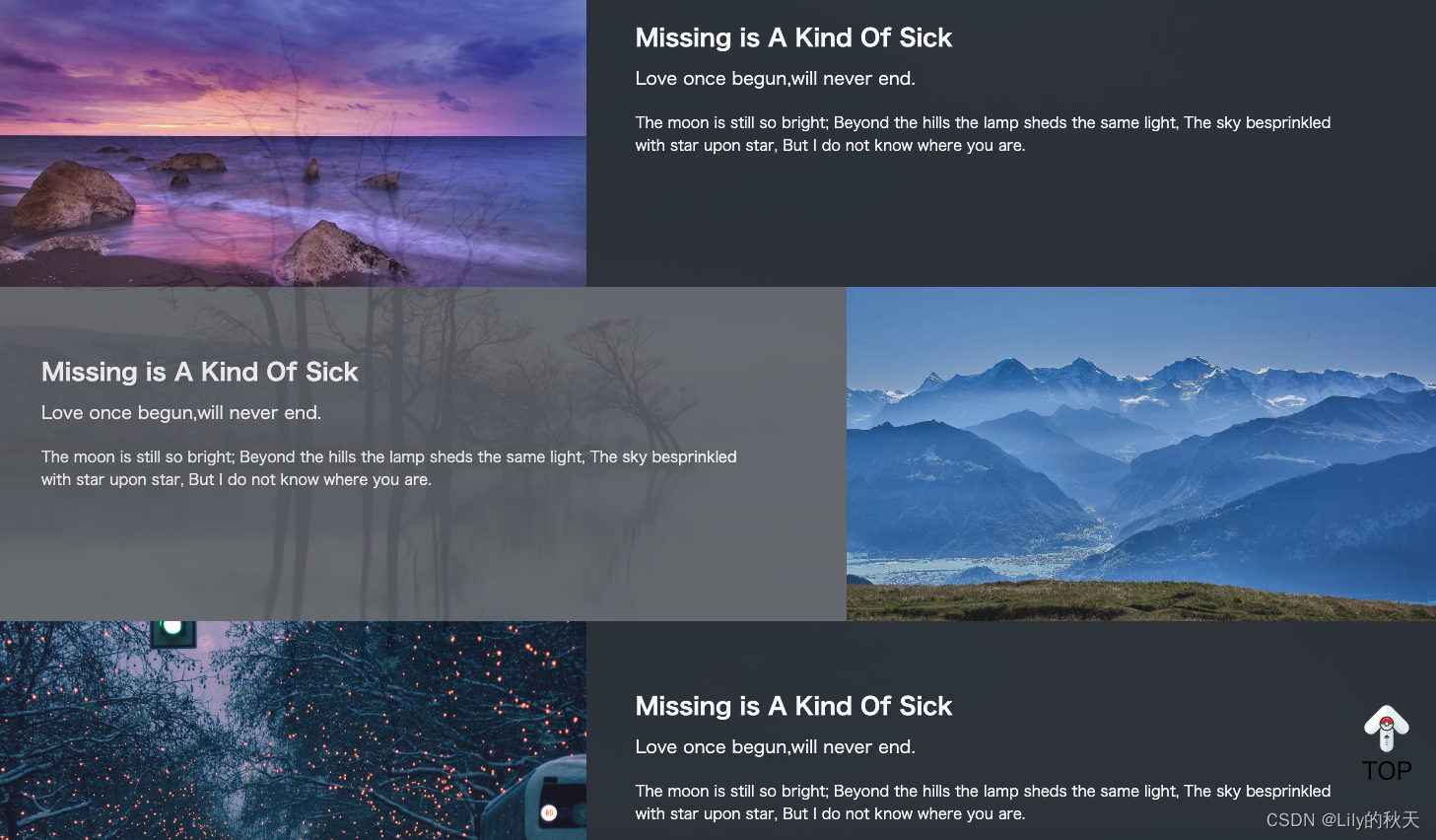
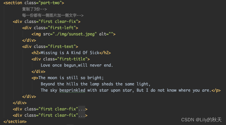
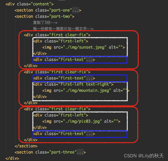
}第二部分为分栏的显示,有重复的3个分栏,可以先做一个,然后复制3份:
?
样式如下:
/*给整个第二部分添加背景色*/
.part-two {
    background-color: rgb(33,41,50);
}

.first .text-right {
    float: right;
}

.first-left {
    width: 41%;
}

.first-left img {
    width: 100%;
}
/*表示first标签的第一代子标签div*/
.first>div {
    float: left;
}
/*设置浮动之后,父元素first就没有了高度,需要清除浮动,用伪元素做以下处理*/
.clear-fix:after {
    content: '';
    display: block;
    clear: both;
}
.first-text {
    position: relative;
    top: 68px;
    left: 50px;
    width: 55%;
    color: white;
}
.first-text h2 {
    font-size: 24px;
    margin-bottom: 10px;

}
.first-text .first-title {
    margin-bottom: 20px;
    font-size: 18px;
}
.first-text p {
    font-size: 15px;
    width: 90%;
}
?需要注意的就是浮动样式的清除。你会发现所有设置了float的class后面都有多加一个clear-fix样式,包括:导航栏、左右分栏部分、6个小card部分。一个元素是可以同时添加多个class样式的。
.clear-fix:after {
    content: '';
    display: block;
    clear: both;
}
后面复制的部分就不详细介绍了,
HTML部分就是将图片(白色)和文字(蓝色)的顺序调换一下:
?看源码,样式有个地方需要注意下:
/*第二部分结构是一样的,故直接复制了3分,将中间一个的左右顺序交换(图片和文字的div交换即可),*/
/*为了更好地区别是三块,采用如下方式将偶数even那一块透明度修改为0.3,同理可修改奇数部分*/
.first:nth-child(even) {
background-color: rgba(255,255,255,0.3);
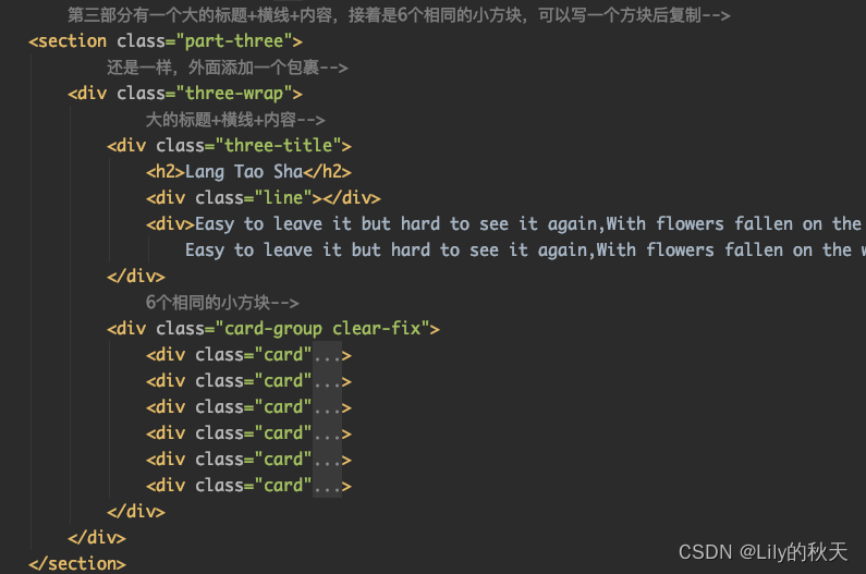
}第三部分有一个大的标题+横线+内容,接着是6个相同的小方块,可以写一个方块后复制。
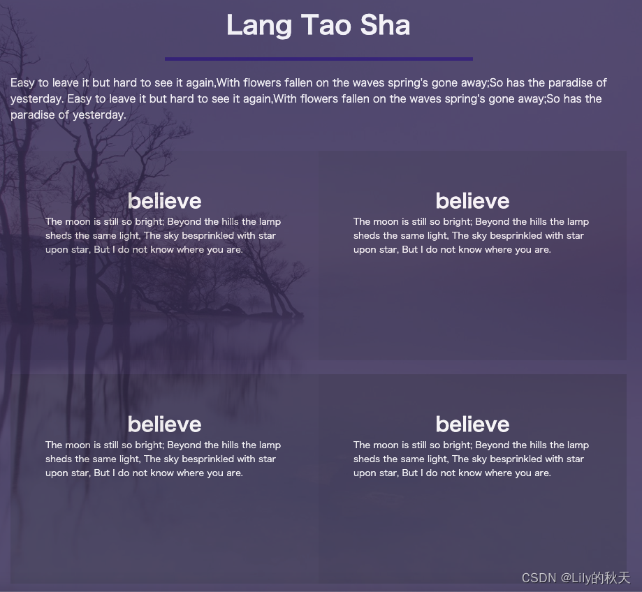
HTML结构:
样式如下:
/*设置第三部分整体的样式:背景、透明度、文字颜色*/
.part-three {
    background: #3f3965;
    opacity: 0.9;
    color: white;
}
/*设置大包裹的框架大小及样式:居中,占宽度的60%*/
.three-wrap {
    margin: 0 auto;
    width: 60%;
}
.three-wrap .three-title {
    /*使用margin会留白,padding是由内向外撑开*/
    padding-top: 60px;
}
/*标题行居中,距离下方20px*/
.three-title h2 {
    margin-bottom: 20px;
    text-align: center;
}
/*设置横线的样式:背景、宽度、居中*/
.three-title .line {
    /*即使不设置高度,也有一个默认的高度显示*/
    height: 5px;
    background: #1a0973;
    width: 50%;
    margin: 0 auto;
}
/*设置three-title下的div的样式*/
.three-title div {
    font-size: 15px;
    margin: 20px auto;
}
/*这里先设置一个card的样式,然后复制*/
/*每个card里面有标题h3和文本p*/
.card {
    min-height: 300px;
    margin-top: 20px;
    width: 50%;
    max-width: 461px;
    padding: 50px;
    float: left;
    /*以下两句解决盒子被挤下去的问题,让每个box都是独立的盒子,不被其他影响,兼容各种浏览器*/
    -webkit-box-sizing: border-box;
    -moz-box-sizing: border-box;
}
.card h3 {
    text-align: center;
}
.card p{
    font-size: 13px;
}
/*因为每个盒子的透明度不同,整体呈现由浅到深的渐变效果*/
.card:nth-child(1) {
    background: rgba(0,0,0,0.05);
}
.card:nth-child(2) {
    background: rgba(0,0,0,0.1);
}
.card:nth-child(3) {
    background: rgba(0,0,0,0.15);
}
.card:nth-child(4) {
    background: rgba(0,0,0,0.2);
}
.card:nth-child(5) {
    background: rgba(0,0,0,0.25);
}
.card:nth-child(6) {
    background: rgba(0,0,0,0.3);
}
footer就不多说了,跟导航栏类似:
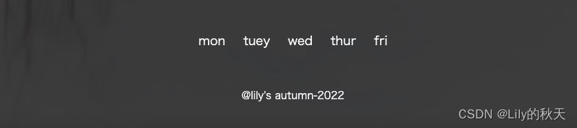
HTML布局:
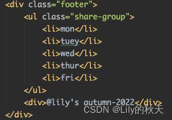
?样式也没啥说的:
/*页尾常规样式*/
.footer {
    background-color: #333;
    min-height: 200px;
    text-align: center;
    color: white;
    opacity: 0.9;
}
.share-group {
    display: block;
    margin: 0 auto;
    width: 1080px;
    padding: 45px;
}
.share-group li {
    display: inline-block;
    padding: 10px;
}
.footer ul {
    font-size: 18px;
}
.footer>div {
    font-size: 15px;
}
接下来解释右侧菜单栏,点击right-menu会弹出一条菜单选项,鼠标悬浮会高亮显示,同样使用ul:
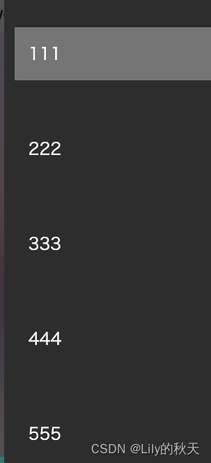
?
同时菜单出来的时候将主页面颜色淡出(加个遮盖),使菜单栏更明显。
对比下左右图,右侧为菜单弹出,加上遮盖的效果,还是明显的哈,棒棒哒💯。
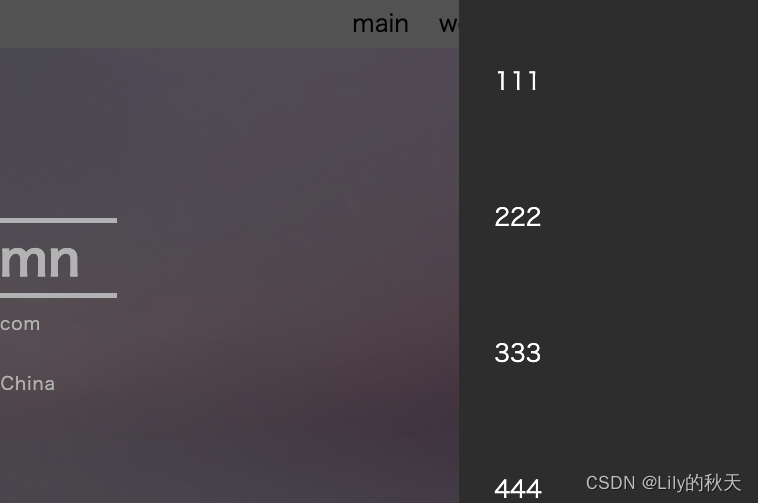
?遮罩:
/*遮罩样式*/
.mask {
    display: none;
    position: fixed;
    top: 0;
    bottom: 0;
    left: 0;
    right: 0;
    background: rgba(0,0,0,0.3);
}
菜单栏:
/*右侧菜单栏*/
.slider {
    background: #333;
    position: fixed;
    top: 0;
    /*这里之所以将位置设置为-300,是一开始将菜单栏放到页面外面隐藏起来*/
    /*当点击标签时再将其挪出来*/
    right: -300px;
    bottom: 0;
    width: 300px;
    /*挪出来的时间设置为0.3s,加个动画*/
    transition: 0.3s;
}
.slider ul li {
    margin-top: 30px;
    padding: 15px;
}
.slider ul li a {
    padding: 20px;
    color: white;
    width: 100%;
    display: inline-block;
}
/*鼠标悬浮时添加背景*/
.slider ul li :hover {
    background: grey;
}
逻辑是这样的:
1.点击菜单栏,遮罩打开,菜单栏移出;
2.点击遮罩:菜单栏挪出页面外,关闭遮罩。
// 2.点击侧边栏按钮,显示菜单栏
    $('.side-bar').click(function () {
        show_slider()
    })
    // 由于给整个页面添加了遮盖,且在点击侧边栏时,触发遮盖,故可以点击遮盖隐藏侧边栏
    $('.mask').click(function () {
        hide_slider()
    })

    // 菜单出现函数
    function show_slider() {
        $('.mask').fadeIn()
        // 因为原菜单栏的right设置的为-300,既可以隐藏到页面外部
        // 将right项设置为0,即可将侧边栏显示出来
        $('.slider').css('right',0)
    }
    // 菜单隐藏函数
    function hide_slider() {
        $('.mask').fadeOut()
        $('.slider').css('right',-300)
    }
终于到最后的一个小动作了。
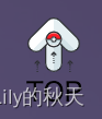
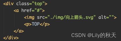
由一个图片和一个文本组成:?
?先将样式设置好:
/*返回顶部快捷键头*/
.top {
    /*一开始设置none的原因是,网页加载出来时,不需要显示它,*/
    /*当滚动到一定位置时再取消隐藏*/
    display: none;
    width: 50px;
    height: 30px;
    position: fixed;
    right: 30px;
    bottom: 120px;
}

.top p,img {
    width: 100%;
    text-align: center;
}
调试的时候可以先将none取消,等调试好样式,写动作时再加上。
// 3.回到顶部的动作
    $('.top').click(function () {
        // 点击TOP,返回至网页顶部
        $('body,html').animate({
            scrollTop: 0
        },300)
    })
    // 监听窗口,当距离顶部超过100时,才显示TOP按钮,否则不显示
    $(window).scroll(function () {
        if ($(window).scrollTop()>100) {
            // top的CSS中display设置的为none,即为隐藏状态
            // 当距离>100时,将其显示出来即可
            $('.top').css('display','block')
        } else {
            // 当距离过近时,再次将其隐藏
            $('.top').css('display','none')
        }
    })
终于弄完了,快烦死了,图片自己找类似的,我懒得上传,路径自己改。
源码部分
HTML文件:
<!DOCTYPE html>
<html lang="en">
<head>
<meta charset="UTF-8">
<title>Blog</title>
<link rel="stylesheet" href="blog.css">
<script src="https://cdn.staticfile.org/jquery/1.10.2/jquery.min.js"></script>
<script src="blog.js"></script>
</head>
<body>
<!--整个页面分成了三部分:头部、内容区、尾部-->
<!--整个的包裹id定义为wrap,内容区的class定义为content,尾部的class定义为footer-->
<!--紧跟着的mask为整个页面设置遮罩:当右侧菜单栏弹出时,整个页面加上遮罩,-->
<!--slider为侧边栏菜单-->
<!--top为右下角"回到顶部"的按钮-->
<div id="wrap">
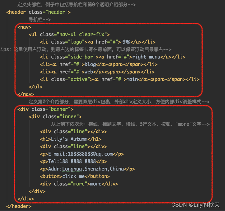
<!-- 定义头部栏,例子中包括导航栏和第0个透明介绍部分-->
<header class="header">
<!-- 导航栏-->
<nav>
<ul class="nav-ul clear-fix">
<li class="logo"><a href="#">博客</a></li>
<!-- tips:这里使用右浮动,则最右边的标签卡写在最前面,可以保证浮动后最靠右-->
<li class="side-bar"><a href="#">right-menu</a></li>
<li><a href="#">blog</a><span></span></li>
<li><a href="#">web</a><span></span></li>
<li class="active"><a href="#">main</a><span></span></li>
</ul>
</nav>
<!-- 定义第0个介绍部分,需要双层div包裹,外部div定义大小,方便内部div调整样式-->
<div class="banner">
<div class="inner">
<!-- 从上到下依次为:横线、标题文字、横线、3行文本、按钮、"more"文字-->
<div class="line"></div>
<h1>Lily's Autumn</h1>
<div class="line"></div>
<p>E-mail:188888888@qq.com</p>
<p>Tel:188 8888 8888</p>
<p>Addr:Longhua,Shenzhen,China</p>
<button>click me</button>
<div class="more">more</div>
</div>
</div>
</header>
<div class="content">
<section class="part-one">
<!-- 设置一个外部的包裹wraper-->
<!-- 内容如下:-->
<!-- 一行标题文字、一行文本、一条线、再一段文字和图标-->
<div class="wraper">
<h2>Spring Flowers and Autumn Moon</h2>
<div class="first-title">Right I die. My life before my eyes.</div>
<div class="line"></div>
<p>
As I was hang there, I see wonderland, I don't really see much of anything.
But I see you. That's crazy.
</p>
<!-- 图标部分-->
<div class="icon">
<span class="item"><img src="./img/钻石.svg" alt=""></span>
<span class="item"><img src="./img/程序.svg" alt=""></span>
<span class="item"><img src="./img/爱心.svg" alt=""></span>
</div>
</div>
</section>
<section class="part-two">
<!-- 复制了3份-->
<!-- 每一份都有一侧图片加一侧文字-->
<div class="first clear-fix">
<div class="first-left">
<img src="./img/sunset.jpeg" alt="">
</div>
<div class="first-text">
<h2>Missing is A Kind Of Sick</h2>
<div class="first-title">
Love once begun,will never end.
</div>
<p>The moon is still so bright;
Beyond the hills the lamp sheds the same light,
The sky besprinkled with star upon star, But I do not know where you are.</p>
</div>
</div>
<div class="first clear-fix">
<div class="first-text">
<h2>Missing is A Kind Of Sick</h2>
<div class="first-title">
Love once begun,will never end.
</div>
<p>The moon is still so bright;
Beyond the hills the lamp sheds the same light,
The sky besprinkled with star upon star, But I do not know where you are.</p>
</div>
<div class="first-left text-right">
<img src="./img/mountain.jpeg" alt="">
</div>
</div>
<div class="first clear-fix">
<div class="first-left">
<img src="./img/pic03.jpg" alt="">
</div>
<div class="first-text">
<h2>Missing is A Kind Of Sick</h2>
<div class="first-title">
Love once begun,will never end.
</div>
<p>The moon is still so bright;
Beyond the hills the lamp sheds the same light,
The sky besprinkled with star upon star, But I do not know where you are.</p>
</div>
</div>
</section>
<!-- 第三部分有一个大的标题+横线+内容,接着是6个相同的小方块,可以写一个方块后复制-->
<section class="part-three">
<!-- 还是一样,外面添加一个包裹-->
<div class="three-wrap">
<!-- 大的标题+横线+内容-->
<div class="three-title">
<h2>Lang Tao Sha</h2>
<div class="line"></div>
<div>Easy to leave it but hard to see it again,With flowers fallen on the waves spring's gone away;So has the paradise of yesterday.
Easy to leave it but hard to see it again,With flowers fallen on the waves spring's gone away;So has the paradise of yesterday.</div>
</div>
<!-- 6个相同的小方块-->
<div class="card-group clear-fix">
<div class="card">
<h3>believe</h3>
<p>The moon is still so bright; Beyond the hills the lamp sheds the same light,
The sky besprinkled with star upon star, But I do not know where you are.</p>
</div>
<div class="card">
<h3>believe</h3>
<p>The moon is still so bright; Beyond the hills the lamp sheds the same light,
The sky besprinkled with star upon star, But I do not know where you are.</p>
</div>
<div class="card">
<h3>believe</h3>
<p>The moon is still so bright; Beyond the hills the lamp sheds the same light, The sky besprinkled with star upon star, But I do not know where you are.</p>
</div>
<div class="card">
<h3>believe</h3>
<p>The moon is still so bright; Beyond the hills the lamp sheds the same light, The sky besprinkled with star upon star, But I do not know where you are.</p>
</div>
<div class="card">
<h3>believe</h3>
<p>The moon is still so bright; Beyond the hills the lamp sheds the same light, The sky besprinkled with star upon star, But I do not know where you are.</p>
</div>
<div class="card">
<h3>believe</h3>
<p>The moon is still so bright; Beyond the hills the lamp sheds the same light, The sky besprinkled with star upon star, But I do not know where you are.</p>
</div>
</div>
</div>
</section>
</div>
<div class="footer">
<ul class="share-group">
<li>mon</li>
<li>tuey</li>
<li>wed</li>
<li>thur</li>
<li>fri</li>
</ul>
<div>@lily's autumn-2022</div>
</div>
<div class="mask"></div>
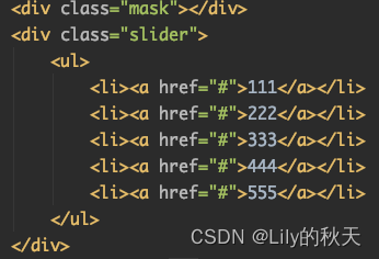
<div class="slider">
<ul>
<li><a href="#">111</a></li>
<li><a href="#">222</a></li>
<li><a href="#">333</a></li>
<li><a href="#">444</a></li>
<li><a href="#">555</a></li>
</ul>
</div>
<div class="top">
<a href="#">
<img src="./img/向上箭头.svg" alt="">
<p>TOP</p>
</a>
</div>
</div>
</body>
</html>CSS文件:
* {
    margin: 0;
    padding: 0;
}

em,i {
    font-style: normal;
}

/*去除列表前的小黑点*/
li {
    list-style: none;
}

img {
    border: 0;
    vertical-align: middle;
}

button {
    cursor: pointer;
}

a {
    color: black;
    /*去除下划线*/
    text-decoration: none;
}

a:hover {
    color: #c81623;
}
/*以上为清除浏览器设置,并给定一下常见的样式*/


.header {
    /*居中*/
    /*给整个头部设置背景和透明度*/
    line-height: 50px;
    background: rgba(0,0,0,0.4);
}

/*给header的导航栏设置背景色*/
.header nav {
    background-color: gray;
    height: 50px;
}

/*导航栏向右浮动*/
nav ul li {
    float: right;
    margin-right: 30px;
}

/*整个页面最外层的包裹*/
#wrap {
    /*背景使用banner的图片,不重复的显示,居中,固定在页面上,就可以不随滚动条而变化*/
    /*同时设置整个页面的文字*/
    background: url("./img/banner.jpeg") no-repeat;
    background-position: center center;
    background-attachment: fixed;
    background-size: cover;
    font-family: "Microsoft Yahei","Hiragino Sans GB","Helvetica Neue",Helvetica,tahoma,arial,"WenQuanYi Micro Hei",Verdana,sans-serif,"\5B8B\4F53";
}

/*logo单独设置靠左的li元素,可以单独添加样式*/
.logo {
    float: left;
    margin-left: 40px;
}
/*class为logo的li元素下的a标签样式----即"博客"二字*/
.logo a {
    font-size: 20px;
    color: white;
    font-weight: 700;
    /*文字中间的空隙*/
    letter-spacing: 2px;
}

.banner {
    height: 600px;
}
/*设置第0部分的内容样式*/
.banner .inner {
    /*全部使用白色,居中对齐,并设置一个最大的宽度*/
    color: white;
    text-align: center;
    margin: 0 auto;
    max-width: 400px;
    /*设置relative就会随着鼠标上下滚动,fixed就会固定在页面上,跟背景图一样*/
    position: relative;
    top:160px;
}

/*设置文本上下的线条的样式*/
.line {
    /*这个宽度为父元素inner的宽度400px*/
    width: 100%;
    /*设置了一个高度为2px的白色背景作为线条*/
    height: 5px;
    background: white;
    margin: 10px 10px;
}

/*inner里面的p元素设置样式*/
.banner .inner p {
    line-height: 30px;
    font-size: 18px;
    letter-spacing: 1px;
}

/*给按钮设置样式*/
.banner .inner button {
    margin-top: 20px;
    /*使用margin会留白,padding会带着背景色一起撑开*/
    padding: 10px 20px;
    background: #e85e17;
    /*设置圆角*/
    border-radius: 5px;
   /*去除按钮的边框*/
    border: none;
    color: white;
   /*去掉按钮点击时的边框*/
    outline: none;
}

/*鼠标悬浮到按钮上时,按钮的动作*/
.banner .inner button:hover {
    /*鼠标经过时,开始旋转720°动画,并放大2倍,持续时间2s*/
    transform: rotate(720deg) scale(2);
    transition: 2s;
}

.banner .inner .more {
    margin-top: 140px;
}

/*中间的内容整个设置为透明度0.9,保证滚动条滑动时,主背景可以透出来,*/
/*同时主背景用的是fixed,不随滚动条而移动*/
.content{
    opacity: .9;
}

/*设置第一部分整体的样式*/
.part-one {
    text-align: center;
    color: white;
    background: rgba(67,178,165,1);
    padding-top: 65px;
    opacity: 0.95;
}

.wraper {
/*margin这样设置可以居中*/
    margin: 0 auto;
    max-width: 1080px;
}

.wraper h2 {
    padding: 15px 0;
}

.wraper .line {
    /*居中可以这样设置margin*/
    margin: 15px auto;
    width: 40%;
    height: 5px;
    background-color: #666666;
}

.wraper p {
    margin: 25px 0;
    font-size: 18px;
}

.icon {
    margin: 30px auto;
    margin-bottom: 0;
    padding-bottom: 30px;
}
/*给3个图标设置边框*/
/*宽度2px实线、绿色,80*80px,旋转45°*/
.icon .item{
    border: 2px solid green;
    /*因为span不可以调整宽高,所以先将display设置成如下*/
    display: inline-block;
    height: 80px;
    width: 80px;
    margin-right: 50px;
    transform: rotate(45deg);
}

/*设置宽和高为100%,适应父元素item的宽和高,就不会超出item的border,
同时img继承了item的旋转,需要纠正回来*/
.icon .item img{
    width: 100%;
    height: 100%;
    transform: rotate(-45deg);
}

/*给整个第二部分添加背景色*/
.part-two {
    background-color: rgb(33,41,50);
}

.first .text-right {
    float: right;
}

.first-left {
    width: 41%;
}

.first-left img {
    width: 100%;
}
/*表示first标签的第一代子标签div*/
.first>div {
    float: left;
}
/*设置浮动之后,父元素first就没有了高度,需要清除浮动,用伪元素做以下处理*/
.clear-fix:after {
    content: '';
    display: block;
    clear: both;
}
.first-text {
    position: relative;
    top: 68px;
    left: 50px;
    width: 55%;
    color: white;
}
.first-text h2 {
    font-size: 24px;
    margin-bottom: 10px;

}
.first-text .first-title {
    margin-bottom: 20px;
    font-size: 18px;
}
.first-text p {
    font-size: 15px;
    width: 90%;
}

/*第二部分结构是一样的,故直接复制了3分,将中间一个的左右顺序交换(图片和文字的div交换即可),*/
/*为了更好地区别是三块,采用如下方式将偶数even那一块透明度修改为0.3,同理可修改奇数部分*/
.first:nth-child(even) {
    background-color: rgba(255,255,255,0.3);
}


/*设置第三部分整体的样式:背景、透明度、文字颜色*/
.part-three {
    background: #3f3965;
    opacity: 0.9;
    color: white;
}
/*设置大包裹的框架大小及样式:居中,占宽度的60%*/
.three-wrap {
    margin: 0 auto;
    width: 60%;
}
.three-wrap .three-title {
    /*使用margin会留白,padding是由内向外撑开*/
    padding-top: 60px;
}
/*标题行居中,距离下方20px*/
.three-title h2 {
    margin-bottom: 20px;
    text-align: center;
}
/*设置横线的样式:背景、宽度、居中*/
.three-title .line {
    /*即使不设置高度,也有一个默认的高度显示*/
    height: 5px;
    background: #1a0973;
    width: 50%;
    margin: 0 auto;
}
/*设置three-title下的div的样式*/
.three-title div {
    font-size: 15px;
    margin: 20px auto;
}
/*这里先设置一个card的样式,然后复制*/
/*每个card里面有标题h3和文本p*/
.card {
    min-height: 300px;
    width: 50%;
    /*最大值可以打开浏览器调试,自己看一下那个值合适,就改一下*/
    max-width: 461px;
    padding: 50px;
    float: left;
    /*以下两句解决盒子被挤下去的问题,让每个box都是独立的盒子,不被其他影响,兼容各种浏览器*/
    -webkit-box-sizing: border-box;
    -moz-box-sizing: border-box;
}
/*单独设置标题居中,文本不需要*/
.card h3 {
    text-align: center;
}
.card p{
    font-size: 13px;
}
/*因为每个盒子的透明度不同,整体呈现由浅到深的渐变效果*/
.card:nth-child(1) {
    background: rgba(0,0,0,0.05);
}
.card:nth-child(2) {
    background: rgba(0,0,0,0.1);
}
.card:nth-child(3) {
    background: rgba(0,0,0,0.15);
}
.card:nth-child(4) {
    background: rgba(0,0,0,0.2);
}
.card:nth-child(5) {
    background: rgba(0,0,0,0.25);
}
.card:nth-child(6) {
    background: rgba(0,0,0,0.3);
}


/*页尾常规样式*/
.footer {
    background-color: #333;
    min-height: 200px;
    text-align: center;
    color: white;
    opacity: 0.9;
}
.share-group {
    display: block;
    margin: 0 auto;
    width: 1080px;
    padding: 45px;
}
.share-group li {
    display: inline-block;
    padding: 10px;
}
.footer ul {
    font-size: 18px;
}
.footer>div {
    font-size: 15px;
}


.active {
    position: relative;
}
/*同样设置了4px高度的白色背景框作为短横线*/
/*因为4个标签中main、web、blog都添加了span标签*/
/*right-menu没有添加*/
.active span {
    position: absolute;
    height: 4px;
    background: white;
    bottom: 5px;
    left: 0;
    width: 100%;
}


/*遮罩样式*/
.mask {
    display: none;
    position: fixed;
    top: 0;
    bottom: 0;
    left: 0;
    right: 0;
    background: rgba(0,0,0,0.3);
}

/*右侧菜单栏*/
.slider {
    background: #333;
    position: fixed;
    top: 0;
    /*这里之所以将位置设置为-300,是一开始将菜单栏放到页面外面隐藏起来*/
    /*当点击标签时再将其挪出来*/
    right: -300px;
    bottom: 0;
    width: 300px;
    /*挪出来的时间设置为0.3s,加个动画*/
    transition: 0.3s;
}
.slider ul li {
    margin-top: 30px;
    padding: 15px;
}
.slider ul li a {
    padding: 20px;
    color: white;
    width: 100%;
    display: inline-block;
}
/*鼠标悬浮时添加背景*/
.slider ul li :hover {
    background: grey;
}


/*返回顶部快捷键头*/
.top {
    /*一开始设置none的原因是,网页加载出来时,不需要显示它,*/
    /*当滚动到一定位置时再取消隐藏*/
    display: none;
    width: 50px;
    height: 30px;
    position: fixed;
    right: 30px;
    bottom: 120px;
}

.top p,img {
    width: 100%;
    text-align: center;
}
JS文件:
$(function () {
    // 本例中只有3个动作,
    // 一是鼠标悬浮在标签栏时,显示白色加粗的下划线;
    // 二是点击右侧菜单栏有弹出菜单;
    // 三是点击回到顶部的按钮;

    // 1.鼠标移到标签上时,当前标签有一个白色的下划线,其他的兄弟标签样式取消
    $('.nav-ul li').click(function () {
        $(this).addClass('active')
        $(this).siblings().removeClass('active')
    })


    // 2.点击侧边栏按钮,显示菜单栏
    $('.side-bar').click(function () {
        show_slider()
    })
    // 由于给整个页面添加了遮盖,且在点击侧边栏时,触发遮盖,故可以点击遮盖隐藏侧边栏
    $('.mask').click(function () {
        hide_slider()
    })

    // 菜单出现函数
    function show_slider() {
        $('.mask').fadeIn()
        // 因为原菜单栏的right设置的为-300,既可以隐藏到页面外部
        // 将right项设置为0,即可将侧边栏显示出来
        $('.slider').css('right',0)
    }
    // 菜单隐藏函数
    function hide_slider() {
        $('.mask').fadeOut()
        $('.slider').css('right',-300)
    }


    // 3.回到顶部的动作
    $('.top').click(function () {
        // 点击TOP,返回至网页顶部
        $('body,html').animate({
            scrollTop: 0
        },300)
    })
    // 监听窗口,当距离顶部超过100时,才显示TOP按钮,否则不显示
    $(window).scroll(function () {
        if ($(window).scrollTop()>100) {
            // top的CSS中display设置的为none,即为隐藏状态
            // 当距离>100时,将其显示出来即可
            $('.top').css('display','block')
        } else {
            // 当距离过近时,再次将其隐藏
            $('.top').css('display','none')
        }
    })
})