1、使用plot()绘制折线图
2、使用bar()绘制柱形图或堆积柱形图
3、使用barh()绘制条形图或堆积条形图
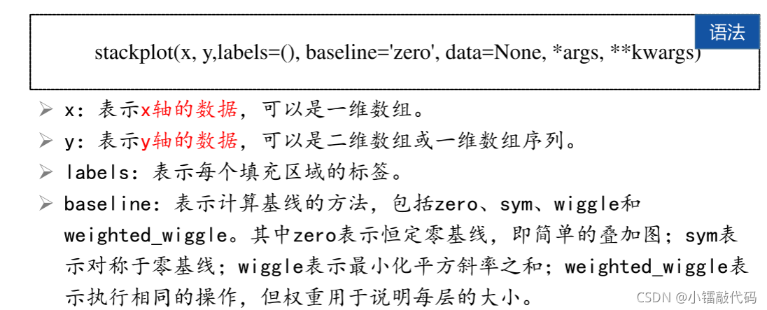
4、使用stackplot()绘制堆积面积图
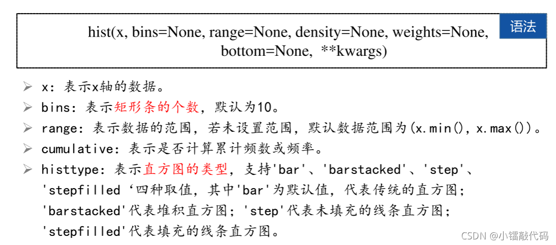
5、使用hist()绘制直方图
?6、使用pie()绘制饼图或圆环图
使用的库
import matplotlib.pyplot as plt
import numpy as np
plt.rcParams["font.family"]="SimHei"
1、使用plot()绘制折线图
?实例1:未来15天最高气温和最低气温
def plot():
    list_y1 = [32, 33, 34, 34, 33, 31, 30, 29, 30, 29, 26, 23, 21, 25, 31]
    list_y2 = [19, 19, 20, 22, 22, 21, 22, 16, 18, 18, 17, 14, 15, 16, 16]
    # x = list(range(len(list_y1)))
    # x = np.range(4,19)
    x = np.linspace(1, len(list_y1), len(list_y1))  # np.linspace(start,stop,num)
    plt.figure()
    plt.plot(x, list_y1, color='r', linewidth=3, label='最高气温')
    plt.plot(x, list_y2, color='b', linewidth=2, label='最低气温')
    plt.title('未来15天最高气温和最低气温')
    plt.legend()
    plt.show()
?
?
?2、使用bar()绘制柱形图或堆积柱形图
 ? ? ?
? ? ?
? ?实例2:2013~2019年阿里巴巴淘宝和天猫平台的GMV
def bar():
    y = 10770, 16780, 24440, 30920, 37670, 48200, 57270
    label_list = ["FY2013", "FY2014", "FY2015", "FY2016", "FY2017", "FY2018", "FY2019"]
    x = np.arange(1,len(y)+1)
    plt.figure()
    plt.title('2013~2019年阿里巴巴淘宝和天猫平台的GMV')
    plt.bar(x,height=y,tick_label=label_list,linewidth=2,width=0.5,alpha=1)
    plt.show()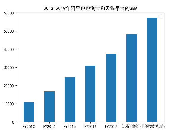
3、使用barh()绘制条形图或堆积条形图?
案例3:各商品种类的网购替代率
def barh():
    label_list = ["家政、家教、保姆等生活服务", "飞机票、火车票", "家具", "手机、手机配件",
          "计算机及其配套产品", "汽车用品", "通信充值、游戏充值", "个人护理用品",
          "书报杂志及音像制品", "餐饮、旅游、住宿", "家用电器",
          "食品、饮料、烟酒、保健品", "家庭日杂用品", "保险、演出票务",
          "服装、鞋帽、家用纺织品", "数码产品", "其他商品和服务", "工艺品、收藏品"]
    y = [0.959, 0.951, 0.935, 0.924, 0.893, 0.892, 0.865, 0.863, 0.860, 0.856,
     0.854, 0.835, 0.826, 0.816, 0.798, 0.765, 0.763, 0.67]
    x = np.arange(1, len(y) + 1)
    plt.figure()
    plt.subplots_adjust(left=0.3)       # subplots_adjust(left=None, bottom=None, right=None, top=None, wspace=None, hspace=None)
    plt.title('各商品种类的网购替代率')
    plt.barh(x, width=y,height=0.6, tick_label=label_list,
        linewidth=2, alpha=1)
    plt.show()
?4、使用stackplot()绘制堆积面积图
案例4:物流公司物流费用统计
def stackplot():
    y = {'A公司':[198, 215, 245, 222, 200, 236, 201, 253, 236, 200, 266, 290],
         'B公司':[203, 236, 200, 236, 269, 216, 298, 333, 301, 349, 360, 368],
         'C公司':[185, 205, 226, 199, 238, 200, 250, 209, 246, 219, 253, 288]}
    x = np.arange(1, len(y['A公司']) + 1)
    plt.figure()
    plt.subplots_adjust(left=0.3)       # subplots_adjust(left=None, bottom=None, right=None, top=None, wspace=None, hspace=None)
    plt.title('物流公司物流费用统计')
    plt.stackplot(x,y.values(),labels=y.keys())
    plt.legend()
    plt.show()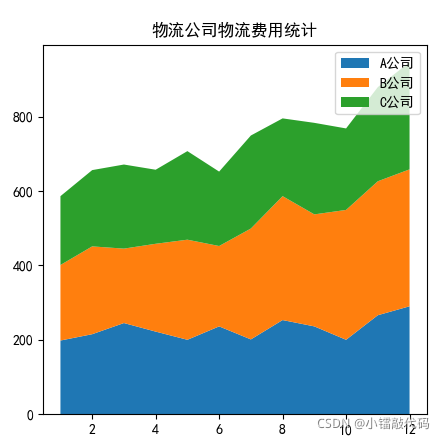
?5、使用hist()绘制直方图
案例5:人脸识别的灰度直方图
def hist():
    plt.figure()
    random_state = np.random.RandomState(19680801)
    x = random_state.randn(10000)
    plt.hist(x,bins=25)
    plt.title('人脸识别的灰度直方图')
    plt.show()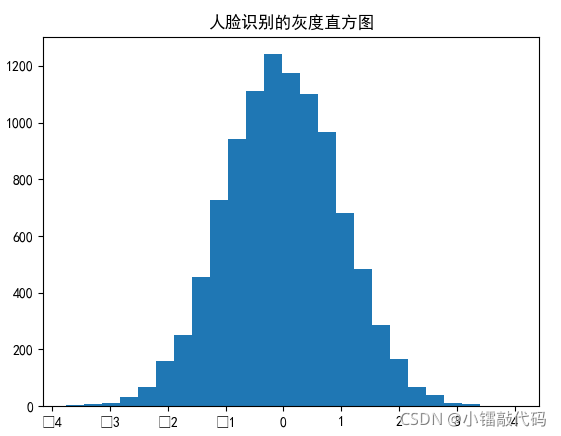
??
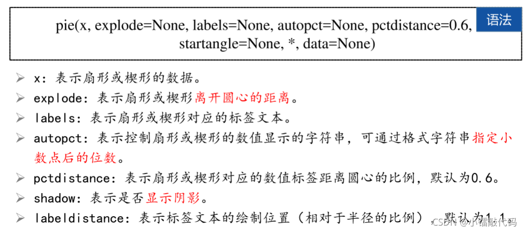
6、使用pie()绘制饼图或圆环图
案例6:支付宝月账单报告
def pie():
    plt.figure()
    x = [800,100,1000,200,300,200,200,200]
    label = ['购物', '人情往来', '餐饮美食', '通信物流', '生活日用','交通出行', '休闲娱乐', '其他']
    explodes = [0,0,0.2,0,0,0,0,0]
    plt.pie(x,explode=explodes,labels=label,autopct='%.2f%%')
    plt.title('用户某月使用支付宝的消费明细')
    plt.show()
?