matplotlib:https://www.matplotlib.org.cn/
pyecharts:https://pyecharts.org/#/zh-cn/intro
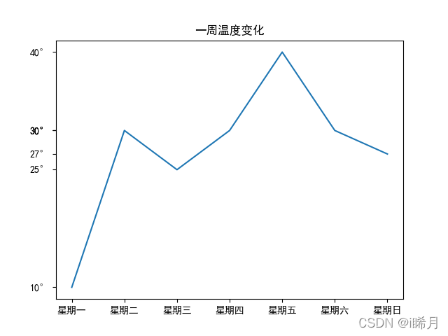
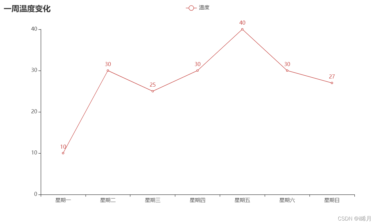
折线图
一周温度变化折线图
matplotlib
import matplotlib.pyplot as plt

# 设置字体
plt.rcParams["font.sans-serif"] = ["SimHei"]

# 生成温度数据
values = [10, 30, 25, 30, 40, 30, 27]
label = [f'星期{i}' for i in '一二三四五六日']
plt.plot(label, values)
plt.title("一周温度变化")
# 将数值格式化成摄氏度
plt.yticks(values, list(map(lambda x: f'{x}°', values)))
plt.show()
pyecharts
from pyecharts.charts import Line
import pyecharts.options as opts

# 生成温度数据
values = [10, 30, 25, 30, 40, 30, 27]
label = [f'星期{i}' for i in '一二三四五六日']
Line().add_xaxis(label).add_yaxis("温度", values) \
    .set_global_opts(title_opts=opts.TitleOpts(title='一周温度变化')).render()
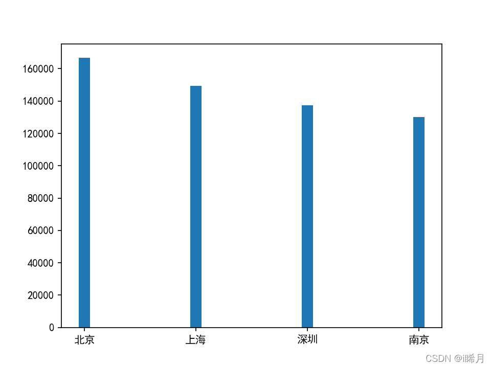
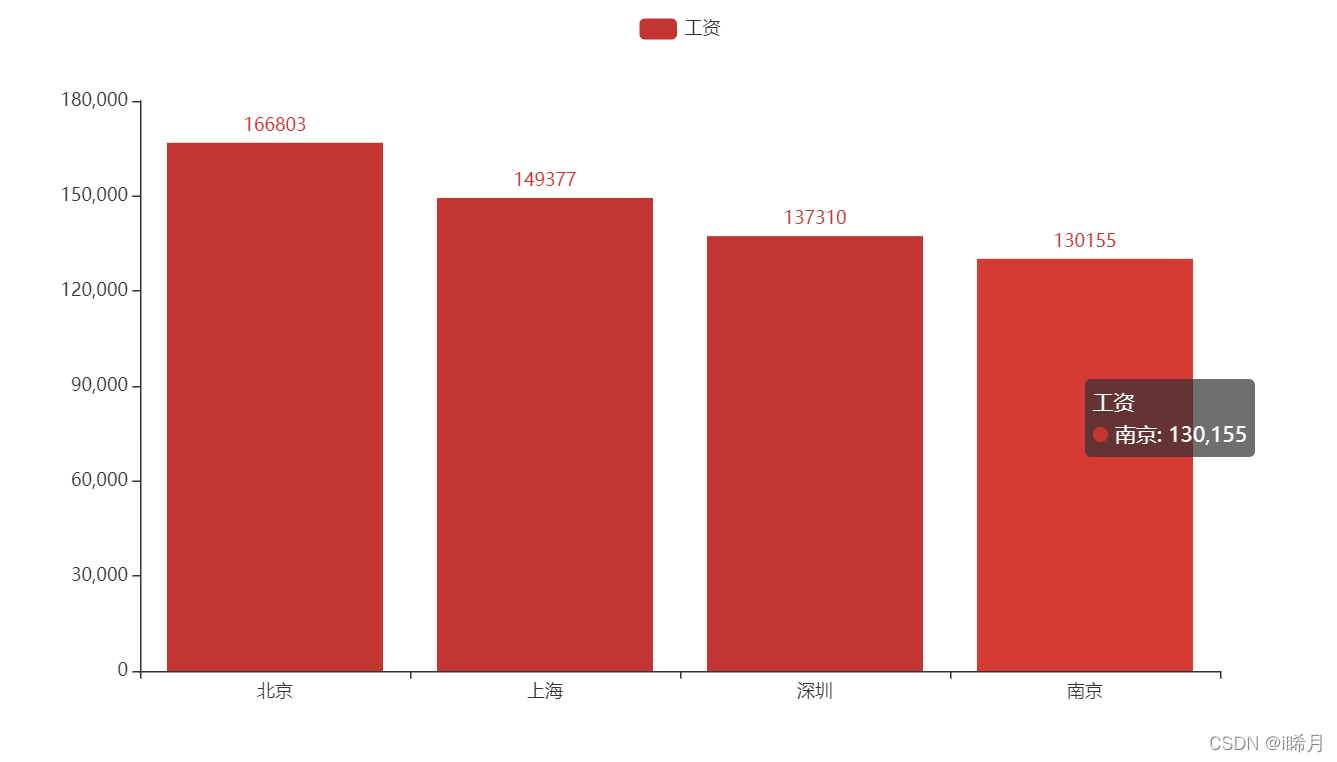
柱形图
部分城市平均工资
matplotlib
import matplotlib.pyplot as plt

plt.rcParams['font.sans-serif'] = ['SimHei']

salarys = [166803, 149377, 137310, 130155]
citys = ['北京', '上海', '深圳', '南京']
plt.bar(citys, salarys, width=0.1)
plt.show()
pyecharts
from pyecharts.charts import Bar

salarys = [166803, 149377, 137310, 130155]
citys = ['北京', '上海', '深圳', '南京']
Bar().add_xaxis(citys).add_yaxis("工资", salarys).render()
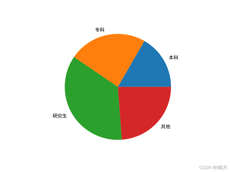
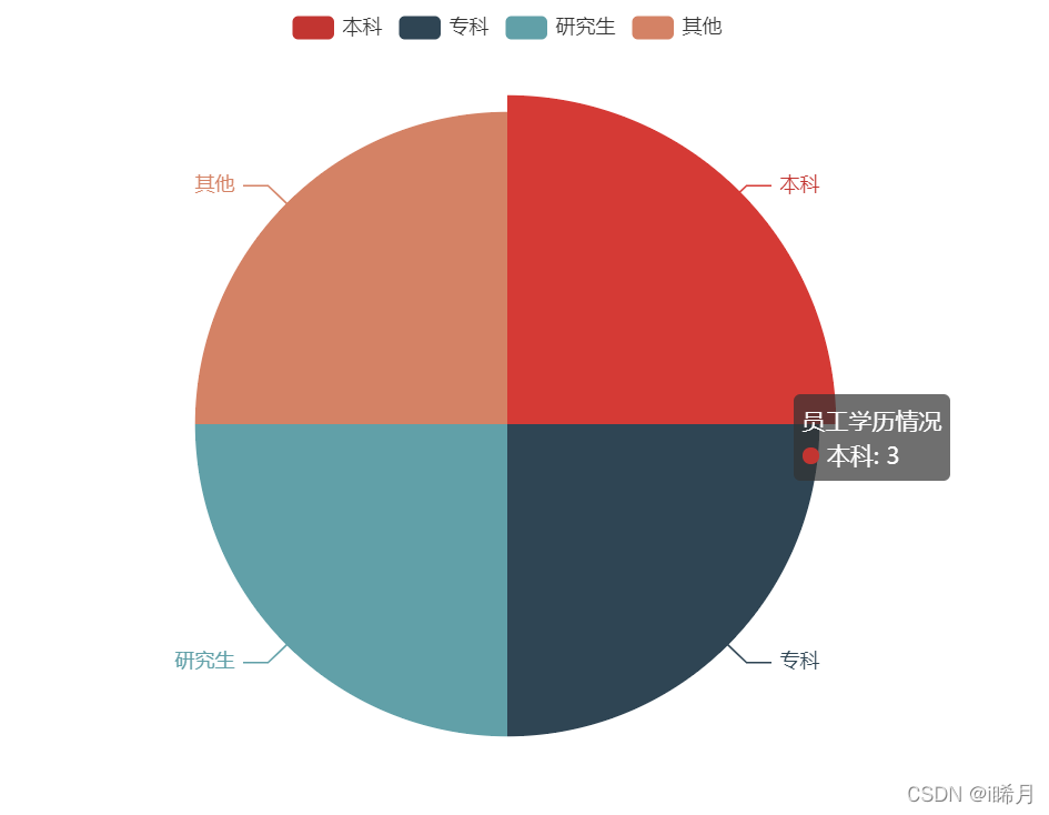
饼图
员工学历情况
matplotlib
import matplotlib.pyplot as plt

plt.rcParams['font.sans-serif'] = ['SimHei']

salarys = [14, 20, 30, 20]
citys = ['本科', '专科', '研究生', '其他']
plt.pie(salarys, labels=citys)
plt.show()
pyecharts
from pyecharts.charts import Pie
from collections import Counter

citys = ['本科', '专科', '研究生', '其他', '本科', '专科', '研究生', '其他', '本科', '专科', '研究生', '其他']
Pie().add("员工学历情况", Counter(citys).most_common()).render()
词云图
城市词云图
wordcloud
from wordcloud import WordCloud

citys = ["北京", "上海", "广州", "南京", "上海", "广州", "南京", "广州", "南京", '长沙']

w = WordCloud(font_path='simhei.ttf', background_color='white')
w.generate(" ".join(citys))
w.to_file('abc.png')

pyecharts
from pyecharts.charts import WordCloud
from collections import Counter

citys = ["北京", "上海", "广州", "南京", "上海", "广州", "南京", "广州", "南京", '长沙']

WordCloud().add("城市", Counter(citys).most_common()).render()