R���Կ��ӻ���ggplot2��
���µ�����/ͼƬ/���벿��/ȫ����Դ�����ѧ�����Ļ�μ�,���»�������ɸ���,����ѧϰʹ�á�
Ŀ¼
����ggplot2(Grammar of Graphics)
һ�����ӻ�����
���ӻ�:���ӻ���������һ���ı任���Ӿ�����ԭ��ӳ��Ϊ���ӻ���ͼ���û��Կ��ӻ��ĸ�֪������ͨ���˵��Ӿ�ͨ����ɡ�
���ӻ�����:���ӻ����� (visual encoding) �ǿ��ӻ��ĺ�������,�ǽ�������Ϣӳ��ɿ��ӻ�Ԫ�صļ���,��ͨ�����б���ֱ�ۡ���������ͼ�������ԡ�
���ӱ��������������: ��Ǻ��Ӿ�ͨ����
���:�����������Եķ���,ͨ����һЩ����ͼ��Ԫ��,����:�㡢�ߡ��桢�塣
�Ӿ�ͨ��:��ʾ�������ܿ����ĸ���Ԫ�ص�����,������С����״����ɫ��,��������չʾ���ԵĶ�����Ϣ��
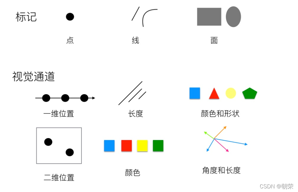
�Ӿ�ͨ����:λ�á����ȡ��Ƕȡ������������������Ͷȡ�ɫ�ࡢ��������״��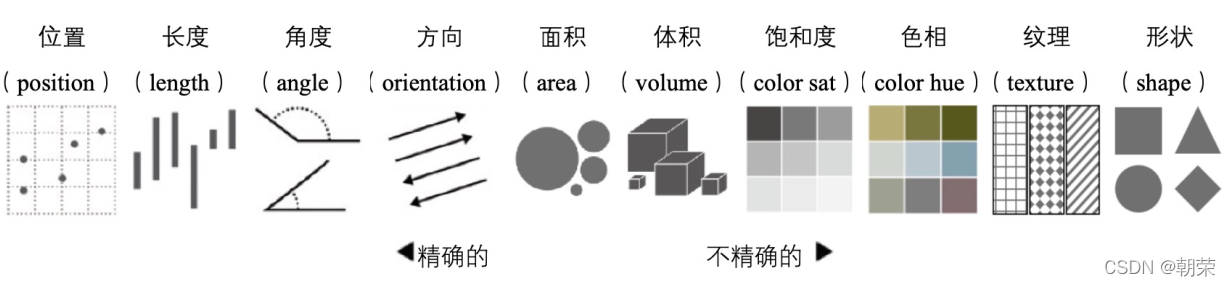
ɫ�ʿռ�:
RGB ɫ�ʿռ�:���õѿ�������ϵ������ɫ,������ֱ��Ӧ��ɫ (R)����ɫ (G) ����ɫ (B) ���������� RGB ɫ�ʿռ�������Ϊֹʹ����㷺��ɫ�ʿռ�,�������еĵ�����ʾ�豸��ʹ�� RGBɫ�ʿռ䡣
CMYK ɫ�ʿռ�:��ɫ (Cyan)��Ʒ��ɫ (Magenta)����ɫ (Yellow)�ͺ�ɫ (Black)��ͨ������ӡˢ��ҵ�С�
?
������ͬ������õ�ͼ��
���Ƚ�:
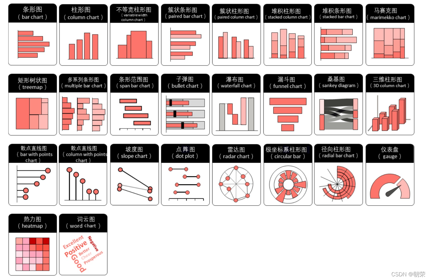
?��ֵ��ϵ:
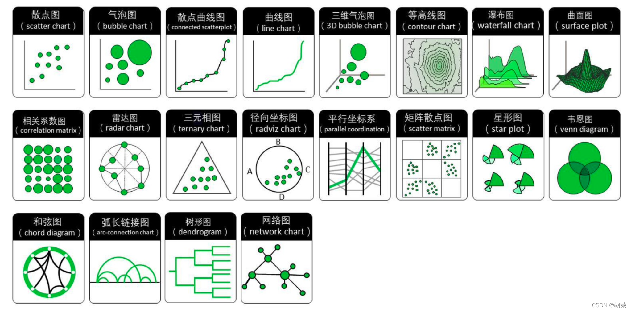
���ݷֲ�:
?ʱ������:
?�ֲ�������:
�ټ�������:
?���Ƚ�:����ͼ
?���Ƚ�:����ͼ
?���Ƚ�:����������ͼ
������ͼ (lollipop chart):��������ͼ/����ͼ,ֻ�ǽ�����ת�������,����չʾ�ռ�,�ص�������ݵ���,���������Ӽ�����ۡ�
����������ͼ (Cleveland��s dot plot):����ɢ��ͼ,���ư�����ͼ,ֻ��û�����ӵ�����,�ص�ǿ�����ݵ�����չʾ������֮���ࡣ
����ͼ (dumbbell plot):���Կ��ɶ�����ϵ�еĿ���������ͼ,ֻ��ʹ��ֱ����������������ϵ�е����ݵ㡣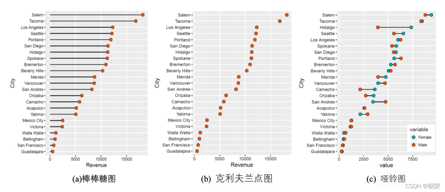
?���Ƚ�:�϶����õ��ͼ
�϶����õ��ͼ (Nightingale rose chart, coxcomb chart, polar area diagram) ������������ͼ,��һ��Բ�ε�����ͼ,�ɸ�����˹���϶������������������ X ������ǻ�״���������������,�����·ݡ����ڡ����ڵ�,��Щ���Ǿ��������Ե����������ݡ����������Ƚ϶�ʱ,ʹ���϶����õ��ͼ���ܽ�ʡ��ͼ�ռ䡣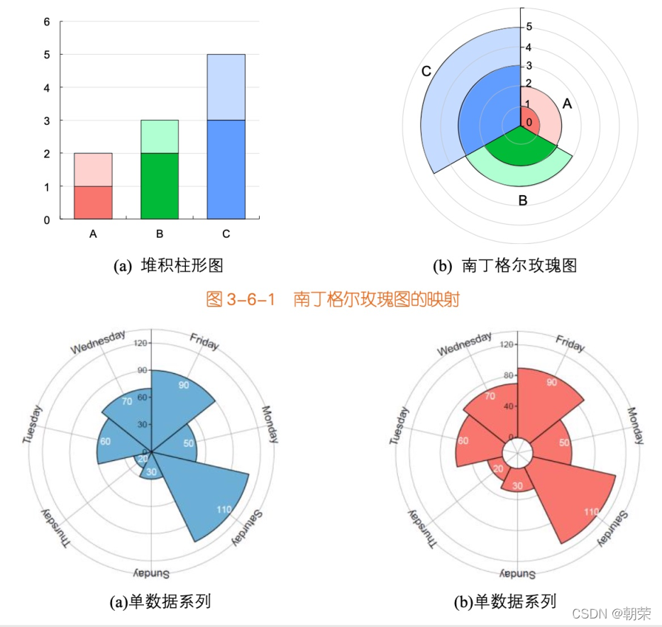
?��ֵ��ϵ:ɢ��ͼ
?
?
?��ֵ��ϵ:����ͼ
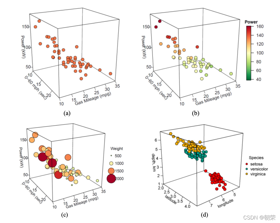
?��ֵ��ϵ:��άɢ��/����ͼ
?��ֵ��ϵ:�ٲ�ͼ
�ٲ�ͼ (waterfall plot) ����չʾӵ����ͬ�� X ��������� (����ͬ��ʱ������)����ͬ�� Y ����ɢ�ͱ��� (�粻ͬ��������) ��Z ����ֵ����,����������չʾ��ͬ����֮������ݱ仯��ϵ��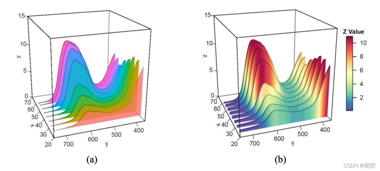
?��ֵ��ϵ:����ͼ
?��ֵ��ϵ:���ϵ��ͼ
���ϵ��ͼ:���ϵ������Ŀ��ӻ�
����ͼ (heatmap) ���ǽ�һ���������ӳ�䵽ָ������ɫ������,ǡ����ѡȡ��ɫ��չʾ���ݡ�
����ͼ�ǽ�һ���������ӳ�䵽���ݵ��������ɫ��,����ʹ�������Ӿ�������ʾ����,�����ö��߸��������ع۲����ݡ�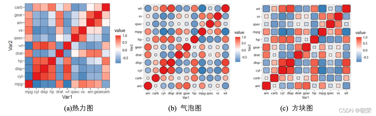
?��ֵ��ϵ:Τ��ͼ
Τ��ͼ (venn diagram),������ʾԪ�ؼ����ص������ͼ����ͨ��ͼ����ͼ��֮��IJ����ϵ,����ʾ�����뼯��֮����ཻ��ϵ��ÿ������ͨ����һ��ԲȦ��ʾ��һ����˵,���� 5 �����ϵij���,���ʺ�ʹ��Τ��ͼ��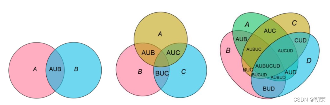
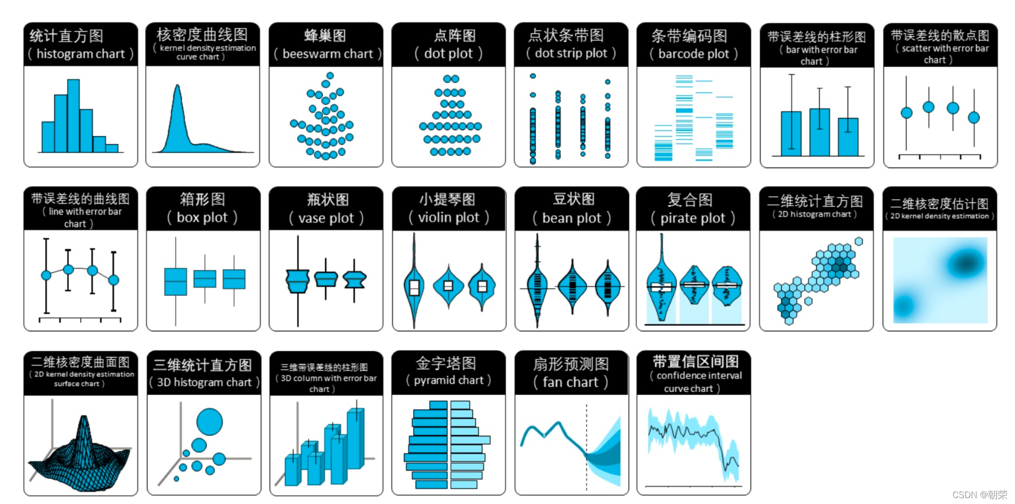
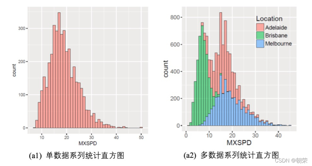
?���ݷֲ�:ֱ��ͼ
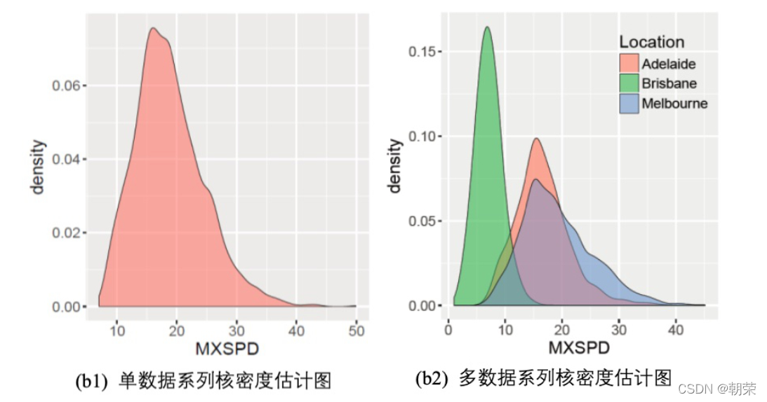
?���ݷֲ�:���ܶȹ���ͼ
���ܶȹ���ͼ (kernel density plot) ��ֱ��ͼ�ı���,ʹ��ƽ������������ˮƽ��ֵ,�Ӷ��ó���ƽ���ķֲ������ܶȹ���ͼ��ֱ��ͼ��ʤ�ĵط���,���Dz�����ʹ�÷���������Ӱ��,�����ܸ�
�õؽ綨�ֲ���״��
?�ֲ�����:ֱ��ͼ/�ܶ�ͼ
ggplot(df, aes(x = MXSPD, fill = Location))+
geom_histogram(binwidth = 1, alpha=0.5, colour="black", size=0.25) +
theme_cowplot()
ggplot(df, aes(x = MXSPD, fill = Location)) +
geom_density(binwidth = 1, alpha=0.5, colour="black", size=0.25) +
theme_cowplot()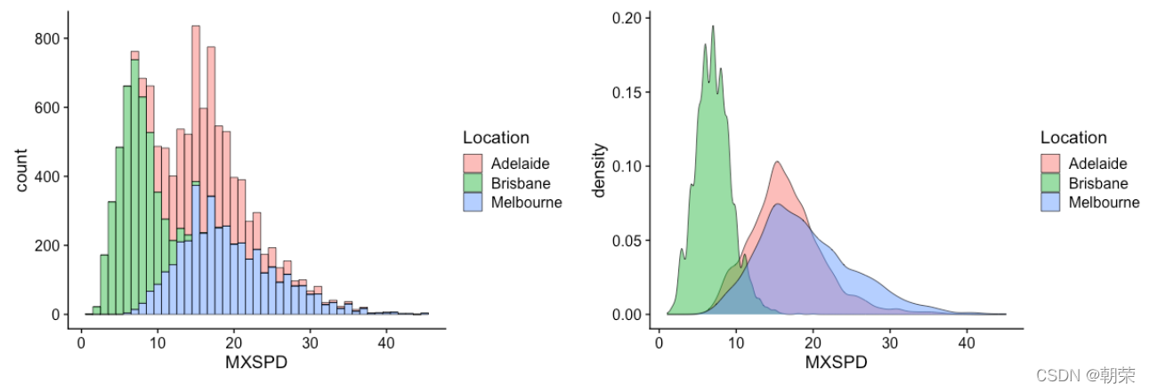
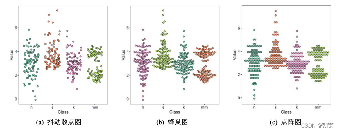
?���ݷֲ�:ɢ��ֲ�ͼ
ɢ��ֲ�ͼ��ָʹ��ɢ��ͼ�ķ�ʽչʾ���ݵķֲ����ɡ�
����ɢ��ͼ (jitter chart),ÿ��������ݵ�� Y ����ֵ���ֲ���,���ݵ� X ����ֵ���� X ������ǩ��������һ����Χ���������,Ȼ����Ƴ�ɢ��ͼ��
?���ݷֲ�:���ηֲ�ͼ
?���ݷֲ�:����ͼ
����ͼ (box plot)������ͼ (box-whisker plot),����ʾ��һ�����ݵ����ֵ����Сֵ����λ��,�Լ������ķ�λ��,����������ӳһ�����������Ͷ������ݷֲ�������λ�ú�ɢ����Χ��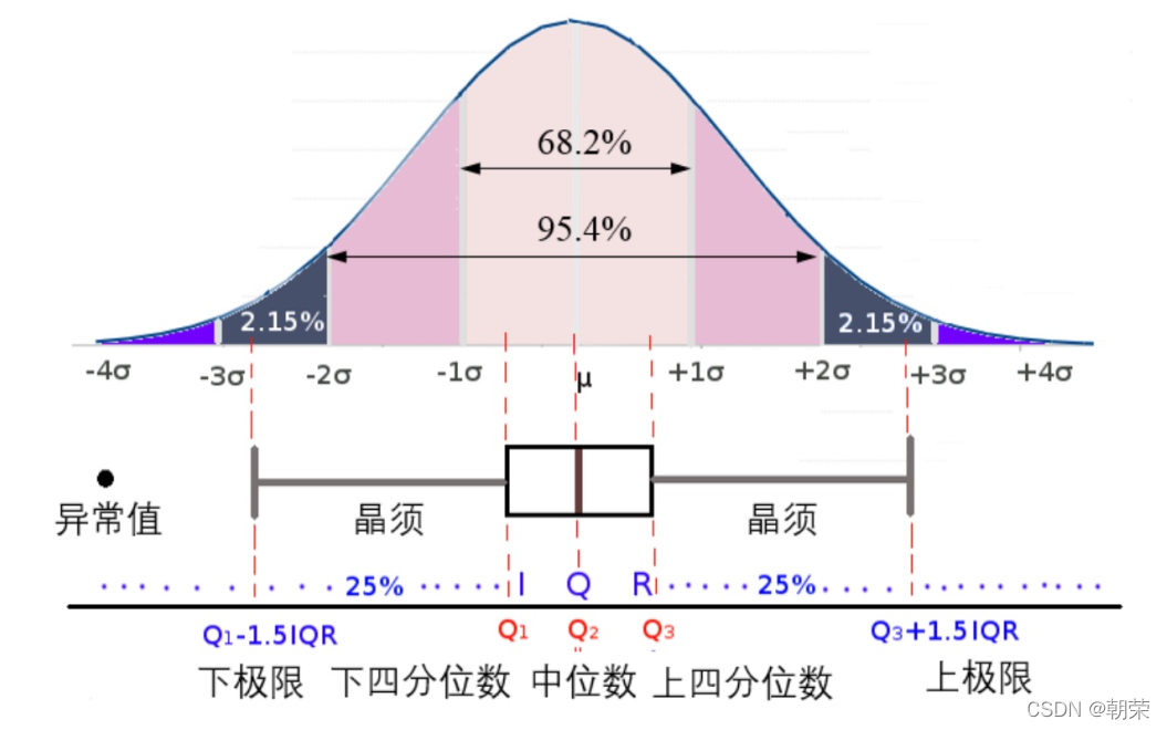
?���ݷֲ�:С����ͼ������ͼ
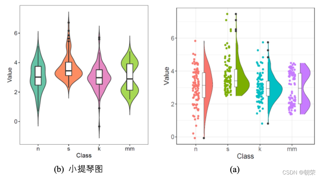
?С����ͼ (violin plot) ������ʾ���ݷֲ���������ܶ�,���������ͼ���ܶ�ͼ������,��Ҫ������ʾ���ݵķֲ���״��
����ͼ (raincloud plot) ���Կ�������ͼ���ܶ�ͼ�Ͷ���ɢ��ͼ�����ͼ��,���������������۵�չʾ������������Ϣ��
?���ݷֲ�:�����Ա�ǩ������ͼ
ggboxplot(mydata, x = "Class", y = "Value",
fill = "Class", palette = palette,
add = "none", size=0.5, add.params = list(size = 0.25)) +
geom_hline(yintercept = mean(mydata$Value), linetype = 2) +
stat_compare_means(method = "anova", label.x=0.8,label.y = 7.8) +
stat_compare_means(label = "p.signif", method = "t.test",
ref.group = ".all.", hide.ns = TRUE,label.y = 8) +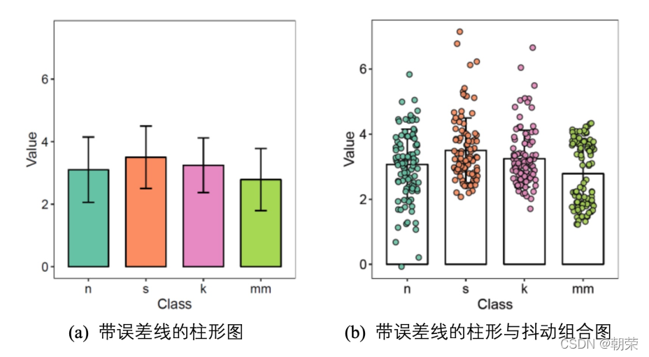
theme_cowplot()ggpubr:���ڻ��Ʒ��ϳ�����Ҫ���ͼ��,���������Ա�ǩ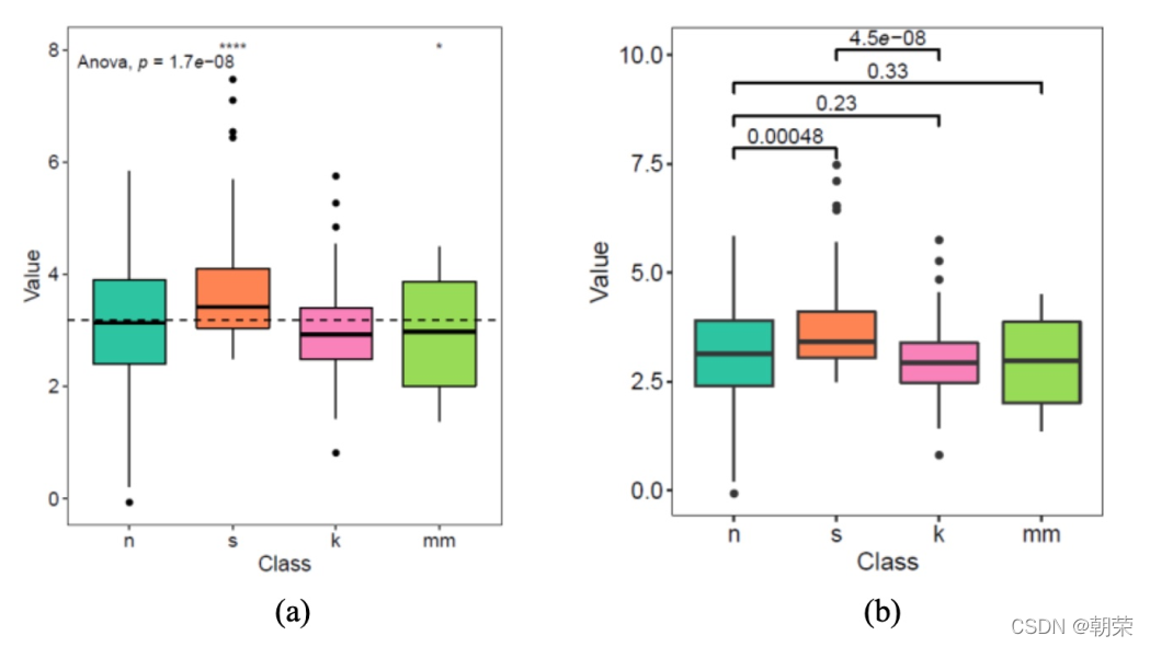
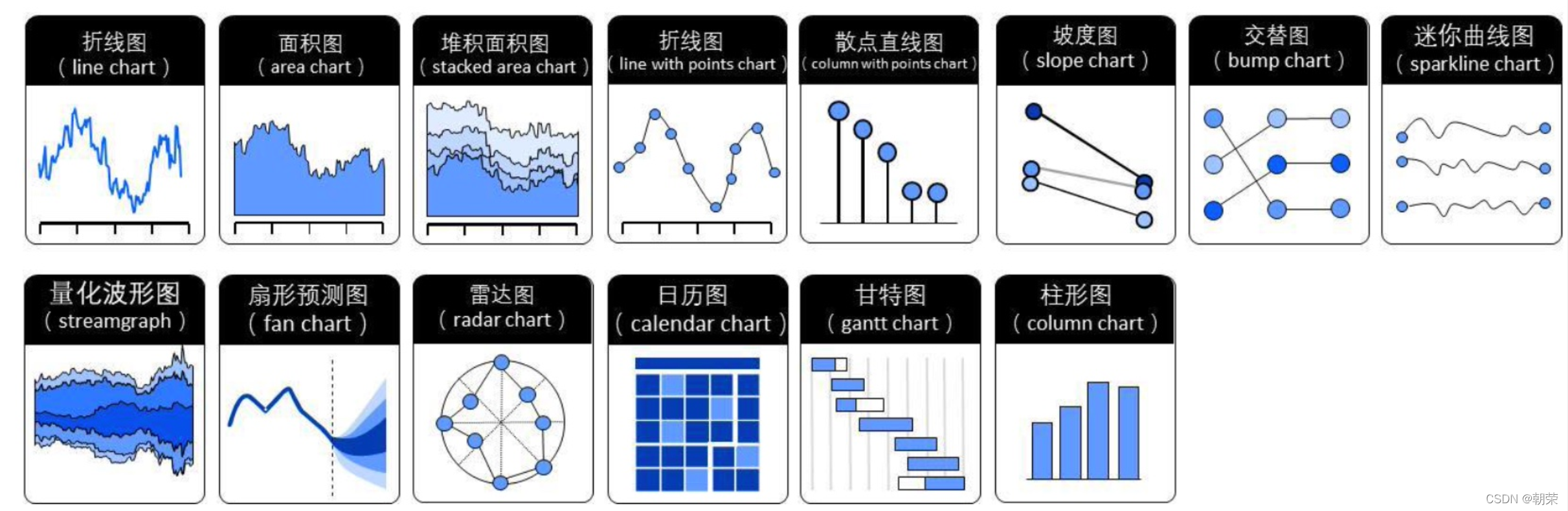
?ʱ������:����ͼ/���ͼ
����ͼ (line chart) ���������������ʱ��������ʾ������ֵ��
���ͼ (area graph) ��������ͼ�Ļ���֮���γɵ�,ʹ����ɫ�����������,�������Ը��õ�ͻ��������Ϣ,��ͼ���������ۡ�������ϵ�е����ͼ���ʹ�õõ�,��ôЧ�����Աȶ�����ϵ�е�����ͼ���ۺܶࡣע��Ҫ������,ϵ�в�Ҫ���� 3 ����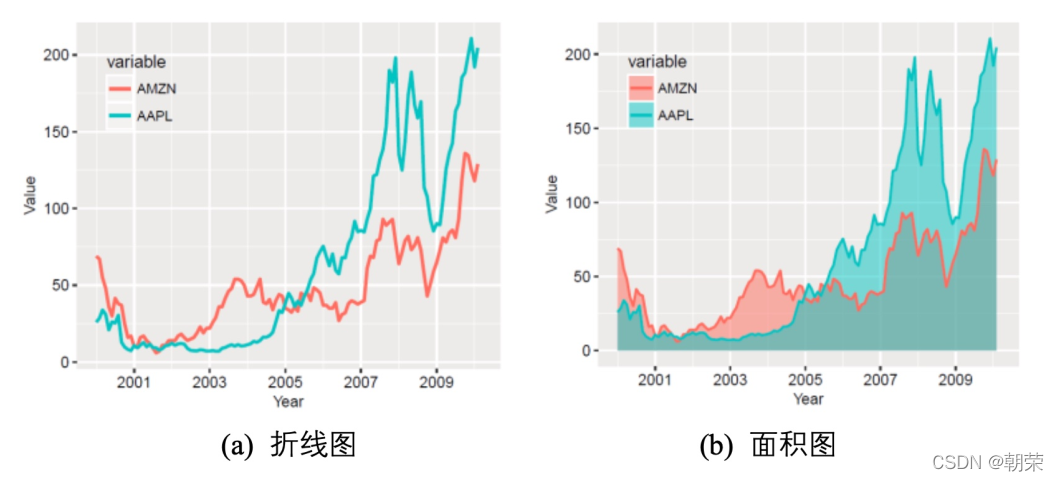
?ʱ������:�ѻ����ͼ
�ѻ����ͼ (stacked area graph),ÿһ��ϵ�еĿ�ʼ������ǰ����ϵ�еĽ�����,�ڱ��ַ����ı仯���ʱ�������á�
�ٷֱȶѻ����ͼ,���ܷ�ӳ�����ı仯,���ǿ��������ط�ӳÿ����ֵ��ռ�ٷֱ���ʱ������仯�������ߡ�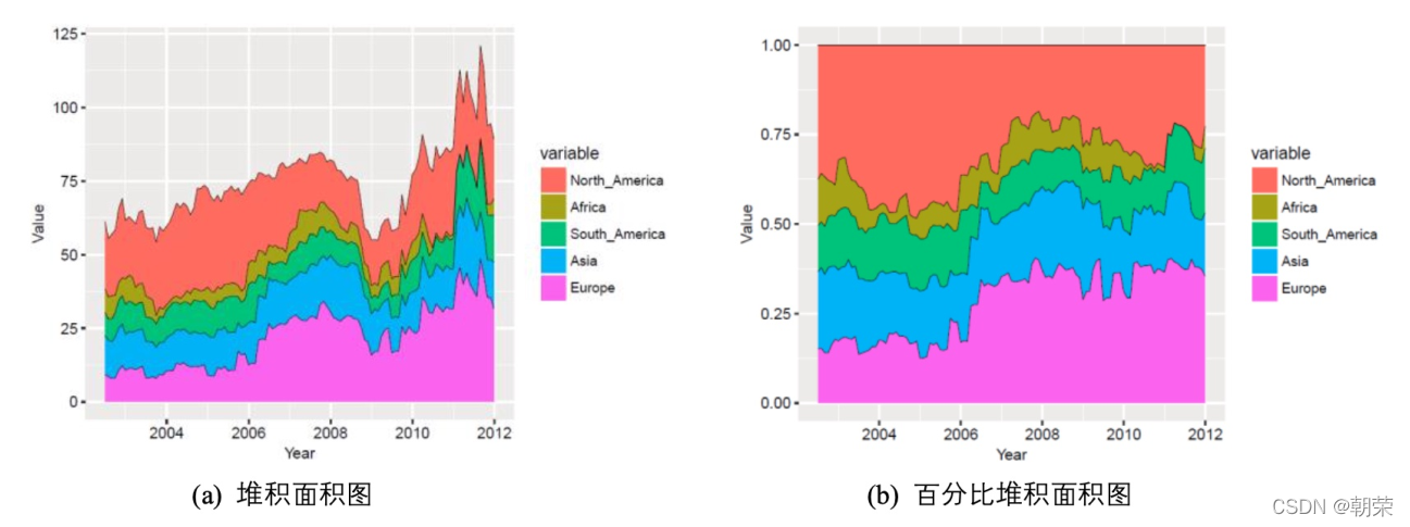
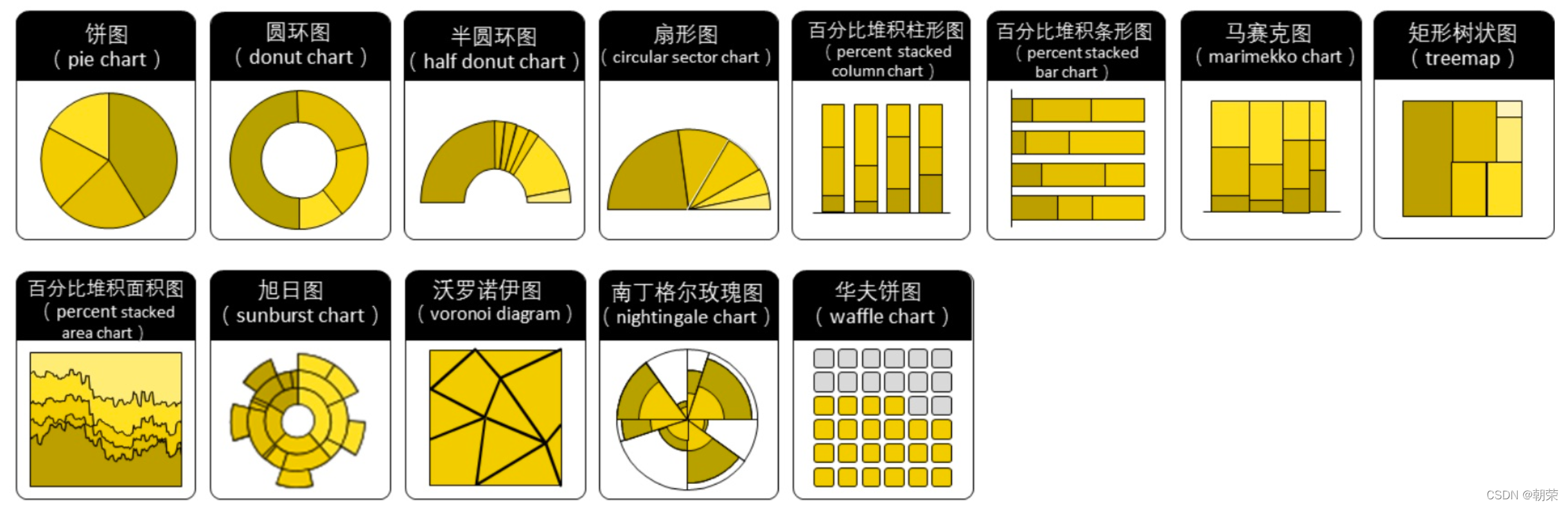
?�ֲ�����:��ͼ
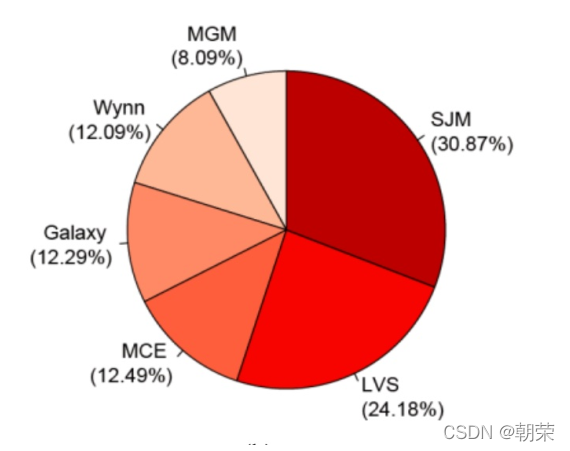
��ͼ (pie chart) ���㷺��Ӧ���ڸ�������,���ڱ�ʾ��ͬ�����ռ�����,ͨ���Ƕȴ�С���Աȸ��ַ��ࡣ��ͼ�������ڶ���������,ԭ����һ�ű�ͼ���ɶ��� 9 �����ࡣ�ڻ��Ʊ�ͼǰһ��ע��Ҫ�Ѷ�����һ���Ĺ��������Ķ���ͼ����ͬ�Ķ��ӱ�һ��,�˻�DZ��ʶ�شӶ� 12 �㿪ʼ˳ʱ�������Ķ����ݡ�
�ֲ�����:Բ��ͼ
Բ��ͼ (�ֽ�������Ȧͼ, donut chart),�䱾���ǽ���ͼ���м������ڿա�Բ��ͼ�ȽϵIJ��ǽǶ��ǻ�����Բ��ͼ����ڱ�ͼ�ռ�������ʸ���,����ʹ�ÿ���������ʾ��
����Ϣ (�����)��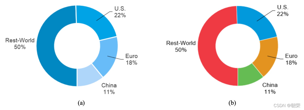
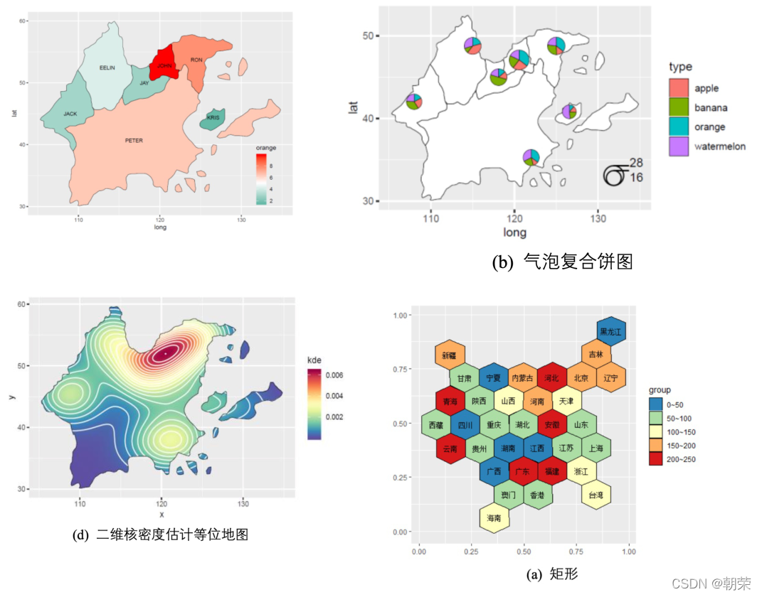
?��ά����:��ά
����һ���ܸ�֪�Ŀռ�Ϊ��ά����ά����ά���ݱ任����ʹ�ý�ά�ȵķ���,ʹ�����Ի�����Ա任�Ѹ�ά����ͶӰ����ά�ռ�,ȥ����������,ͬʱ�����ܵر�����ά�ռ����Ҫ��Ϣ��������
���ɷַ��� PCA����ά�߶ȷ��� MDS�� t-SNE�� UMAP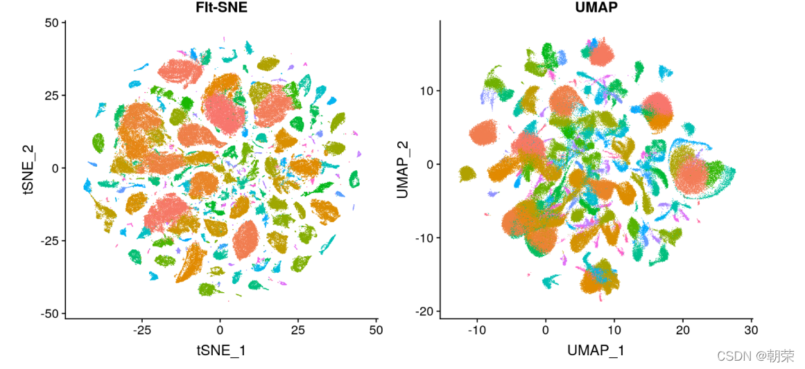
?��ά����:����ͼ
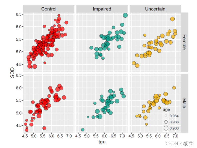
����ͼ (facet) ������������л�����,ʹ��ɢ��ͼ������ͼ������ͼ��������ͼ�Ȼ���ͼ��չʾ����,��ʾ����֮��Ĺ�ϵ,����������������ά�����ݽṹ���͡�
������:
?������:
?������:
?
��ά����:����ɢ��ͼ
����ɢ��ͼ scatter plot matrix ��ɢ��ͼ�ĸ�ά��չ������ά�����ݵ�ÿ�����������һ��ɢ��ͼ,�Ӷ�����ά�����������еı�������֮��Ĺ�ϵչʾ������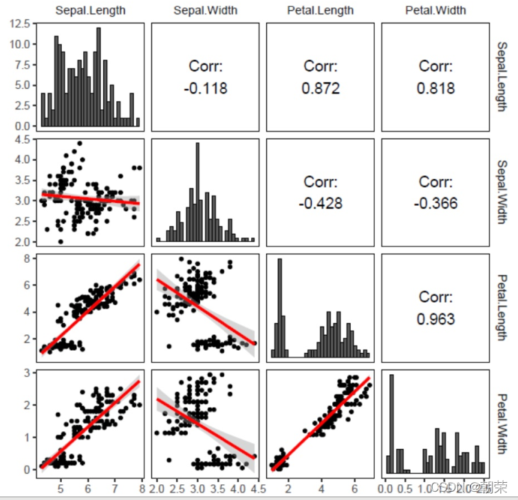
?��ά����:����ͼ
?����ͼ (heat map) ��һ�ֽ�����������ת������ɫɫ���ij��õĿ��ӻ�����,����ÿ����Ԫ��Ӧ���ݵ�ijЩ����,���Ե�ֵͨ����ɫӳ��ת��Ϊ��ͬɫ����������Ԫ��
?
?��ά����:ƽ������ϵͼ
ƽ������ϵͼ (parallel coordinates chart) ��һ���������ֶ����,���߸�ά�����ݵĿ��ӻ�����,�������Ժܺõس��ֶ������֮��Ĺ�ϵ��
?��ά����:ͼ�귨-����ͼ
λ�� 2 ά + ���� 5 ά
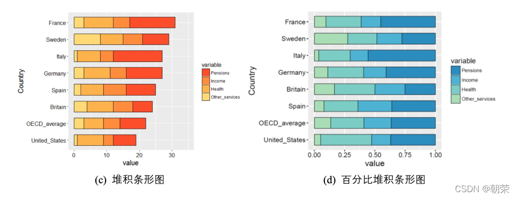
?��ι�ϵ:����ͼ
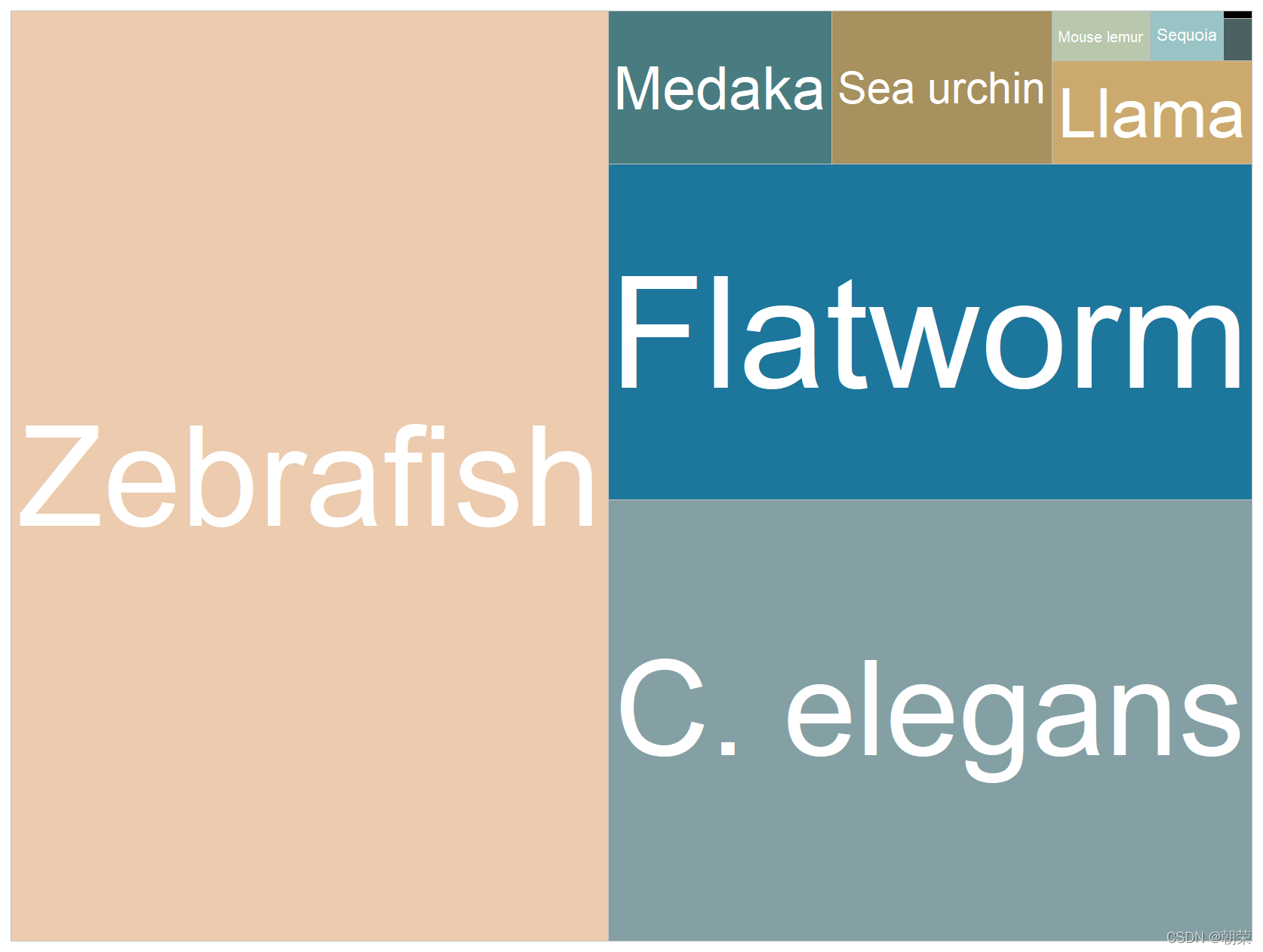
?��ι�ϵ:������״ͼ
������״ͼ (treemap):����Ƕ��ʽ��������ʾ��״�ṹ����,�Բ�ͬ��ɫ������ֲ�ͬ���,�����������С�����������ֵ��С�Ƚϡ�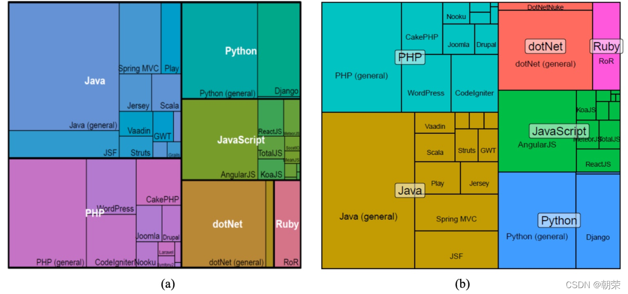
?��ι�ϵ: Voronoi ��ͼ
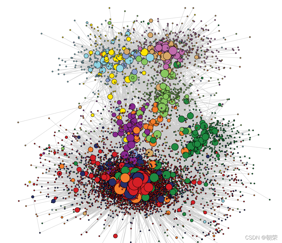
?�����ϵ:����ͼ
?�����ϵ:ɣ��ͼ
?�����ϵ:�ڵ�����ͼ
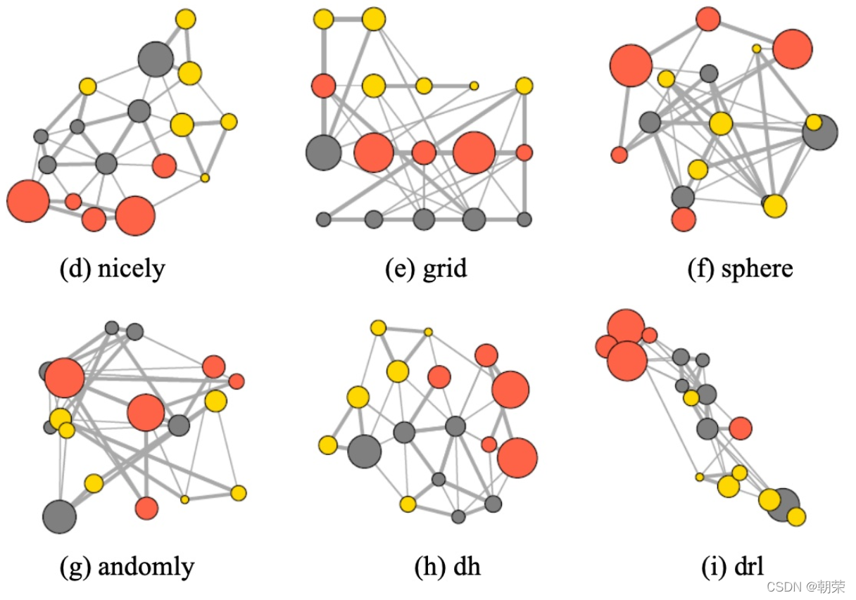
?�����ϵ:�ڵ�����ͼ
?
�����ռ�
?��
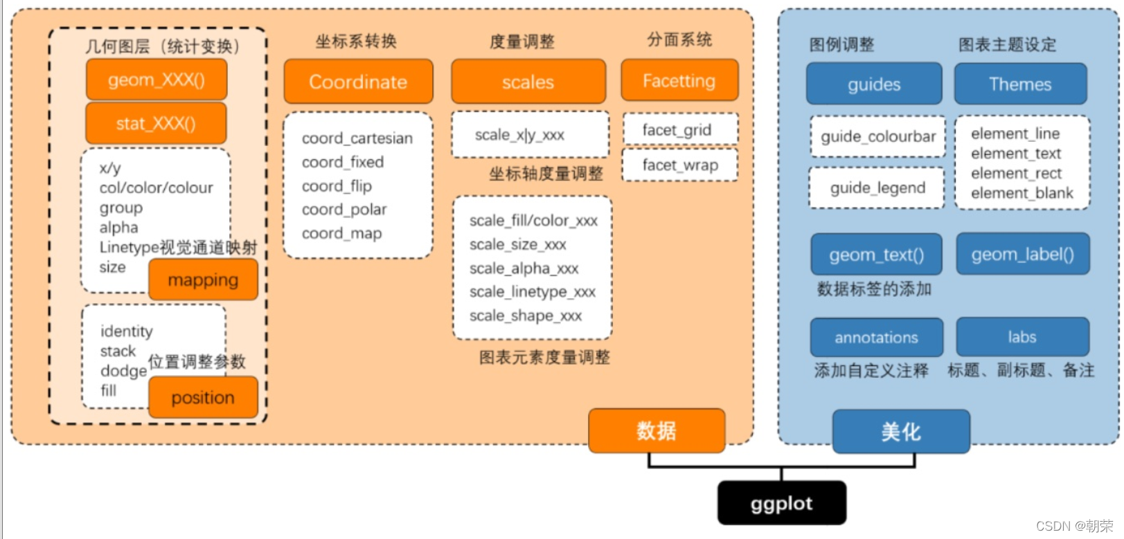
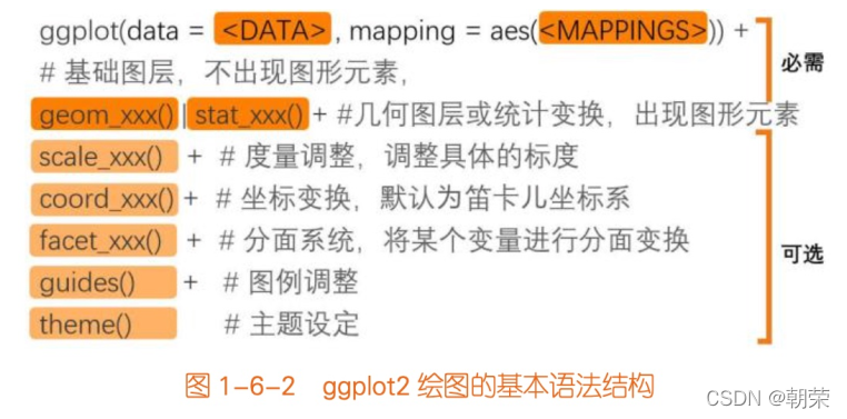
����ggplot2(Grammar of Graphics)
- ggplot2 ����ͼ���,�ṩ��һ��ȫ�µ�ͼ�δ�����ʽ��
- ��ͼ���̹���Ϊ���� data��ת�� transformation������ scale������ϵ coordinate��Ԫ�� element��ָ�� guide����ʾ display ��һϵ�ж����IJ��衣
- ͨ������Щ����������,��ʵ�ָ��Ի���ͳ�ƻ�ͼ��
ggplot2��ͼ��:
Data ����: Input data
Geom �����: A geometry representing data. Points, Lines etc
Aesthetic �Ӿ�ͨ��: Visual characteristics of the geometry. Size, Color, Shape etc
Scale ����: How visual characteristics are converted to display values
Statistics ͳ��: Statistical transformations. Counts, Means etc
Coordinates ����: Numeric system to determine position of geometry. Cartesian, Polar etc
Facets ����: Split data into subsets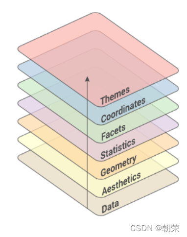
?ggplot2 ͼ����ص�:
- ����ͼ�����Ʒ�ʽ,�����ڽṹ��˼άʵ�����ݿ��ӻ�;
- ���������ݺ�ͼ��ϸ�ڷֿ�,�ܿ��ٽ�ͼ�α��ֳ���;
- ͼ������,��չ���ḻ,���ڶ��Ƹ��Ի�ͼ����
?ggplot2 ������ͼ�:
library(ggplot2)
library(RColorBrewer)
library(wesanderson)
library(cowplot)
library(reshape2)

str(mpg)
head(mpg)

ggplot(data= mpg, mapping = aes(x=displ, y=hwy, colour=class)) +
    geom_point()
data Ϊ���ݼ�,��Ҫ�����ݿ� (data.frame) ��ʽ�����ݼ�;
mapping Ϊ�������Ӿ�ͨ��ӳ��,������ʾ���� x �� y,����������������ɫ (color)����С (size) ����״ (shape) ���Ӿ�ͨ����
# different vis channels
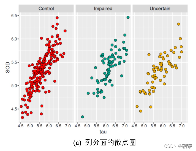
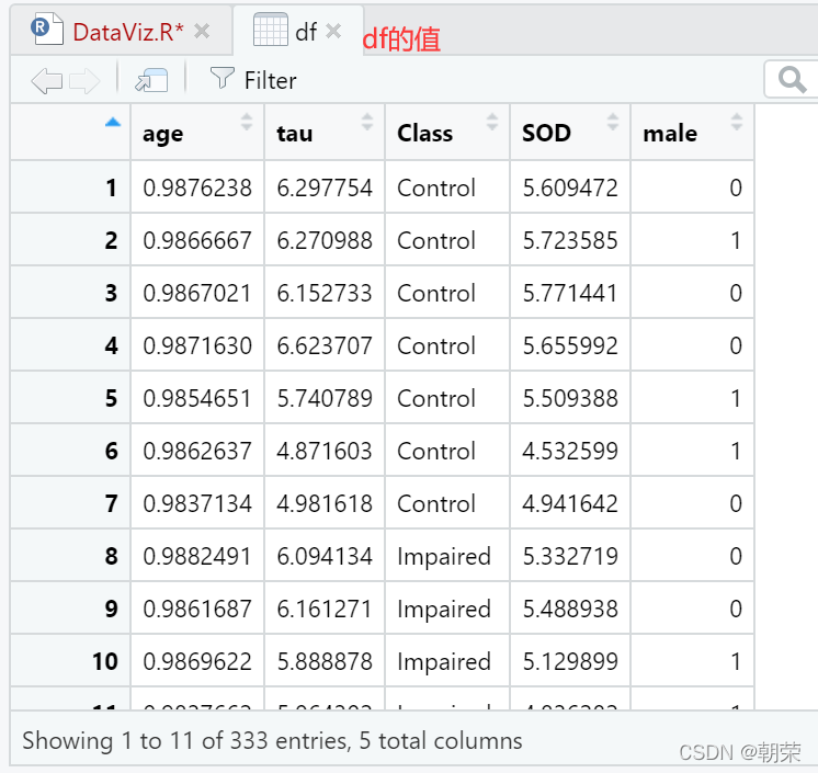
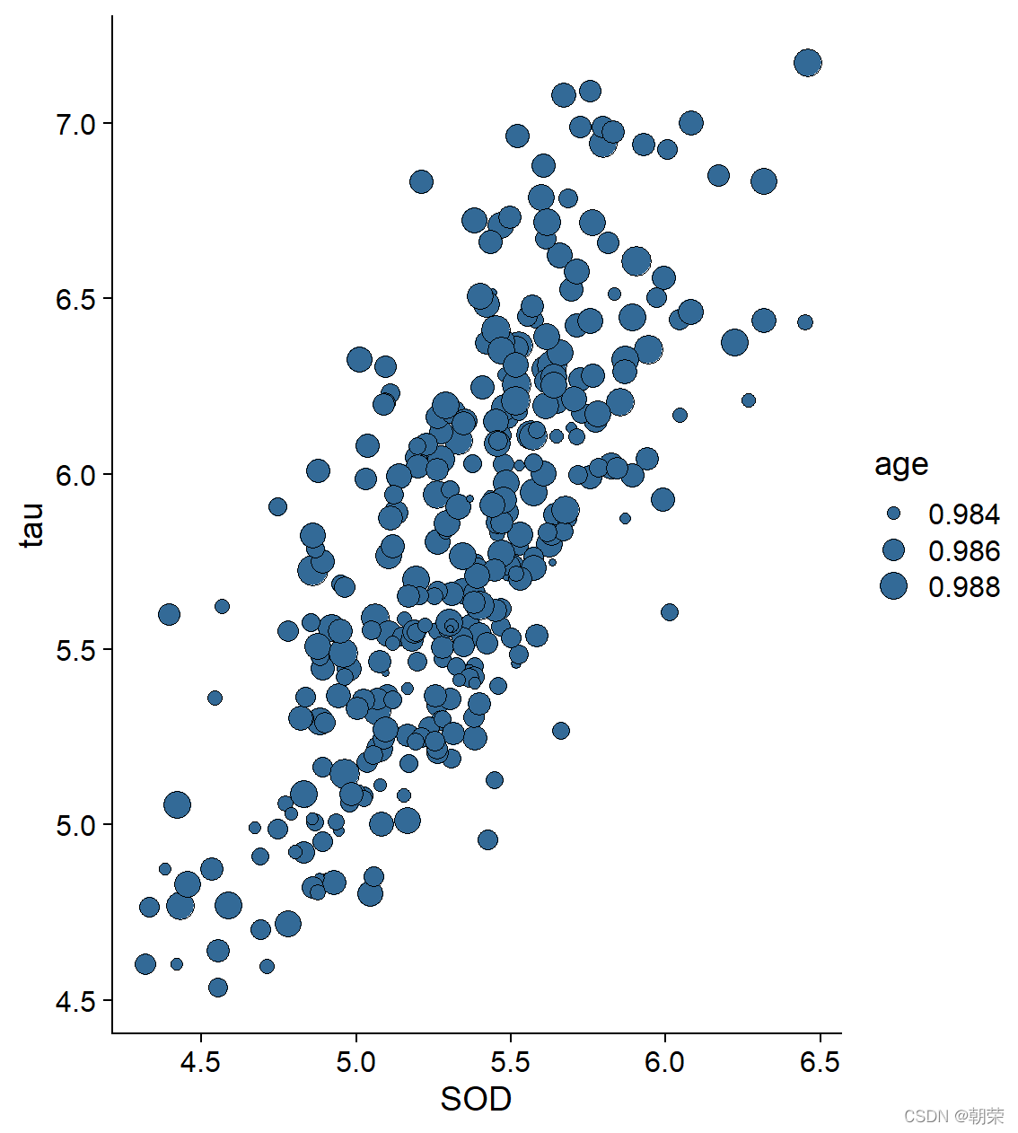
df <- read.csv("pubdata/Facet_Data.csv", header = TRUE)
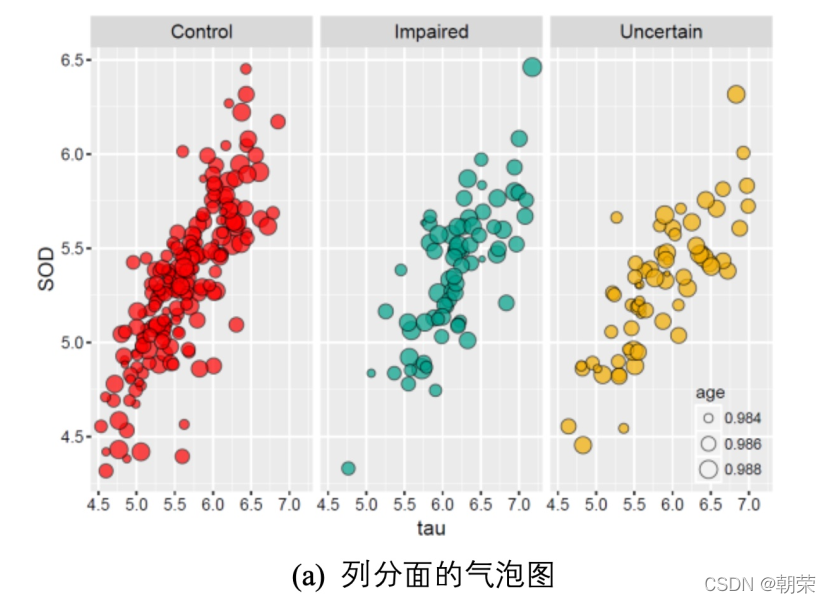
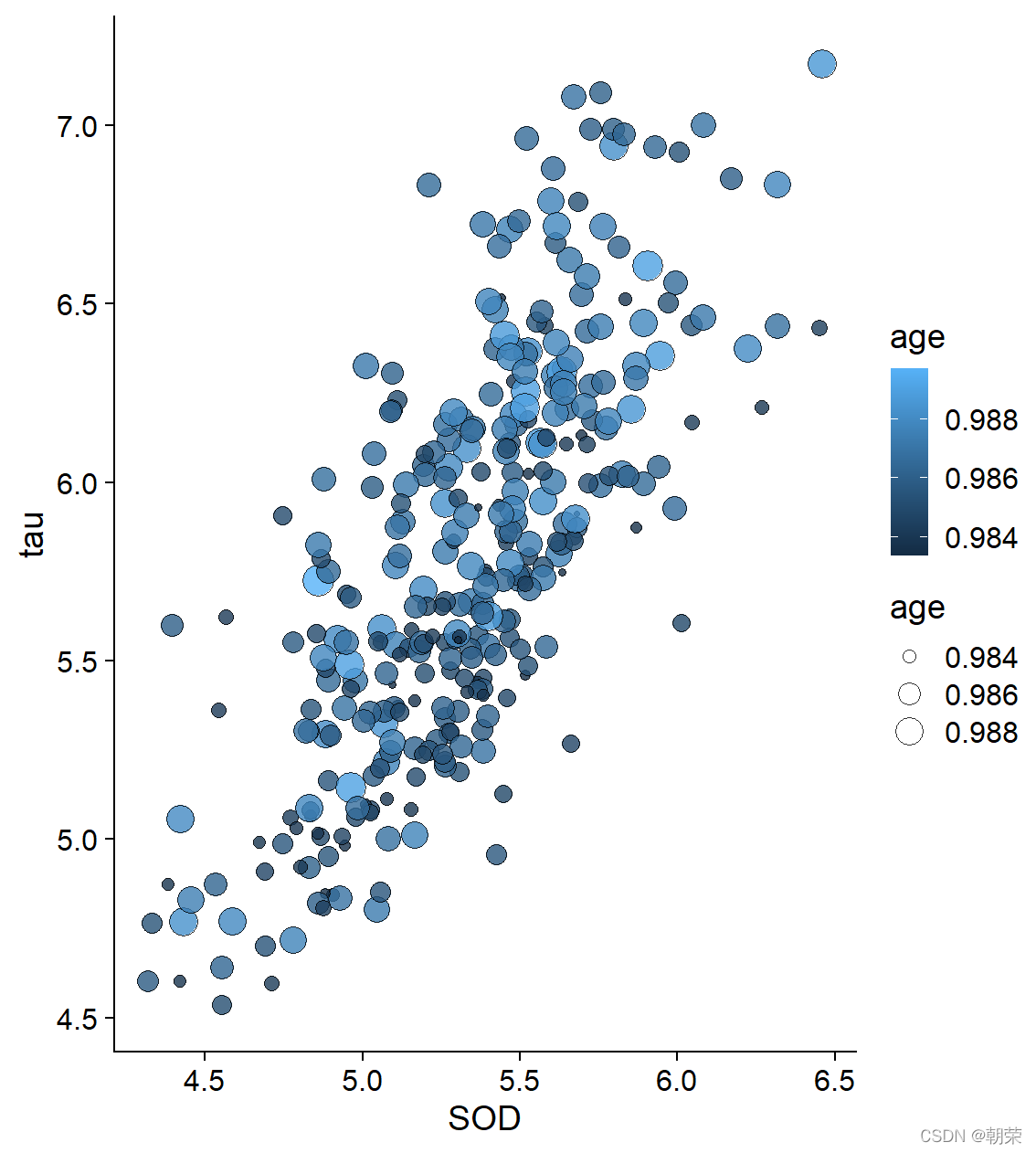
ggplot(df, aes(SOD, tau, size = age)) +
geom_point(shape=21, color="black", fill="#336A97", stroke=0.25) +
theme_cowplot()
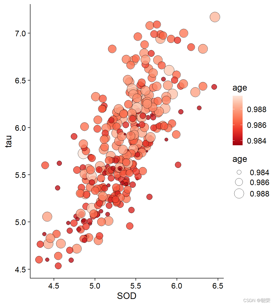
ggplot(df, aes(SOD, tau, fill = age, size = age)) +
geom_point(shape=21, colour="black", stroke=0.25, alpha=0.8) +
theme_cowplot()
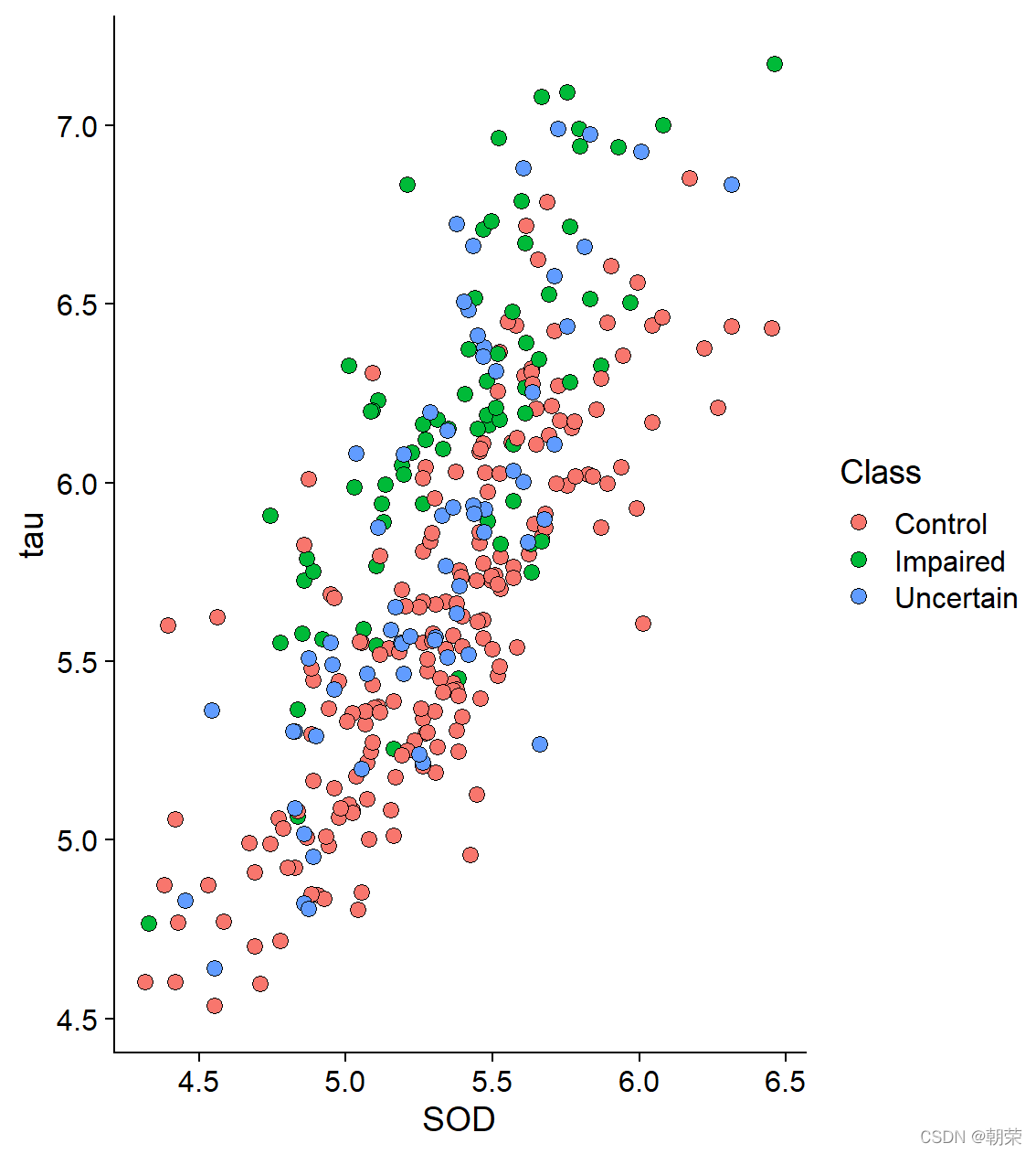
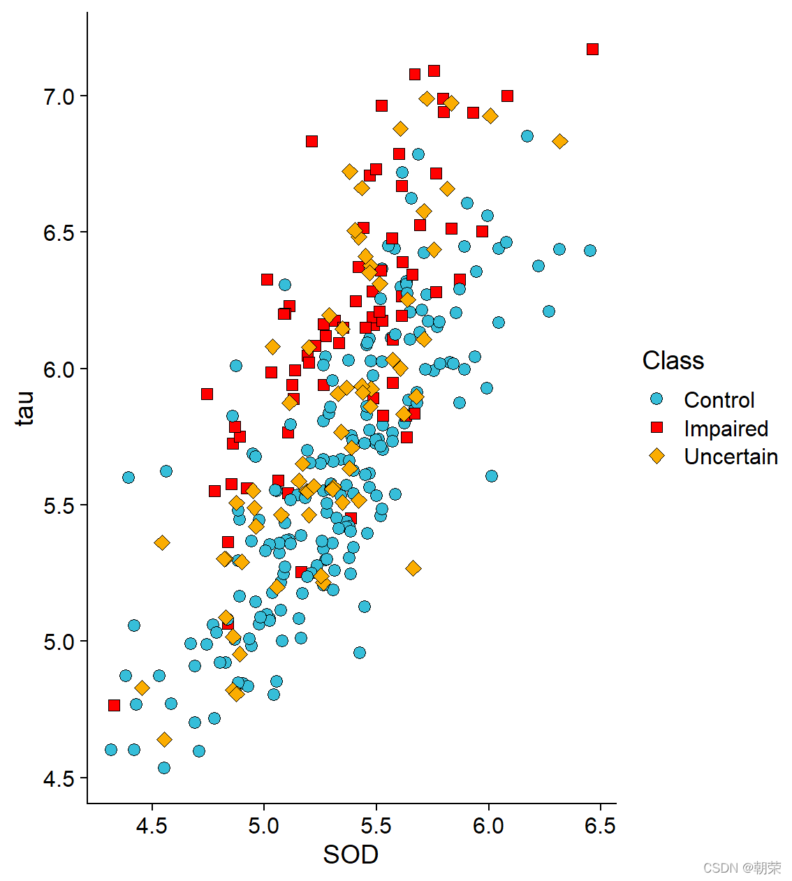
ggplot(df, aes(SOD, tau, fill = Class)) +
geom_point(shape=21, size=3, colour="black", stroke=0.25) +
theme_cowplot()
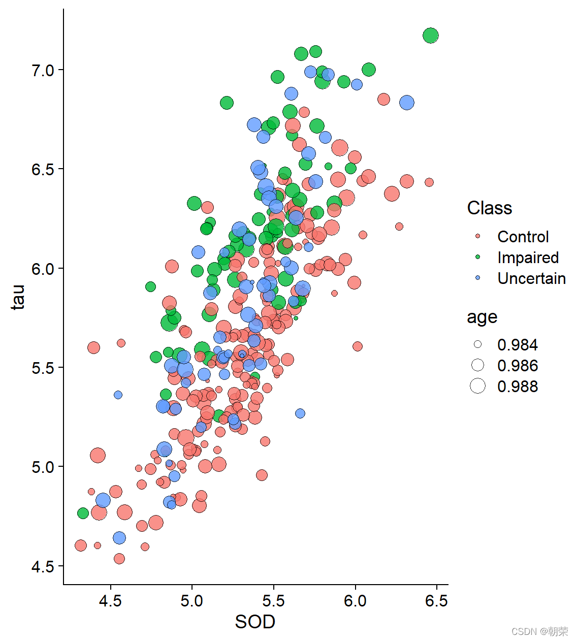
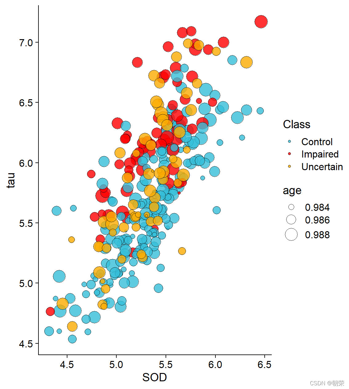
ggplot(df, aes(SOD, tau, fill = Class, size = age)) +
geom_point(shape = 21, colour="black", stroke=0.25, alpha=0.8) +
theme_cowplot()
?
# different scales

ggplot(df, aes(x=SOD, y=tau, size=age)) +
    geom_point(shape=21, color="black", fill="#E53F2F", stroke=0.25, alpha=0.8) +
    scale_size(range = c(1, 8)) +
    theme_cowplot()

ggplot(df, aes(SOD, tau, fill=age, size=age)) +
    geom_point(shape=21,colour="black",stroke=0.25, alpha=0.8) +
    scale_size(range = c(1, 8)) +
    scale_fill_distiller(palette="Reds") +
    theme_cowplot()

ggplot(df, aes(x=SOD, y=tau, fill=Class, shape=Class)) +
    geom_point(size=3, colour="black", stroke=0.25)+
    scale_fill_manual(values=c("#36BED9", "#FF0000", "#FBAD01")) +
    scale_shape_manual(values=c(21,22,23)) +
    theme_cowplot()

ggplot(df, aes(SOD, tau, fill=Class, size=age)) +
    geom_point(shape=21, colour="black", stroke=0.25, alpha=0.8) +
    scale_fill_manual(values=c("#36BED9","#FF0000","#FBAD01")) +
    scale_size(range = c(1, 8)) +
    theme_cowplot()
?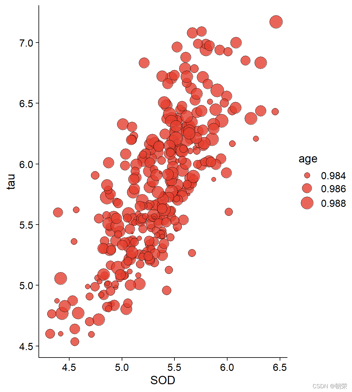
?
?
# multi-plots

p1 <- ggplot(mtcars, aes(disp, mpg)) + geom_point()
p2 <- ggplot(mtcars, aes(qsec, mpg)) + geom_point()
plot_grid(p1, p2, labels = c('A', 'B'))
?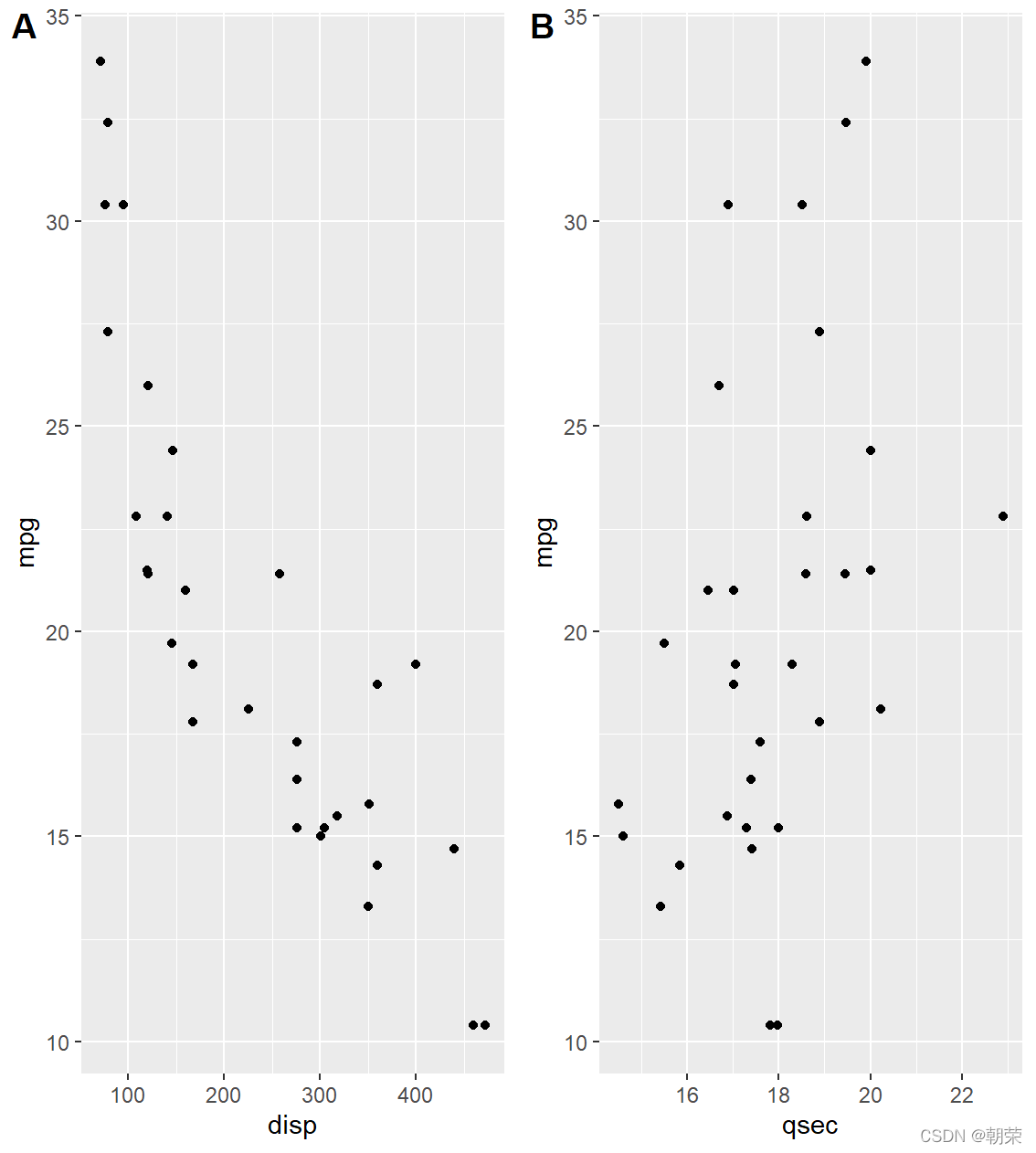
# color brewer

df <- structure(list(cond = structure(1:3, .Label = c("A", "B", "C"), class = "factor"),
                     yval = c(2, 2.5, 1.6)), .Names = c("cond", "yval"), class = "data.frame",
                row.names = c(NA, -3L))

p1 <- ggplot(df, aes(x=cond, y=yval, fill=cond)) + geom_bar(stat="identity") +
    scale_fill_manual(values=brewer.pal(9,"Blues")[3:5])

p2 <- ggplot(df, aes(x=cond, y=yval, fill=cond)) + geom_bar(stat="identity") +
    scale_fill_manual(values=brewer.pal(9,"Set1")[1:3])

p3 <- ggplot(df, aes(x=cond, y=yval, fill=cond)) + geom_bar(stat="identity") +
    scale_fill_manual(values=c(brewer.pal(9,"Spectral")[3],
                               brewer.pal(9,"Spectral")[6],
                               brewer.pal(9,"Spectral")[8]))

plot_grid(p1, p2, p3, nrow = 1)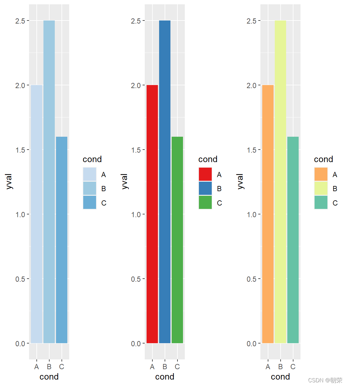
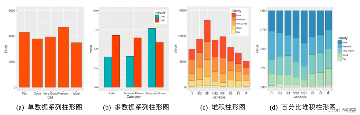
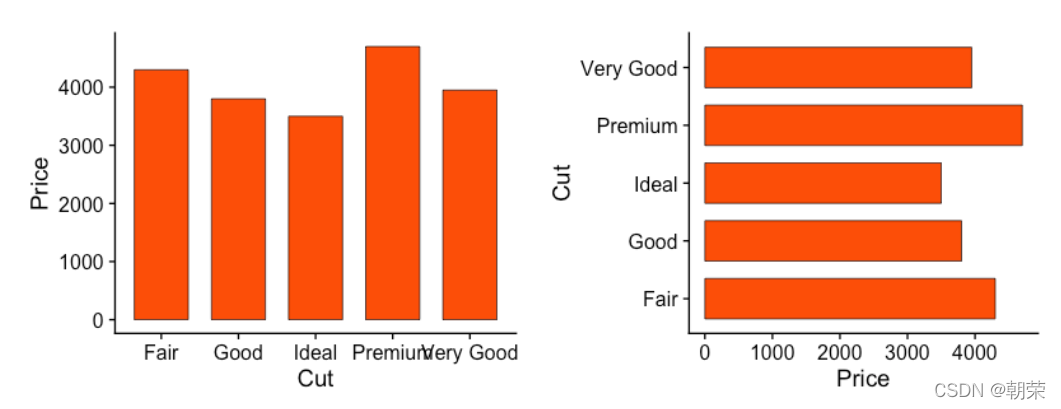
# bar plots

mydata <- data.frame(Cut=c("Fair","Good","Very Good","Premium","Ideal"),
                   Price=c(4300,3800,3950,4700,3500))

ggplot(data = mydata, aes(x=Cut, y=Price))+
    geom_bar(stat = "identity", width = 0.7,
             colour="black", size=0.25, fill="#FC4E07") +
    coord_flip() +
    theme_cowplot()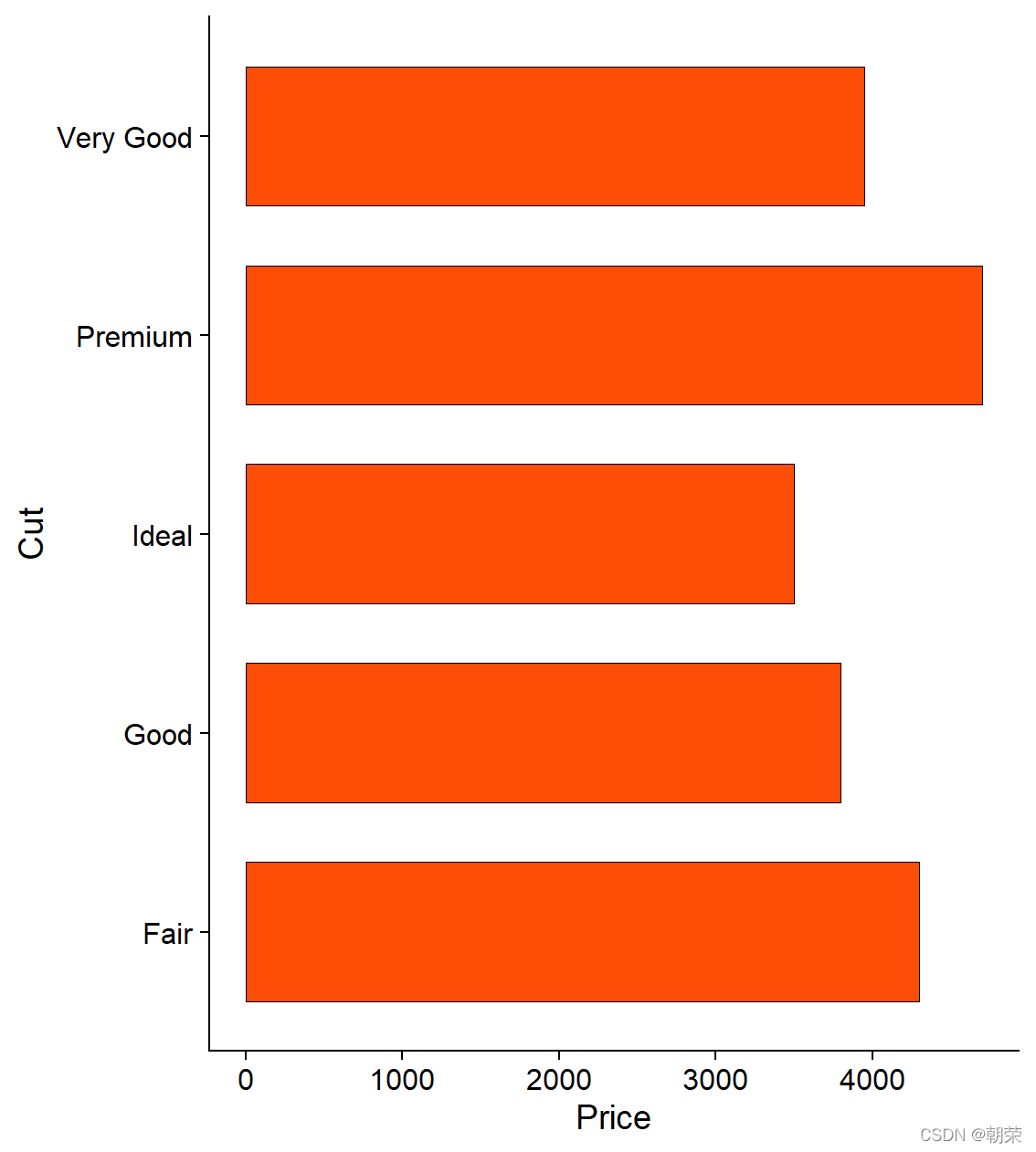
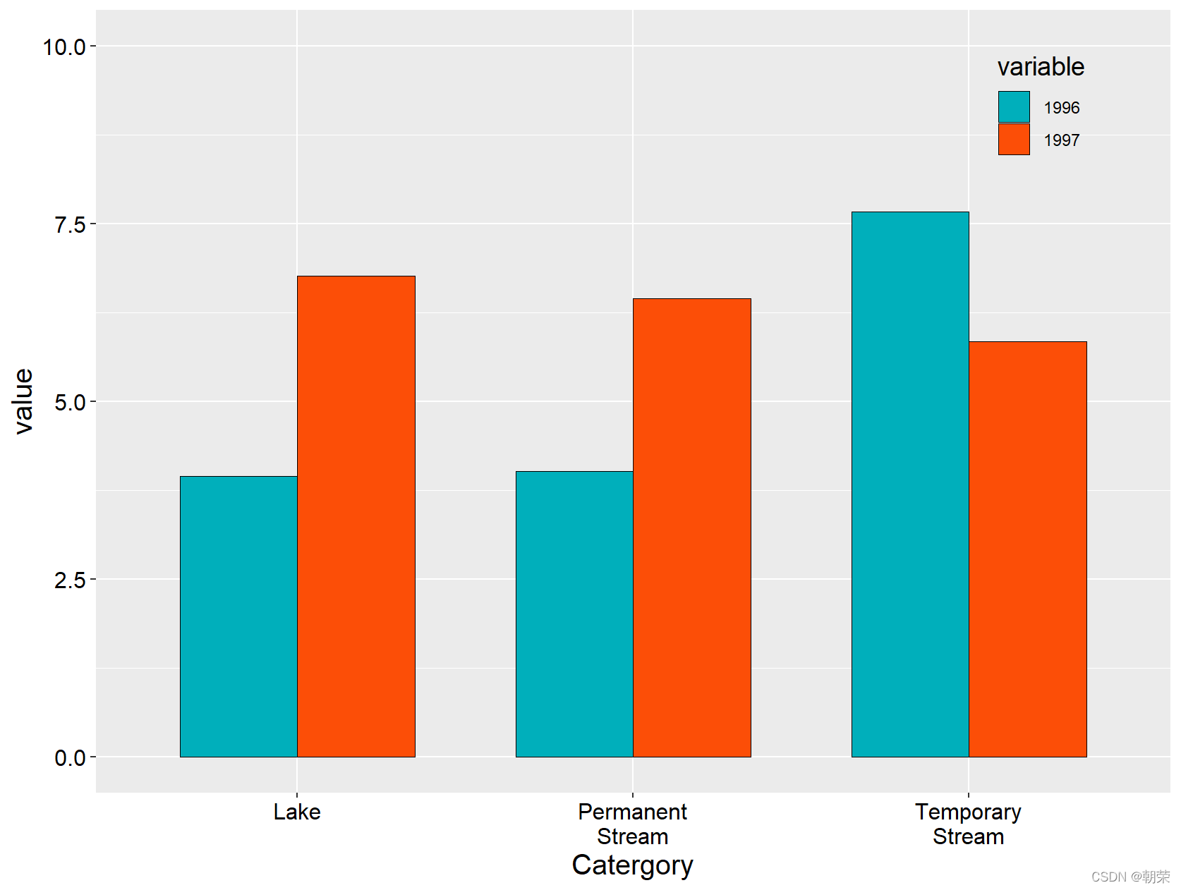
mydata<-read.csv("pubdata/MultiColumn_Data.csv",check.names=FALSE,
                 sep=",",na.strings="NA",
                 stringsAsFactors=FALSE)

mydata<-melt(mydata,id.vars='Catergory')

ggplot(data=mydata,aes(Catergory,value,fill=variable))+
    geom_bar(stat="identity",position=position_dodge(),
             color="black",width=0.7,size=0.25)+
    scale_fill_manual(values=c("#00AFBB", "#FC4E07"))+
    ylim(0, 10)+
    theme(
        axis.title=element_text(size=15,face="plain",color="black"),
        axis.text = element_text(size=12,face="plain",color="black"),
        legend.title=element_text(size=14,face="plain",color="black"),
        legend.background  =element_blank(),
        legend.position = c(0.88,0.88)
    )
?
?
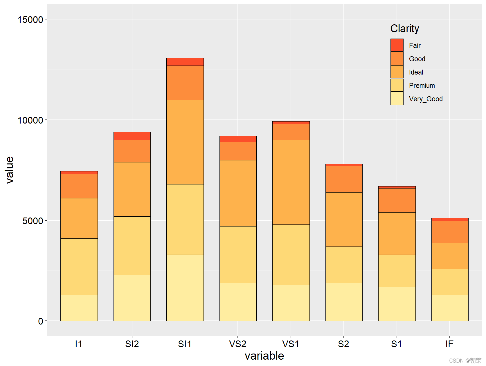
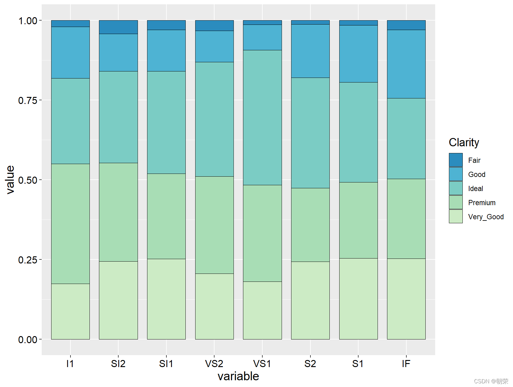
mydata<-read.csv("pubdata/StackedColumn_Data.csv",sep=",",na.strings="NA",stringsAsFactors=FALSE)


mydata<-melt(mydata,id.vars='Clarity')

ggplot(data=mydata,aes(variable,value,fill=Clarity))+
    geom_bar(stat="identity",position="stack", color="black", width=0.7,size=0.25)+
    scale_fill_manual(values=brewer.pal(9,"YlOrRd")[c(6:2)])+
    ylim(0, 15000)+
    theme(
        axis.title=element_text(size=15,face="plain",color="black"),
        axis.text = element_text(size=12,face="plain",color="black"),
        legend.title=element_text(size=14,face="plain",color="black"),
        legend.background  =element_blank(),
        legend.position = c(0.85,0.82)
    )
?
?
mydata<-read.csv("pubdata/StackedColumn_Data.csv",sep=",",na.strings="NA",stringsAsFactors=FALSE)

mydata<-melt(mydata,id.vars='Clarity')

ggplot(data=mydata,aes(variable,value,fill=Clarity))+
    geom_bar(stat="identity", position="fill",color="black", width=0.8,size=0.25)+
    scale_fill_manual(values=brewer.pal(9,"GnBu")[c(7:2)])+
    theme(
        axis.title=element_text(size=15,face="plain",color="black"),
        axis.text = element_text(size=12,face="plain",color="black"),
        legend.title=element_text(size=14,face="plain",color="black"),
        legend.position = "right"
    )
?
# cleveland plot

mydata <- read.csv("pubdata/DotPlots_Data.csv",sep=",",na.strings="NA",stringsAsFactors=FALSE)
mydata$sum <- rowSums(mydata[,2:3])

order<-sort(mydata$sum,index.return=TRUE,decreasing = FALSE)
mydata$City<- factor(mydata$City, levels = mydata$City[order$ix])

ggplot(mydata, aes(sum, City)) +
    geom_point(shape=21, size=3, colour="black", fill="#FC4E07")+
    theme_cowplot()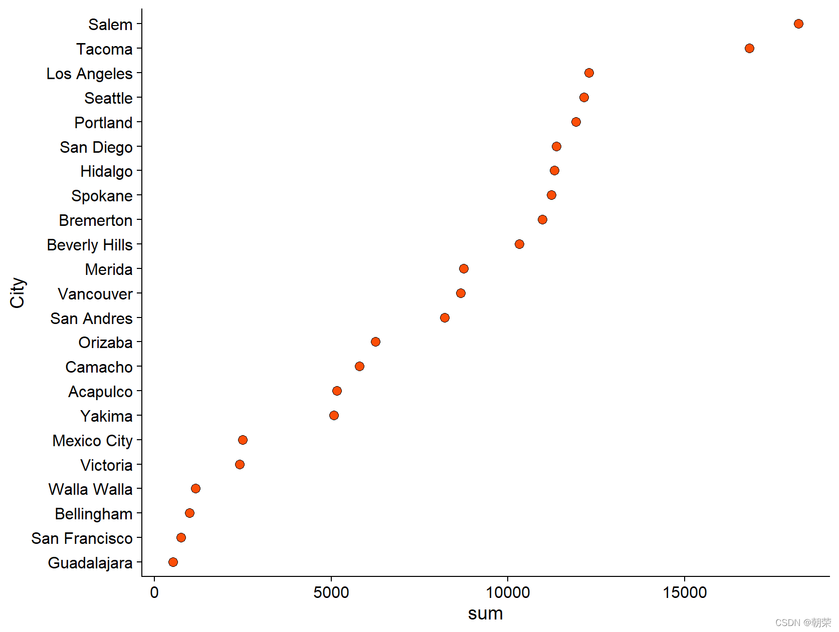
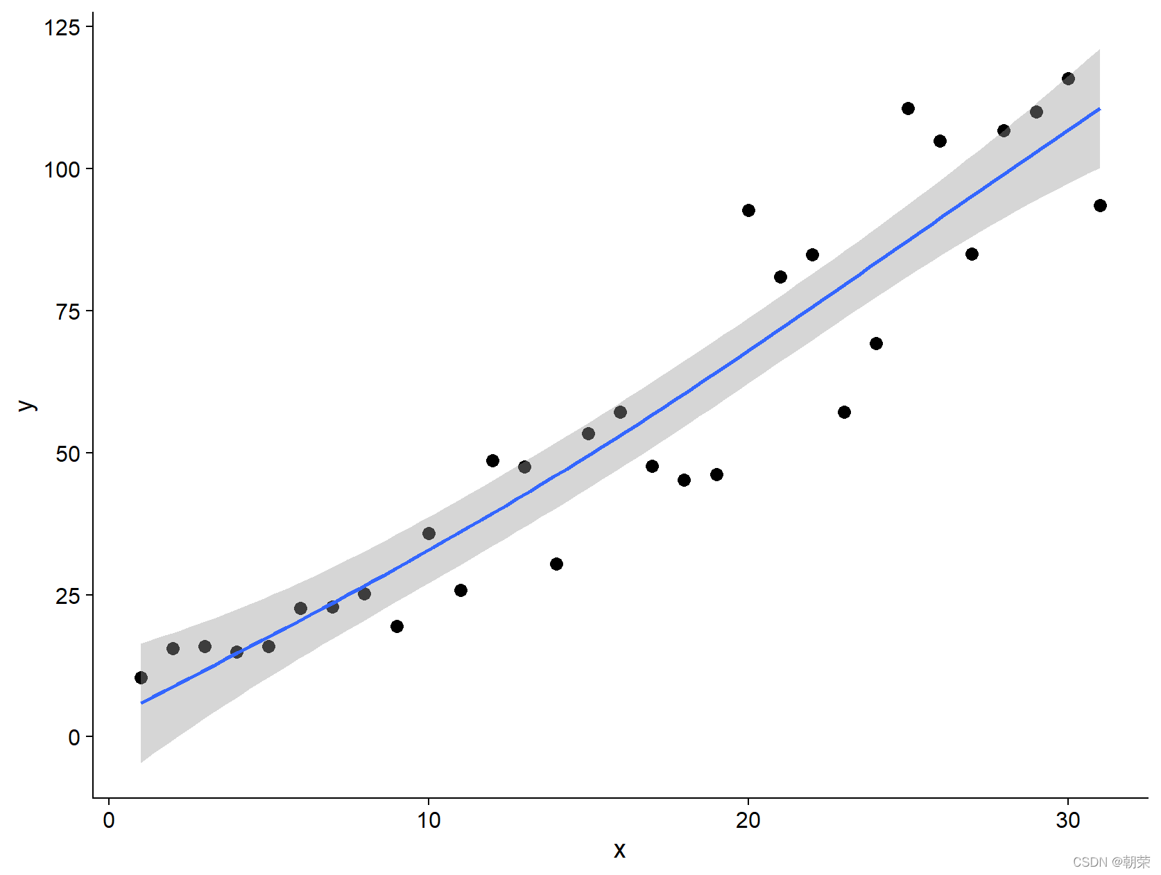
# scatter plot with smoothing
mydata <- read.csv("pubdata/Scatter_Data.csv",stringsAsFactors=FALSE)
p <- ggplot(data = mydata, aes(x,y)) +
geom_point(fill="black",colour="black",size=3,shape=21) +
scale_y_continuous(breaks = seq(0, 125, 25)) +
theme_cowplot()
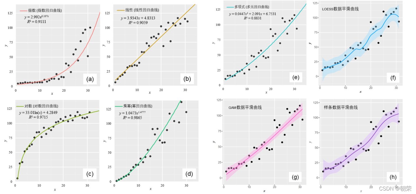
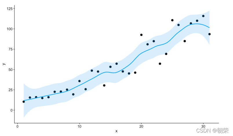
p + geom_smooth(method = 'loess', span=0.4, se=TRUE, formula=y~x,
colour="#00A5FF", fill="#00A5FF", alpha=0.2)
p + geom_smooth(method="lm",se=TRUE,formula=y ~ splines::bs(x, 5),colour="red")
p + geom_smooth(method = 'gam',formula=y ~s(x))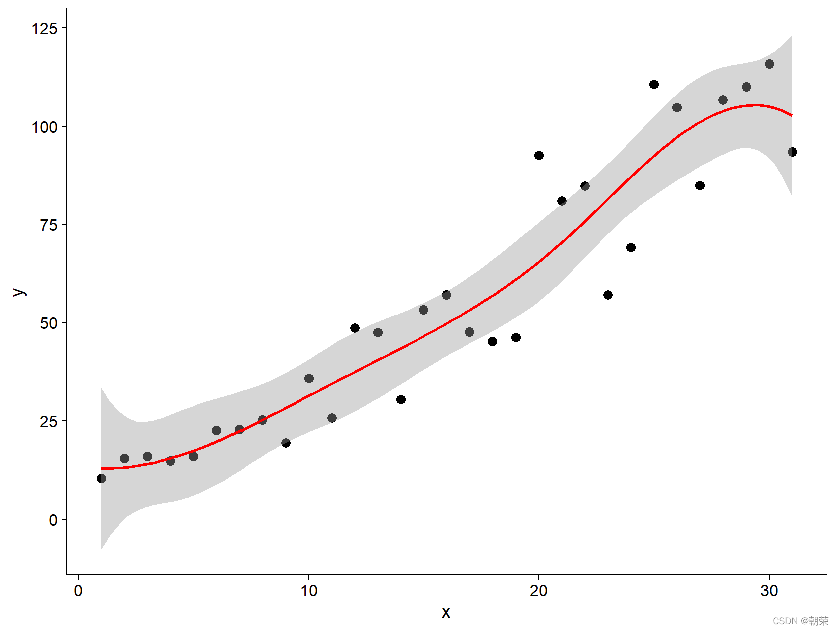
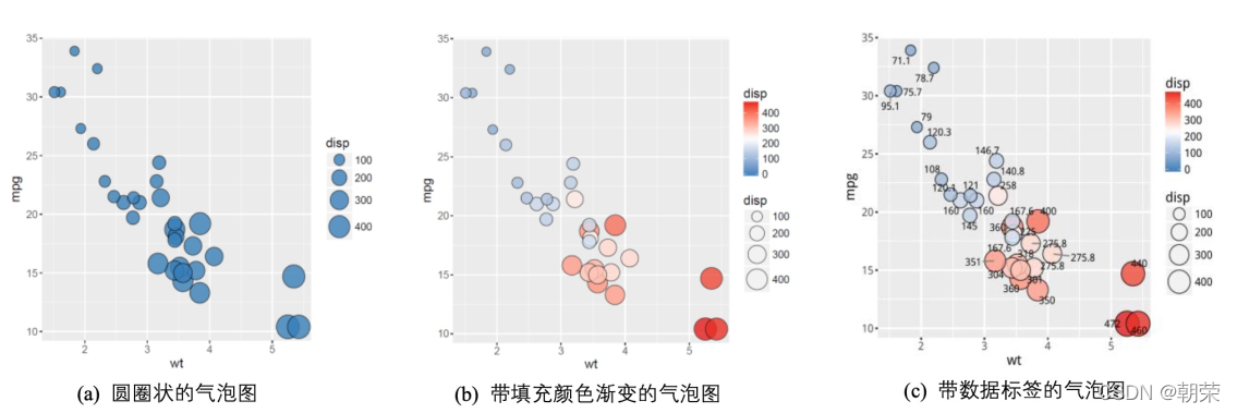
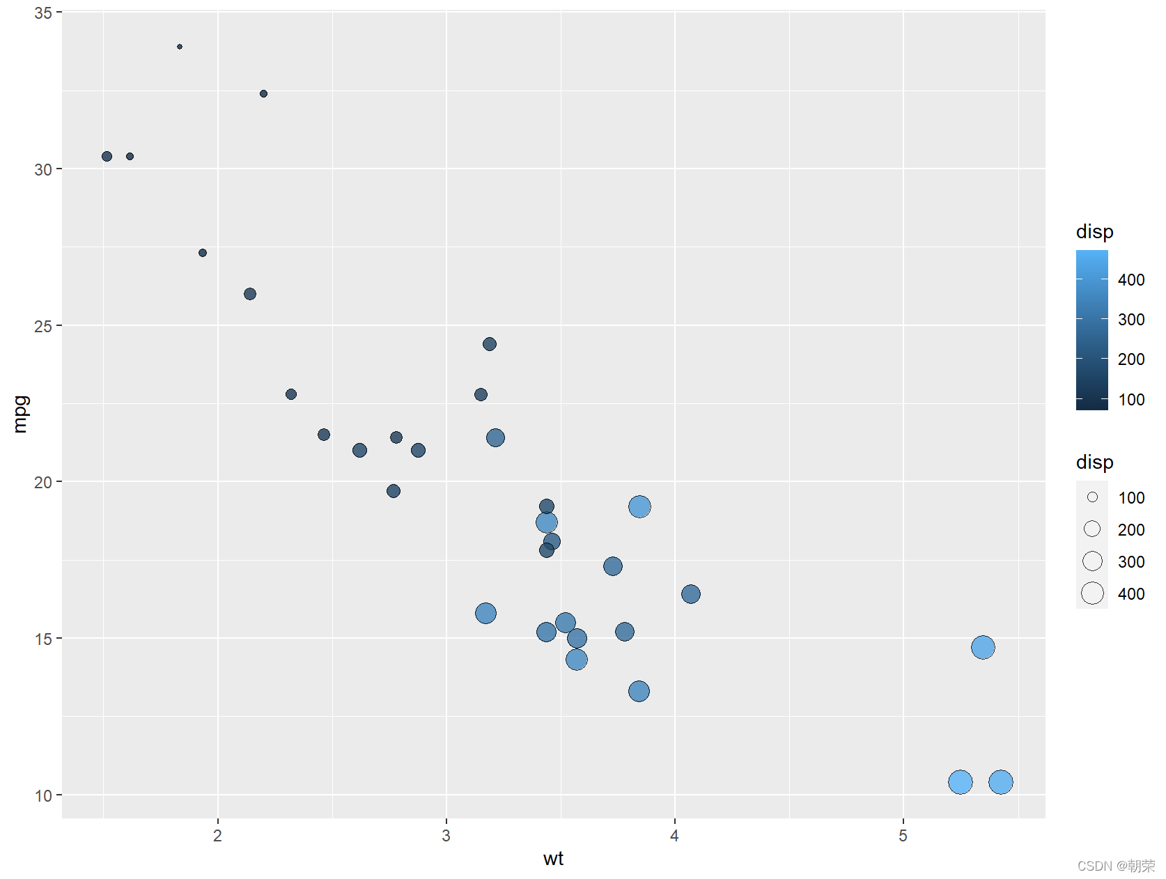
# bubble chart
ggplot(data=mtcars, aes(x=wt,y=mpg))+
geom_point(aes(size=disp, fill=disp), shape=21, colour="black", alpha=0.8)
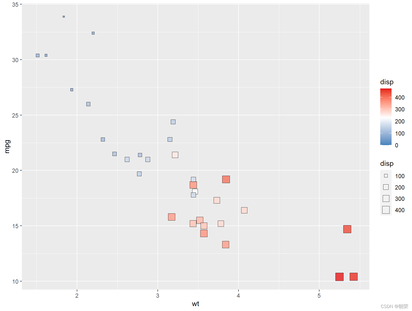
ggplot(data=mtcars, aes(x=wt, y=mpg)) +
geom_point(aes(size=disp, fill=disp), shape=21, colour="black", alpha=0.8) +
scale_fill_gradient2(low="#377EB8",high="#E41A1C",
limits = c(0,max(mtcars$ disp)),
midpoint = mean(mtcars$disp)) +
theme_cowplot()
ggplot(data=mtcars, aes(x=wt,y=mpg))+
geom_point(aes(size=disp,fill=disp),shape=22,colour="black",alpha=0.8)+
scale_fill_gradient2(low="#377EB8",high="#E41A1C",limits = c(0,max(mtcars$ disp)),
midpoint = mean(mtcars$disp))

?
# histogram/density

df <- read.csv("pubdata/Hist_Density_Data.csv", stringsAsFactors=FALSE)

ggplot(df, aes(x = MXSPD, fill = Location))+
    geom_histogram(binwidth = 1, alpha=0.5, colour="black", size=0.25) +
    theme_cowplot()

ggplot(df, aes(x = MXSPD,  fill = Location)) +
    geom_density(alpha=0.5, colour="black", size=0.25) +
    theme_cowplot()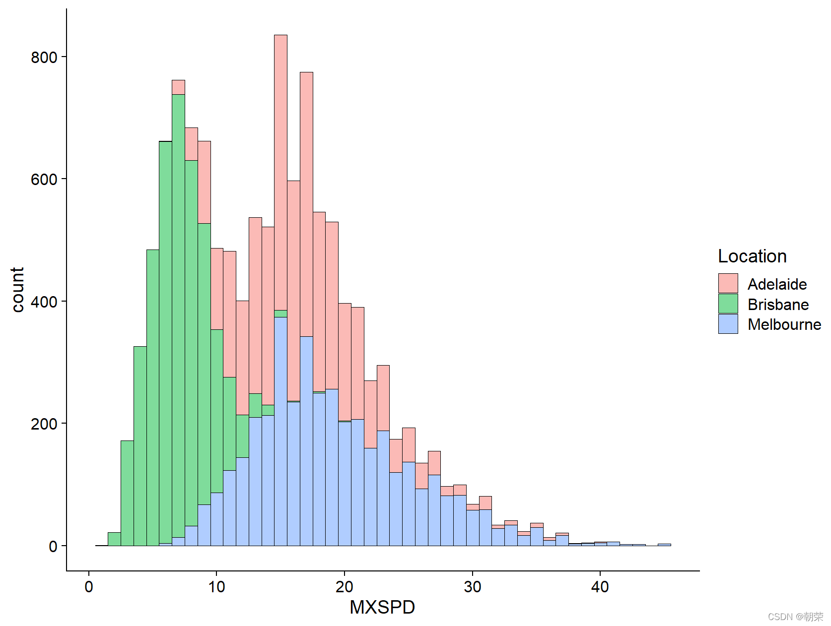
?
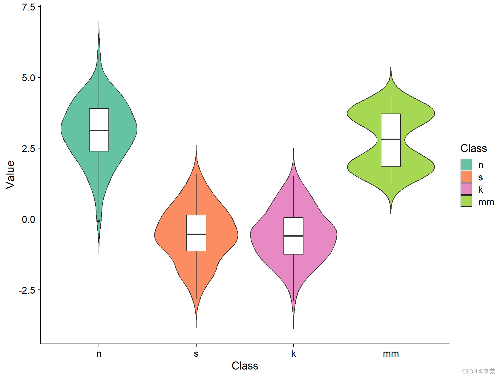
# jitter
library(SuppDists)
set.seed(141079)
n <- rnorm(100,3,1)
s <- rJohnson(100, parms<-JohnsonFit(c(0,1,-.5,4),moment="use"))
k <- rJohnson(100, parms<-JohnsonFit(c(0,1,-.5,4),moment="use"))
mm <- rnorm(100, rep(c(2, 4), each = 50) * sqrt(0.9), sqrt(0.1))
mydata <- data.frame(
Class = factor(rep(c("n", "s", "k", "mm"), each = 100),
c("n", "s", "k", "mm")),
Value = c(n, s, k, mm)
)
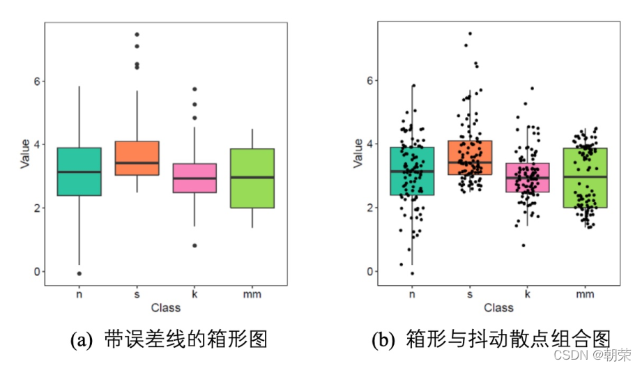
ggplot(mydata, aes(Class, Value)) +
geom_jitter(aes(fill = Class), position = position_jitter(0.3), shape=21, size=2)+
scale_fill_manual(values=c(brewer.pal(7,"Set2")[c(1,2,4,5)]))+
theme_cowplot()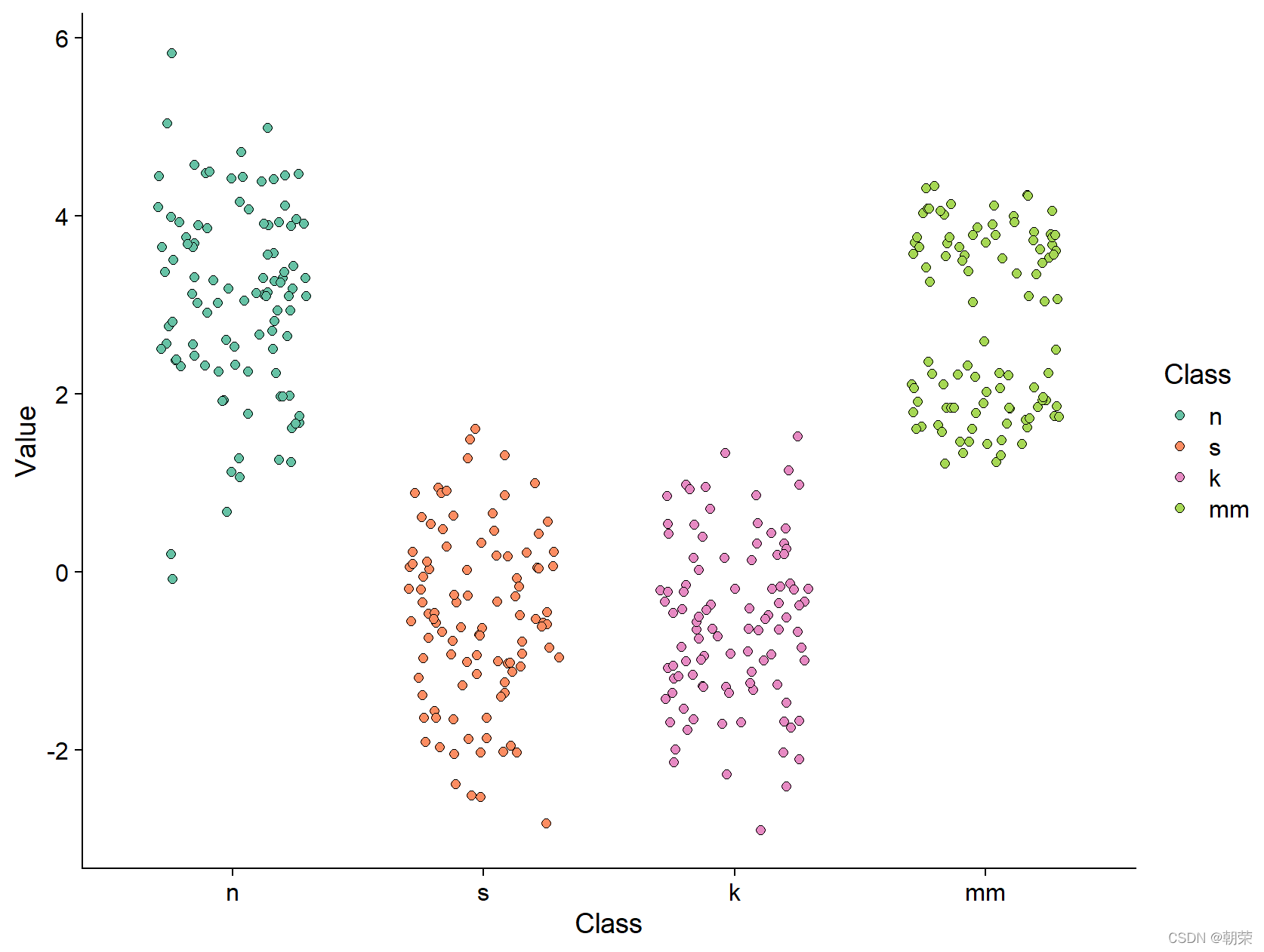
# violin plot

ggplot(mydata, aes(Class, Value))+
    geom_violin(aes(fill = Class), trim = FALSE) +
    geom_boxplot(width = 0.2) +
    scale_fill_manual(values=c(brewer.pal(7,"Set2")[c(1,2,4,5)]))+
    theme_cowplot()
?
# ggpubr
library(ggpubr)
palette <- c(brewer.pal(7,"Set2")[c(1,2,4,5)])
ggboxplot(mydata, x = "Class", y = "Value",
fill = "Class", palette = palette,
add = "none", size=0.5, add.params = list(size = 0.25)) +
geom_hline(yintercept = mean(mydata$Value), linetype = 2) + #添加均值线
stat_compare_means(method = "anova", label.x=0.8,label.y = 7.8) + # 添加全部数据的annova 方法的p-value
stat_compare_means(label = "p.signif", method = "t.test",
ref.group = ".all.", hide.ns = TRUE,label.y = 8) + # 添加每组变量与全部数据的显著�?
theme_cowplot()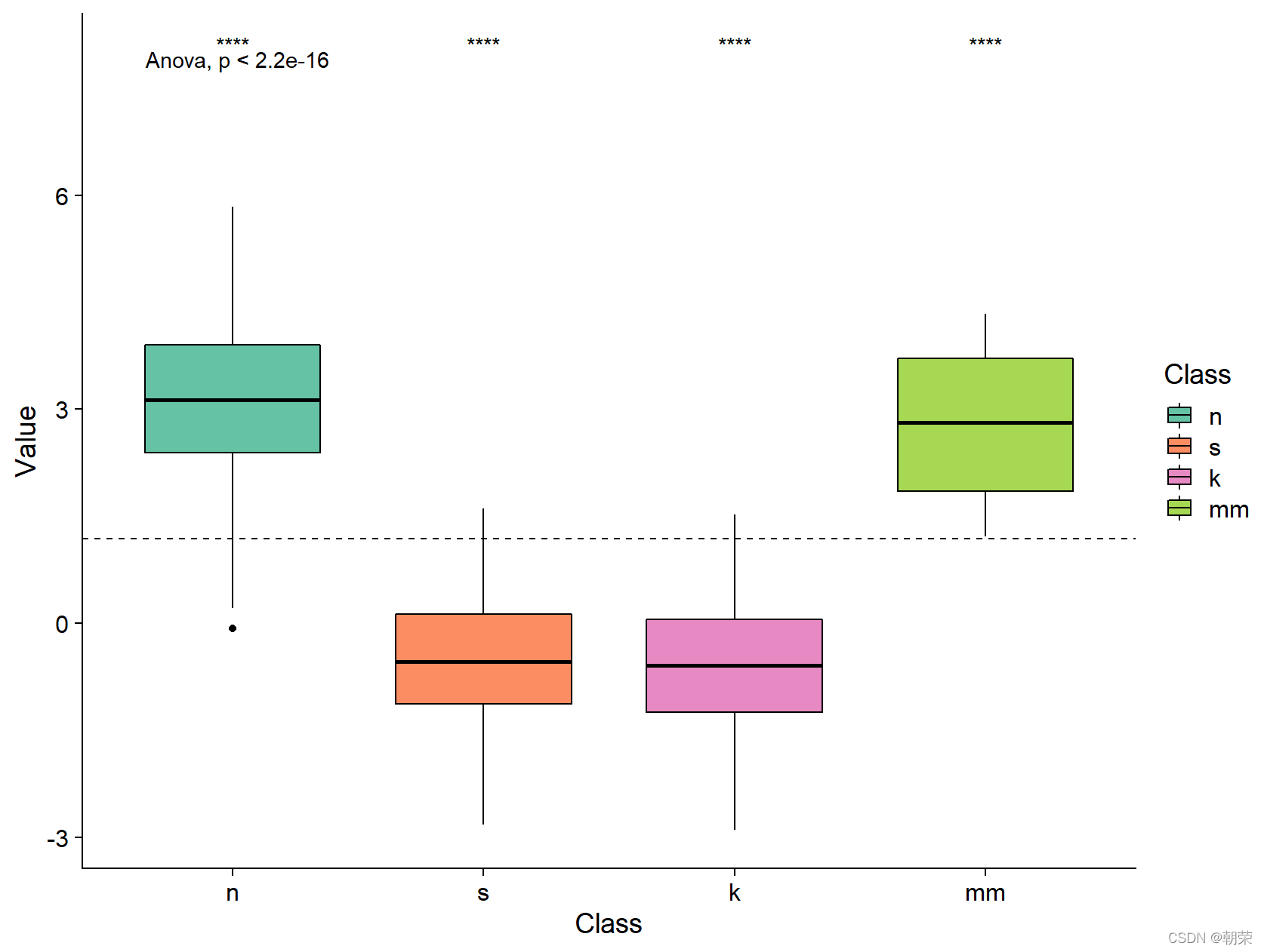
?
# line plot, area plot

linedata <- read.csv('pubdata/linearea.csv')
linedata$date<-as.Date(linedata$date,origin = "1970-01-01")

ggplot(linedata, aes(x = date, y = y)) +
    geom_line(color="black", size=0.5) +
    # geom_bar(color="steelblue", stat = "identity") +
    scale_x_date(date_labels = "%Y", date_breaks = "1 year") +
    theme_cowplot()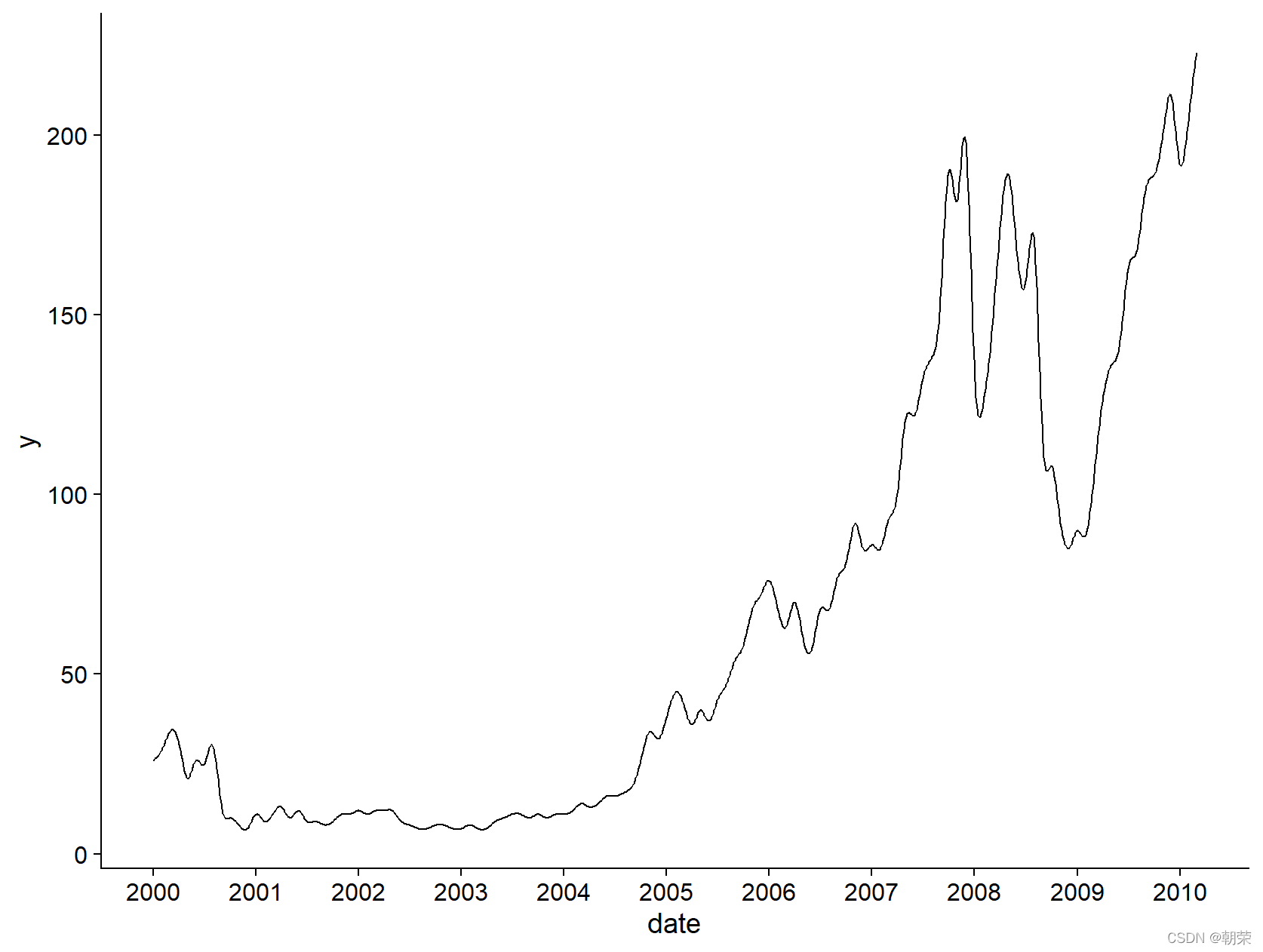
?
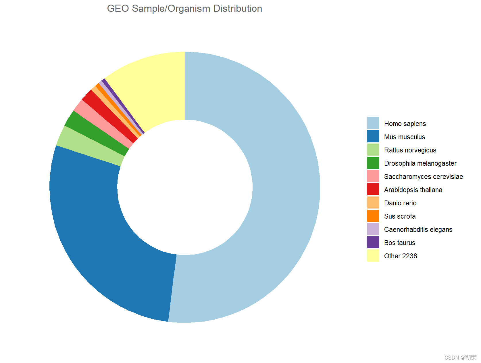
# donut plot

model11 <- read.csv("pubdata/model11.csv")
model11$Organism <- factor(model11$Organism, levels = model11$Organism)

mypalette <- wes_palette("Darjeeling2", n = 11, type="continuous")
mypalette <- c(brewer.pal(11, "Paired"))

ggplot(data = model11, aes(ymax=ymax, ymin=ymin, xmax=4, xmin=3, fill=Organism)) +
    geom_rect() +
    coord_polar(theta="y") +
    xlim(c(2, 4)) +
    labs(x = NULL, y = NULL, fill = NULL, title = "GEO Sample/Organism Distribution") +
    guides(fill = guide_legend()) +
    scale_fill_manual(values = mypalette) +
    theme_classic() +
    theme(axis.line  = element_blank(),
          axis.text  = element_blank(),
          axis.ticks = element_blank(),
          plot.title = element_text(hjust = 0.5, color = "#666666"))
?
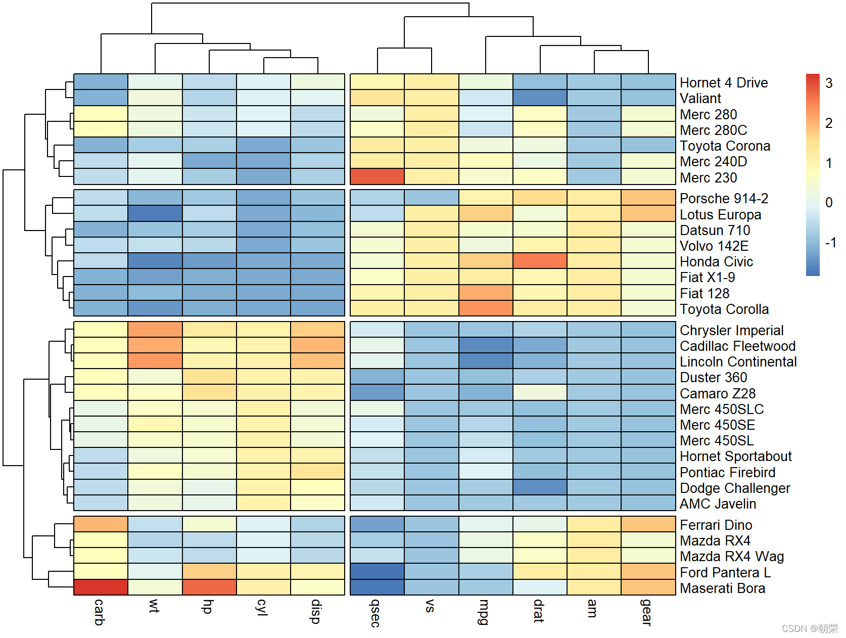
# heatmap

library(pheatmap)

df <- scale(mtcars)
colormap <- colorRampPalette(rev(brewer.pal(n = 7, name = "RdYlBu")))(100)
breaks <- seq(min(unlist(c(df))), max(unlist(c(df))), length.out=100)

pheatmap(df, color = colormap, breaks = breaks, border_color = "black",
         cutree_col = 2,
         cutree_row = 4
        )
?
# treemap

library(treemapify)

comm <- read.csv("pubdata/communities.csv")
comm$name <- factor(comm$name, levels = comm$name)

mypalette <- c(brewer.pal(10, "Paired"))
mypalette <- wes_palette("Darjeeling2", n = 10, type = "continuous")

ggplot(data = comm, aes(area = activelab, fill = name, label = name)) +
    geom_treemap(show.legend = F) +
    geom_treemap_text(colour = "white", place = "centre", grow = T) +
    scale_fill_manual(values = mypalette)