布局类组件介绍
环境介绍以及参考文献
本示例是在 Linux 16.04.1-Ubuntu 搭配 VS Code 使用。
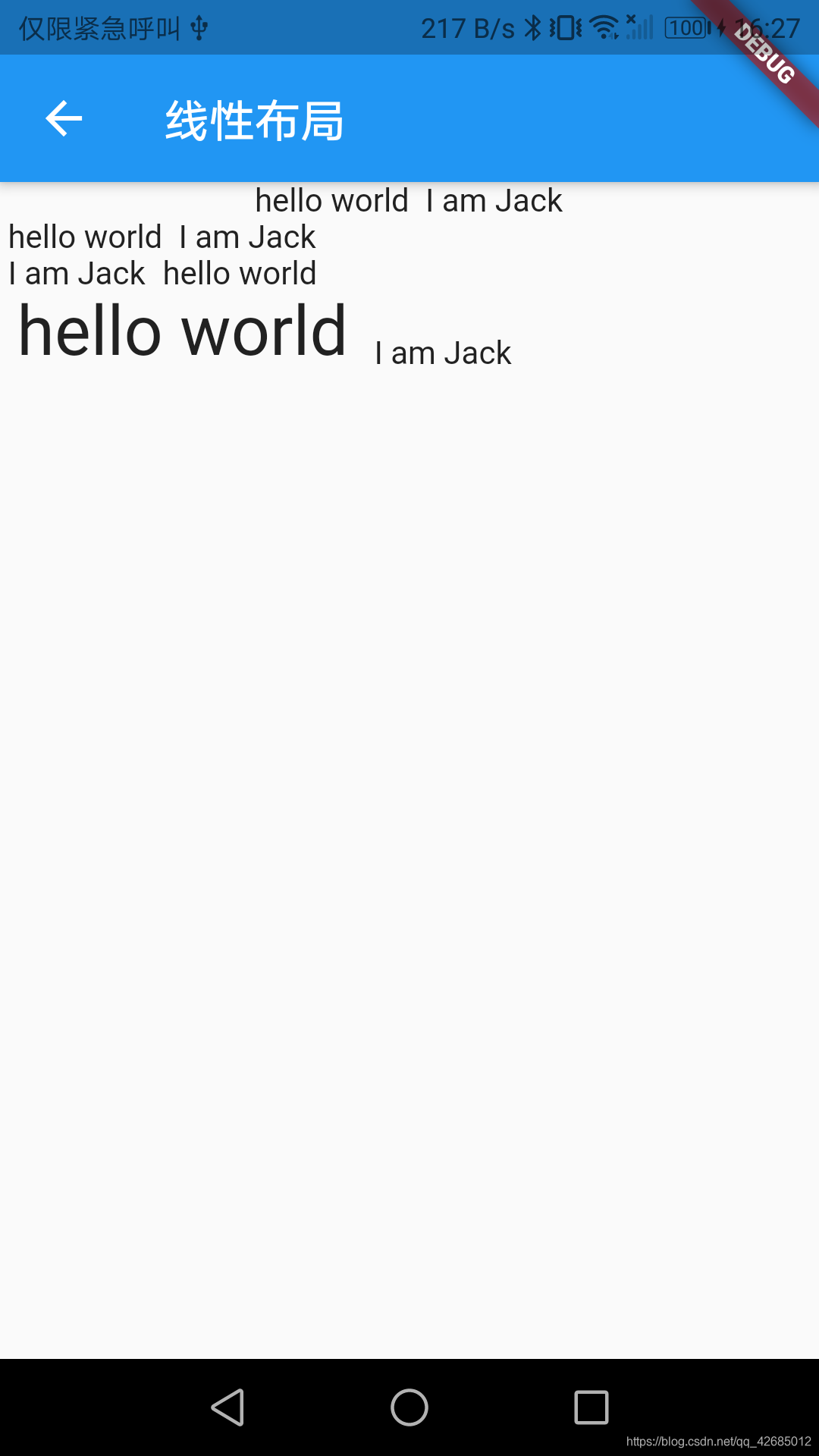
线性布局
线性布局分为水平方向(Row)和垂直方向(Column)。
主轴和纵轴和线性布局的相关,水平方向的布局主轴就是水平方向,纵轴就是垂直方向,垂直方向的布局则相反。
区分主轴和纵轴的意义在于,线性布局有主轴对齐(MainAxisAlignment)和纵轴对齐(CrossAxisAlignment)。
如果 Row 里面嵌套 Row,或者 Column 里面再嵌套 Column,那么只有最外面的 Row 或 Column 会占用尽可能大的空间,里面 Row 或 Column 所占用的空间为实际大小。
示例:
class RowAndColumnLayout extends StatelessWidget{
  @override
  Widget build(BuildContext context) {
    return Scaffold(
      appBar: AppBar(
        title: Text("线性布局"),
      ),
      body: Center(
        child: Column(
          children: <Widget> [
            Column(
              crossAxisAlignment: CrossAxisAlignment.start,
              children: <Widget>[
                Row(
                  mainAxisAlignment: MainAxisAlignment.center,
                  children: <Widget>[
                    Text(" hello world "),
                    Text(" I am Jack "),
                  ],
                ),
                Row(
                  mainAxisSize: MainAxisSize.min,
                  mainAxisAlignment: MainAxisAlignment.center,
                  children: <Widget>[
                    Text(" hello world "),
                    Text(" I am Jack "),
                  ],
                ),
                Row(
                  mainAxisAlignment: MainAxisAlignment.end,
                  textDirection: TextDirection.rtl,
                  children: <Widget>[
                    Text(" hello world "),
                    Text(" I am Jack "),
                  ],
                ),
                Row(
                  crossAxisAlignment: CrossAxisAlignment.start,
                  verticalDirection: VerticalDirection.up,
                  children: <Widget>[
                    Text(" hello world ", style: TextStyle(fontSize: 30.0),),
                    Text(" I am Jack "),
                  ],
                ),
              ]
            )
          ],
        ),
      ),
    );
  }
}
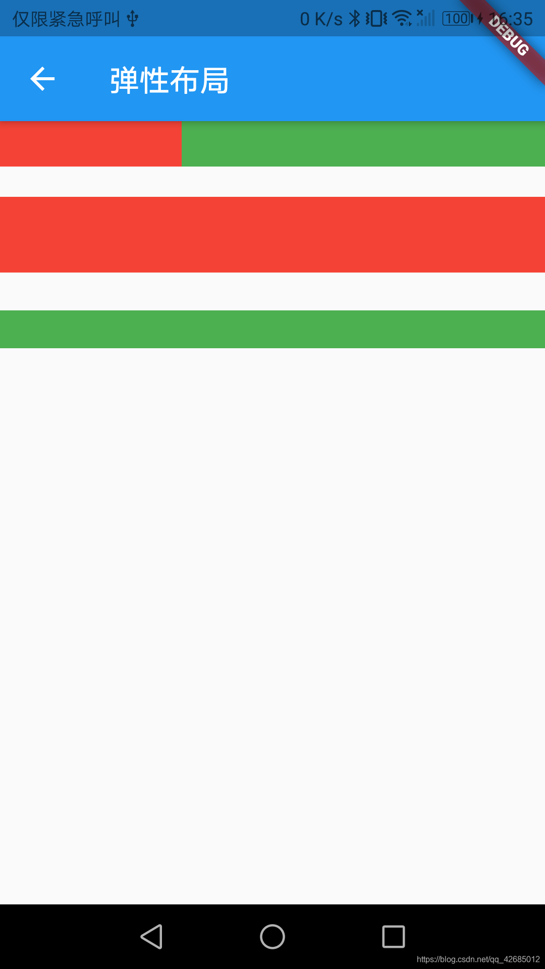
弹性布局
弹性布局允许子组件按照一定比例来分配父容器空间。
Flex
Flex 组件可以沿着水平和垂直方向排列子组件,如果知道主轴的方向后,使用 Row 或者 Column 会方便一些, Row 和 Column 继承 Flex。
Expanded
可以按比例“扩伸” Row、Column 和 Flex 子组件所占用的空间。
其 flex 参数为弹性系数,0 或者 null 表示无弹性,即不会扩伸空间;若大于0,则所有的 Expanded 按照其 flex 的比例来分割主轴的全部空闲空间。
class FlexLayout extends StatelessWidget{
  @override
  Widget build(BuildContext context) {
    return Scaffold(
      appBar: AppBar(
        title: Text("弹性布局"),
      ),
      body: Center(
        child: Column(
          children: <Widget>[
            Flex(
              direction: Axis.horizontal,
              children: <Widget>[
                Expanded(
                  flex: 1,
                  child: Container(
                    height: 30.0,
                    color: Colors.red,
                  ),
                ),
                Expanded(
                  flex: 2,
                  child: Container(
                    height: 30.0,
                    color: Colors.green,
                  ),
                ),
              ],
            ),
            Padding(
              padding: const EdgeInsets.only(top: 20.0),
              child: SizedBox(
                height: 100.0,
                //Flex的三个子widget,在垂直方向按2:1:1来占用100像素的空间
                child: Flex(
                  direction: Axis.vertical,
                  children: <Widget>[
                    Expanded(
                      flex: 2,
                      child: Container(
                        height: 30.0,
                        color: Colors.red,
                      ),
                    ),
                    Spacer(
                      flex: 1,
                    ),
                    Expanded(
                      flex: 1,
                      child: Container(
                        height: 30.0,
                        color: Colors.green,
                      ),
                    ),
                  ]
                )
              )
            ),
          ],
        ),
      ),
    );
  }
}
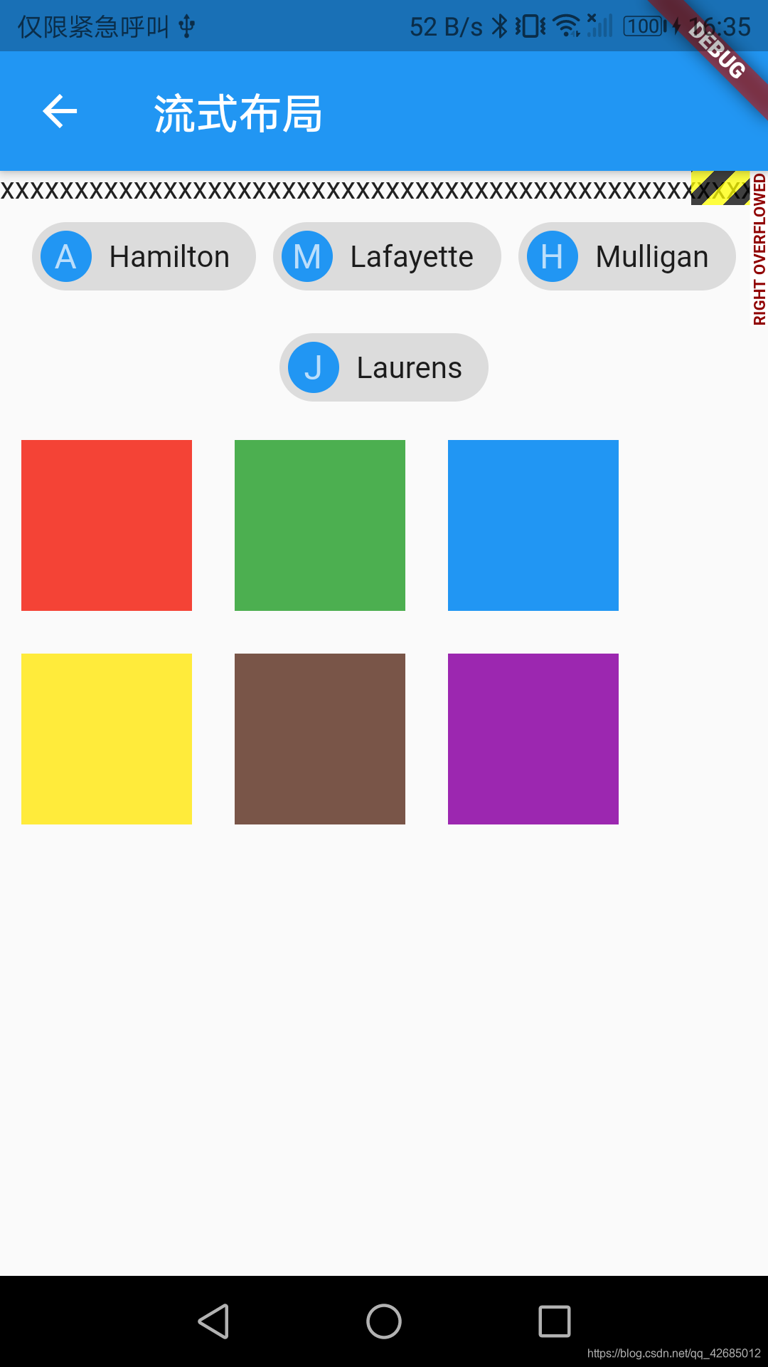
流式布局
如果子 Widget 超出屏幕范围,会报溢出错误。流式布局就是把超出屏幕显示范围自动折行的布局。
Wrap
Wrap 相较于 Flex,多出来几个属性,主要也就是用来处理超出显示范围后的折行。
- spacing:主轴方向子widget的间距
- runSpacing:纵轴方向的间距
- runAlignment:纵轴方向的对齐方式
Flow
需要自己去实现子 widget 的位置转换,主要运用在自定义布局策略或性能要求较高的场景。否则优先考虑 Wrap。
class WrapLayout extends StatelessWidget{
  @override
  Widget build(BuildContext context) {
    return Scaffold(
      appBar: AppBar(
        title: Text("流式布局"),
      ),
      body: Center(
        child: Column(
          children: <Widget>[
            Row(
              children: <Widget>[
                Text("xxx"*100)
              ],
            ),
            Wrap(
              spacing: 8.0, // 主轴(水平)方向间距
              runSpacing: 4.0, // 纵轴(垂直)方向间距
              alignment: WrapAlignment.center, //沿主轴方向居中
              children: <Widget>[
                new Chip(
                  avatar: new CircleAvatar(backgroundColor: Colors.blue, child: Text('A')),
                  label: new Text('Hamilton'),
                ),
                new Chip(
                  avatar: new CircleAvatar(backgroundColor: Colors.blue, child: Text('M')),
                  label: new Text('Lafayette'),
                ),
                new Chip(
                  avatar: new CircleAvatar(backgroundColor: Colors.blue, child: Text('H')),
                  label: new Text('Mulligan'),
                ),
                new Chip(
                  avatar: new CircleAvatar(backgroundColor: Colors.blue, child: Text('J')),
                  label: new Text('Laurens'),
                ),
              ],
            ),
            Flow(
              delegate: TestFlowDelegate(margin: EdgeInsets.all(10.0)),
              children: <Widget>[
                new Container(width: 80.0, height:80.0, color: Colors.red,),
                new Container(width: 80.0, height:80.0, color: Colors.green,),
                new Container(width: 80.0, height:80.0, color: Colors.blue,),
                new Container(width: 80.0, height:80.0,  color: Colors.yellow,),
                new Container(width: 80.0, height:80.0, color: Colors.brown,),
                new Container(width: 80.0, height:80.0,  color: Colors.purple,),
              ],
            )
          ],
        ),
      ),
    );
  }
}
class TestFlowDelegate extends FlowDelegate {
  EdgeInsets margin = EdgeInsets.zero;
  TestFlowDelegate({required this.margin});
  @override
  void paintChildren(FlowPaintingContext context) {
    var x = margin.left;
    var y = margin.top;
    //计算每一个子widget的位置
    for (int i = 0; i < context.childCount; i++) {
      var w = context.getChildSize(i)!.width + x + margin.right;
      if (w < context.size.width) {
        context.paintChild(i,
            transform: new Matrix4.translationValues(
                x, y, 0.0));
        x = w + margin.left;
      } else {
        x = margin.left;
        y += context.getChildSize(i)!.height + margin.top + margin.bottom;
        //绘制子widget(有优化)
        context.paintChild(i,
            transform: new Matrix4.translationValues(
                x, y, 0.0));
         x += context.getChildSize(i)!.width + margin.left + margin.right;
      }
    }
  }

  @override
  getSize(BoxConstraints constraints){
    //指定Flow的大小
    return Size(double.infinity,200.0);
  }

  @override
  bool shouldRepaint(FlowDelegate oldDelegate) {
    return oldDelegate != this;
  }
}
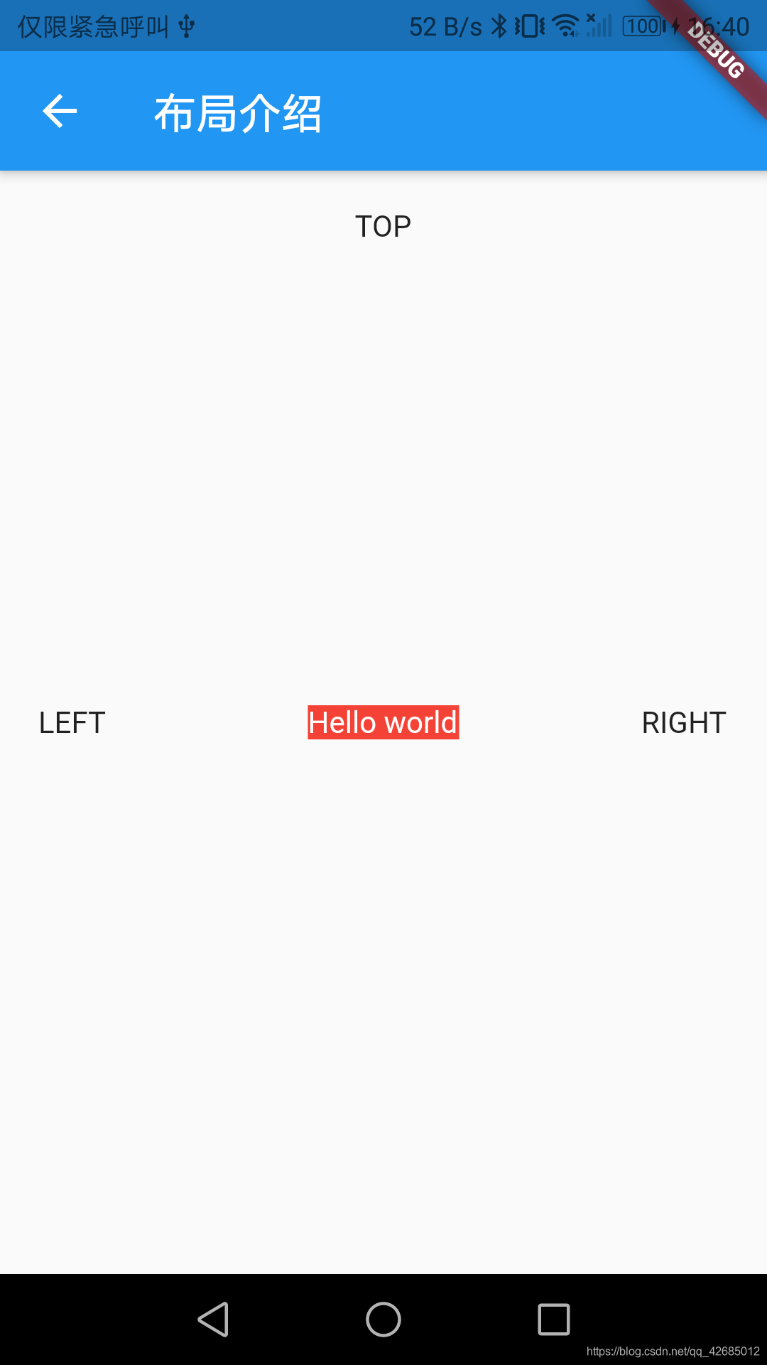
层叠布局
子组件可以根据距父容器的四个角的位置来确定自身的位置。
Stack 允许子组件堆叠(按照代码中声明的顺序), Positioned 用于根据 Stack 的四个角来确定子组件的位置。
class StackLayout extends StatelessWidget{
  @override
  Widget build(BuildContext context) {
    return Scaffold(
      appBar: AppBar(
        title: Text("布局介绍"),
      ),
      body:
        ConstrainedBox(
          constraints: BoxConstraints.expand(),
          child: Stack(
            // fit: StackFit.expand, //此参数用于确定没有定位的子组件如何去适应 Stack 的大小。
            alignment:Alignment.center , //指定未定位或部分定位widget的对齐方式
            children: <Widget>[
              Positioned(
                right: 18.0,
                child: Text("RIGHT"),
              ),
              Container(child: Text("Hello world",style: TextStyle(color: Colors.white)),
                color: Colors.red,
              ),
              Positioned(
                left: 18.0,
                child: Text("LEFT"),
              ),
              Positioned(
                top: 18.0,
                child: Text("TOP"),
              )
            ],
          ),
        ),
    );
  }
}
对齐与相对定位
Align
用来调整子组件的位置,并且根据子组件的狂傲来确定自身的宽高。
Alignment,表示矩形内的一个点,两个属性 x,y 用来表示水平和垂直方向的偏移。
Alignment Widget 以矩形的中心点作为坐标原点。
FractionalOffset 继承自 Alignment,以矩形的左侧顶点为原点。
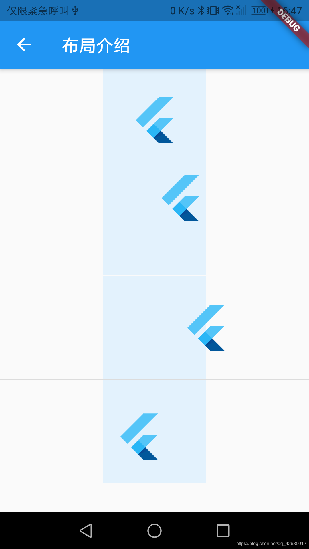
class AlignLayout extends StatelessWidget{
  @override
  Widget build(BuildContext context) {
    return Scaffold(
      appBar: AppBar(
        title: Text("布局介绍"),
      ),
      body: Column(
        children: <Widget>[
          Container(
            height: 120.0,
            width: 120.0,
            color: Colors.blue[50],
            child: Align(
              child: FlutterLogo(
                size: 60,
              ),
            ),
          ),
          Divider(
            height: 1.0,
            indent: 0.0,
            color: Colors.grey[150],
          ),
          Container(
            height: 120.0,
            width: 120.0,
            color: Colors.blue[50],
            child: Align(
              alignment: Alignment.topRight,
              child: FlutterLogo(
                size: 60,
              ),
            ),
          ),
          Divider(
            height: 1.0,
            indent: 0.0,
            color: Colors.grey[150],
          ),
          Container(
            height: 120.0,
            width: 120.0,
            color: Colors.blue[50],
            child: Align(
              alignment: Alignment(2,0.0),
              child: FlutterLogo(
                size: 60,
              ),
            ),
          ),
          Divider(
            height: 1.0,
            indent: 0.0,
            color: Colors.grey[150],
          ),
          Container(
            height: 120.0,
            width: 120.0,
            color: Colors.blue[50],
            child: Align(
              alignment: FractionalOffset(0.2, 0.6),
              child: FlutterLogo(
                size: 60,
              ),
            ),
          ),
        ],
      )

    );
  }
}