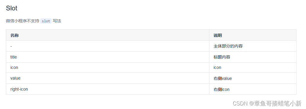
今天使用uView插件的时候发现Collapse 折叠面板有点问题,主要是小程序了不能自定义标题,图标等,没错又是小程序!每次都是小程序,咱就说一套代码适配多端真的很多坑,尤其是小程序。 好了不废话了,先证明一下官网的确指明小程序不可以自定义使用插槽。如图
?官网Collapse 折叠面板 | uView 2.0 - 全面兼容nvue的uni-app生态框架 - uni-app UI框架
因为研究过uView的源码,有点熟悉(这里也推荐大家去看一下,不仅可以吸取一下解决方案,对组件化开发也有帮助,最重要的是对于本菜鸟来说这个源码相对简单,不知道有没有童鞋去看过element-plus源码,整个过程就是从打开到放弃,超出本人水平了,不过有机会我还是会看的,优秀的代码的确值得学习哈哈哈)
一:源码位置
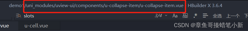
?demo1那里就是自己项目的命名(这波属于保姆级手摸手讲解了~~~)
二:分析源码
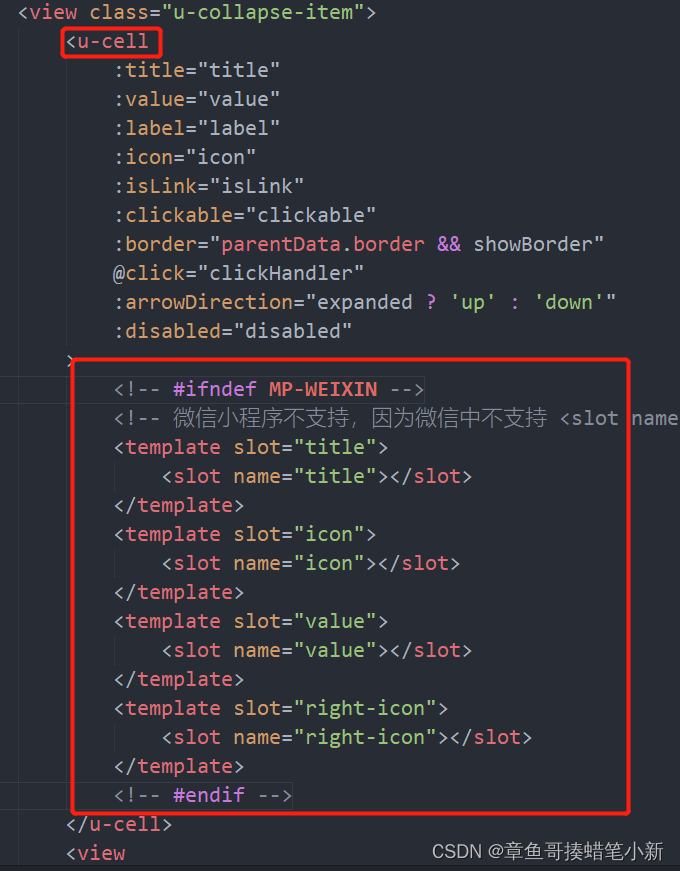
?获取两个重要信息1是源码直接用#ifndef排除了微信小程序使用插槽的可能,2是u-collapse-item中的插槽来源是u-cell组件的(这个很重要,下面有的内容还需要去u-cell了解)
三:解决方案
既然源码排除了在小程序使用插槽的可能,我们就加上这种可能
//源码修改后 ifndef删掉
<template slot="title">
        <slot name="title1">{{title}}</slot>
</template>
<template slot="icon" >
        <slot name="icon1"></slot>
</template>
<template slot="value" >
        <slot name="value1"></slot>
</template>

<template slot="right-icon">
        <slot name="right-icon1" v-if="$slots['right-icon1']">
        </slot>
        <u-icon name="arrow-right"  v-else></u-icon>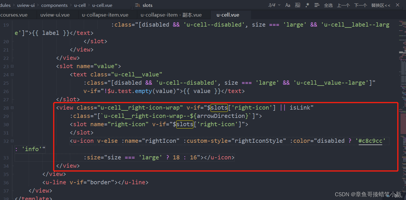
</template>看到源码有写到小程序不支持<slot name="title" slot="title" />的写法,所以作者才放弃让小程序使用插槽吧,我试了一下只要name="title"和slot="title"的值不一样就行了,所以我选择用title1,icon1,value1,right-icon1作为我要自定义时的命名插槽,那title,icon,value,right-icon是谁呢,很显然是u-cell的命名插槽,去看了一下u-cell关于这个四个插槽的源码,像文字类的title,value很好解决,icon本来u-collapse-item就默认没有只用考虑自定义就得行了,最难的就是right-icon,又要考虑自定义,又要考虑啥也不传使用默认的图标,试了很久都不能两者兼得(这或许是作者考虑组件稳定性而舍弃小程序使用插槽的又一可能吧)
?
看了下u-cell关于right-icon插槽的源码,作者做了个判断有$slots['right-icon']则显示自定义插槽,无则显示默认u-icon。我们在改的时候也根据这个思路改,所以也选择用v-if="$slots['right-icon1']"修改
使用方式

?贴一下代码
//修改源码
<u-cell
    :title="title"
    :value="value"
    :label="label"
    :icon="icon"
    :isLink="isLink"
    :clickable="clickable"
    :border="parentData.border && showBorder"
    @click="clickHandler"
    :arrowDirection="expanded ? 'up' : 'down'"
    :disabled="disabled"
>

    <template slot="title">
            <slot name="title1">{{title}}</slot>

    </template>
    <template slot="icon" >
            <slot name="icon1"></slot>
    </template>
    <template slot="value" >
            <slot name="value1"></slot>
    </template>

    <template slot="right-icon">
            <slot name="right-icon1" v-if="$slots['right-icon1']">
            </slot>
            <u-icon name="arrow-right"  v-else></u-icon>
    </template>
</u-cell>
//使用
<u-collapse accordion>

        <u-collapse-item title="众多利器">
                <text slot="title1" class="u-page__item__title__slot-title">文档指南</text>
                <text slot="value1" class="u-page__item__title__slot-title">自定义内容</text>
                <u-icon name="tags-fill" size="25" slot="icon1"></u-icon>
                <u-icon name="tags-fill" size="25" slot="right-icon1"></u-icon>

                <view class="u-collapse-content">众多的贴心小工具,是您开发过程中召之即来的利器,让您飞镖在手,百步穿杨</view>
        </u-collapse-item>
</u-collapse>
本人验证过修改后可适配多端
总结
uniapp虽然一套代码适配多端的确坑很多,好在相关ui组件源码比较容易阅读,所以自己改改说不定能适配上自己的业务