1 前言
1.1 数据集来源
- 本案例中的数据来自于爱彼迎(Airbnb)网站2018-2019年度的多伦多市的真实数据。
- 数据集中包含listings数据集,约有2万条数据,记录着所有的房屋信息,包括价格在内的几十项信息字段。
- 数据集中的另一个数据集是calendar,包含约650万条的租房交易数据,拥有每一天每一所住房的入驻信息。
1.2 数据分析思路
1.2.1 ETL四板斧
.isnull().sum()检查空值情况,可以了解数据集的总体质量shape检查数据尺寸 ,多少行多少列了解数据数量describe查看数据字典数据类型 count,mean,std,min,25%,50%,75%,max。value_counts()查看数据集合数据分布情况。机器学习中数据分布均衡,1:1的比例。
1.2.2 数据可视化招数
本案中我们主要研究的目标是价格的依赖因素,所以我们采用价格和另一个因素的对比作图来观察。常见可视化招数包括:
- 柱状图,来观察数据的分布情况 。 柱状图高低,可以看到因素对数据的影响情况。
- 箱型图,来观察数据的范围。 上引线(最大值)下引线 (最小值) 75% 25% 平均值。一个图就可以看出数据的范围。
- Pairplot,来观察不同因素间的相互联系。 15个因素和价格因素做对比,一次性画出来,柱状图只能一次一个。
- 热力图,来快速筛选出高关联度的信息因素。快速晒选出高关联的因素。
1.2.3 数据集合的转变
传统的数据分析一般就会到此为止,但是对于探索试数据分析来说,事情才刚刚开始,为了更深入的进行数据分析,我们开始引入机器学习模型,由于机器学习模型本质上就是数学模型,所以我们需要对数据集合进行特征工程,把数据集合变为方便模型识别的数组,本例中采用如下几个步骤:
- 数据的标准化
- 缺失数据的修复
- 字符串类数据的编码化
- 数据类型转换和单位统一
1.2.4 模型
对于本例中的众多字段用简单的线性回归等模型已经不能很好的捕捉出数据的动态,所以我们采用一些符合机器学习模型,也就是利用一系列若关联的特性组合出强特性的模型,在本例中我们采用两个模型:
- 随机森林。这个模型是一个复合模型,对特征和标签进行任意排列组合,然后通过概率方式进行建模,最大程度的降低过拟合的出现
- 微软的LightGBM模型也是最近几年非常火的复合模型,在本例中我们使用这个模型和随机森林进行模型对比,利用R2(0-1)值来选出最合适的机器学习模型。
数据分析中要用多种模型就行,看哪种模型最好。
2 数据实操
实操步骤如下:
实战1:数据的加载和基本ETL
实战2:利用数据可视化对数据集进行第一轮分析
实战3:利用特征工程和标准化对数据集进行数字化处理为机器学习做准备
实战4:利用2个机器学习模型对比来找出最合适的建模方案
2.1 数据的加载和基本ETL
数据集的数据字段描述:
listing_id 房屋数据编号
date 当前记录时间
available 当前房间是否没被租赁,t 有价格,f被租。
price 如果没有被租赁,则显示价格。
用excel只能加载1048576行,用python不止这些数据。
import pandas as pd
import numpy as np
import matplotlib.pyplot as plt
import seaborn as sns
%matplotlib inline

calendar = pd.read_csv('toroto/calendar.csv.gz')
print('We have', calendar.date.nunique(), 'days and', calendar.listing_id.nunique(), 'unique listings in the calendar data.')
We have 365 days and 17333(房源) unique listings in the calendar data.
基本四件套如下:
1.calendar.date.min(), calendar.date.max() 交易的时间范围是在2018年10月6号至2019年10月5号,整整一年的时间
2.calendar.shape 共有630w+条交易记录,4个字段。
listing_id 房屋数据编号
date 当前记录时间
available 当前房间是否没被租赁,t 有价格,f被租。
price 如果没有被租赁,则显示价格。
3.calendar.isnull().sum()price字段,由于房子出租后,就没有价格显示,只有未出租才有价格,所以该字段存在着缺失值。
4.calendar.available.value_counts() available字段中f (false) 代表已经被租用 , t(true) 代表可以被出租。与3中的缺失值字段一致。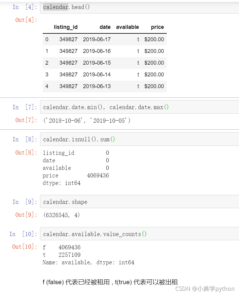
2.2 利用数据可视化进行第一轮分析.
2.2.1 每天房屋的入住率
数据分析
按天进行汇总,找出数据集每天房屋的入住率()
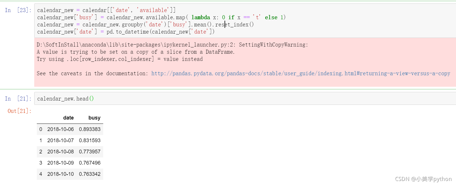
#提取时间日期和房间状态字段并赋值新变量
calendar_new = calendar[['date', 'available']]
#添加一个新的字段记录房源是够被出租.1表示被出租。
calendar_new['busy'] = calendar_new.available.map( lambda x: 0 if x == 't' else 1)
#按照时间日期进行分组求解每日入住的均值并重置索引
calendar_new = calendar_new.groupby('date')['busy'].mean().reset_index()
#最后将时间日期转化为datetime时间格式,原来是字符串型的。
calendar_new['date'] = pd.to_datetime(calendar_new['date'])
#查看处理后的结果前五行
calendar_new.head()
小提示:1.如果不进行reset_index(),数据的date字段就是索引。reset_index()后,date字段就成了列,可以进行to_datetime转化了。
2.输出结果汇总发现有个粉红色的警示输出提醒xxxWarning,需要了解一下pandas在进行数据处理和分析过程中会存在版本和各类模块兼容的情况,xxxWarning是一种善意的提醒,并不是xxxError,这类提醒不会影响程序的正常运行,也可以导入模块进行提醒忽略。
import warnings
warnings.filterwarnings('ignore')
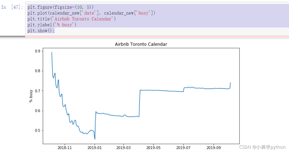
可视化
plt.figure(figsize=(10, 5))
plt.plot(calendar_new['date'], calendar_new['busy'])
plt.title('Airbnb Toronto Calendar')
plt.ylabel('% busy')
plt.show();
通过图中我们可以看到,10-11月是最繁忙的,然后是第二年的7-9月,由于这份数据是来自爱彼迎多伦多地区,所以可以推断出整个短租房的入住率是在下半年会比较旺盛
2.2.2 一年当中价格的走势变化
以月为单位
此次有两个分析技巧,由于价格部分带有$符号和.号,所以我们需要对数据进行格式化处理,并且转换时间字段。处理完时间字段后,使用柱状图进行数据分析.
#数据处理
calendar['date'] = pd.to_datetime(calendar['date'])
calendar['price'] = calendar['price'].str.replace(',', '')
calendar['price'] = calendar['price'].str.replace('$', '')
calendar['price'] = calendar['price'].astype(float)
#按照月份进行分组汇总求解价钱的均值
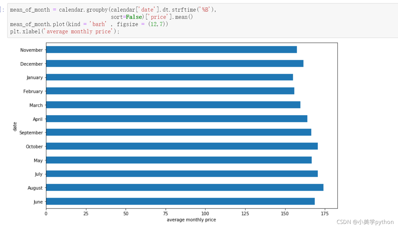
#%B 本地完整的月份名称
mean_of_month = calendar.groupby(calendar['date'].dt.strftime('%B'),
sort=False)['price'].mean()
#绘制条形图 barh为横向来画。
mean_of_month.plot(kind = 'barh' , figsize = (12,7))
#添加x轴标签
plt.xlabel('average monthly price')
图中可以看出6月 8月和10月是平均价格最高的三个月。
bar图:
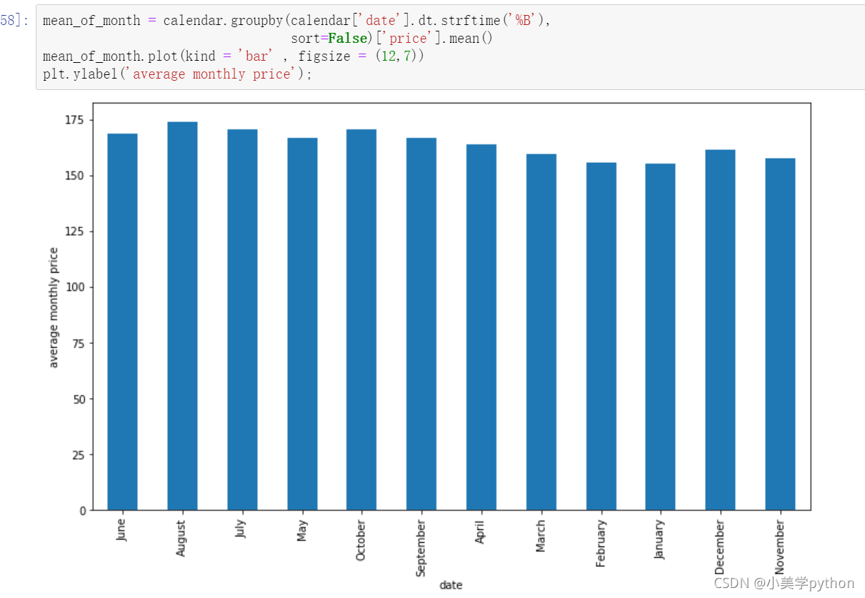
如果想月份按照1-12排序,则
month_index = ['December', 'November', 'October', 'September', 'August',
'July','June', 'May', 'April','March', 'February', 'January']
#重新指定索引后绘制图形
mean_of_month = mean_of_month.reindex(month_index)
mean_of_month.plot(kind = 'barh' , figsize = (12,7))
plt.xlabel('average monthly price')
――――――――――――――――
版权声明:本文为CSDN博主「Be_melting」的原创文章,遵循CC 4.0 BY-SA版权协议,转载请附上原文出处链接及本声明。
原文链接:https://blog.csdn.net/lys_828/article/details/119940333
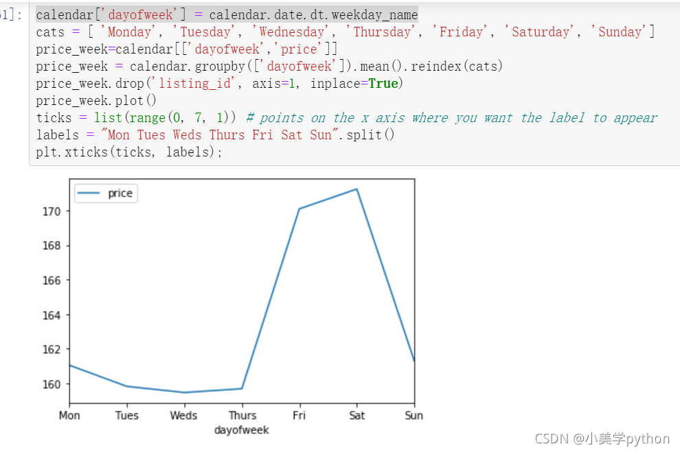
以周为单位
#weekday_name函数返回一周中指定的一天的星期名。
calendar['dayofweek'] = calendar.date.dt.weekday_name
#然后指定显示的索引顺序
cats = [ 'Monday', 'Tuesday', 'Wednesday', 'Thursday', 'Friday', 'Saturday', 'Sunday']
#提取要分析的两个字段
price_week=calendar[['dayofweek','price']]
#按照星期进行分组求解平均价钱后重新设置索引
price_week = calendar.groupby(['dayofweek']).mean().reindex(cats)
#删除不需要的字段
price_week.drop('listing_id', axis=1, inplace=True)
price_week.plot()
#指定轴刻度的数值及对应的标签值
ticks = list(range(0, 7, 1)) # points on the x axis where you want the label to appear
labels = "Mon Tues Weds Thurs Fri Sat Sun".split()
plt.xticks(ticks, labels);
和我们预料的非常类似,短租房本身大都为了旅游而存在,所以周五周六两天的价格都比其他时间贵出一个档次。(周末双休,使得入驻的时间为周五周六晚两个晚上)
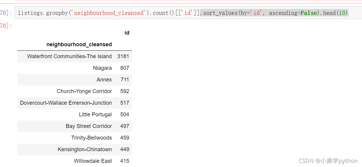
2.2.3 房屋的社区分布情况
17343套房源。
listings = pd.read_csv('toroto/listings.csv.gz')
print('We have', listings.id.nunique(), 'listings in the listing data.')
#按照neighbourhood_cleansed分组汇总,截取id字段,降序排列,查看前10个值。
listings.groupby('neighbourhood_cleansed').count()[['id']].sort_values(by='id', ascending=False).head(10)
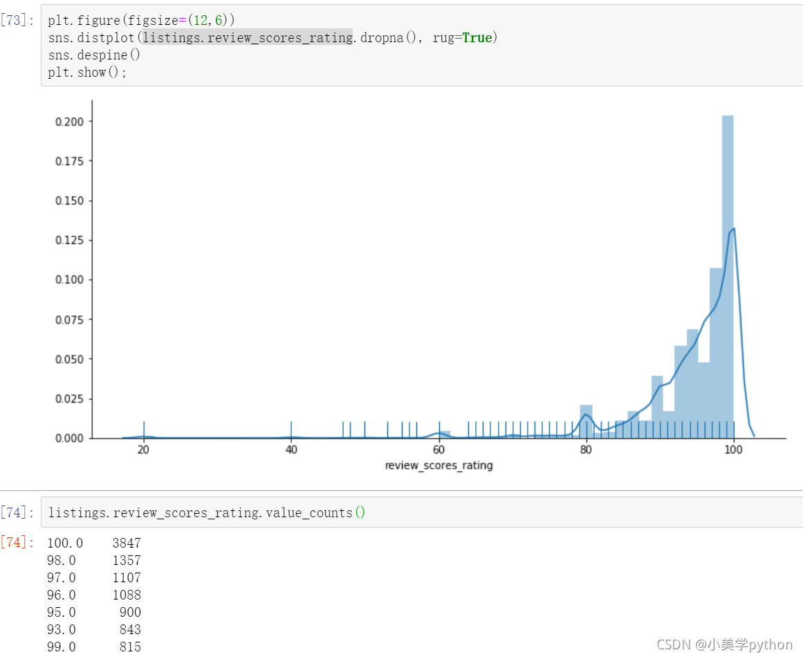
2.2.4 房屋的评分情况
plt.figure(figsize=(12,6))
# distplot  rug(x轴上柱子的密集度,告诉我们分布情况)
sns.distplot(listings.review_scores_rating.dropna(), rug=True)
sns.despine()
plt.show();
可以看出总体来看爱彼迎的房屋好评率非常高。
2.2.5 房屋的价格情况
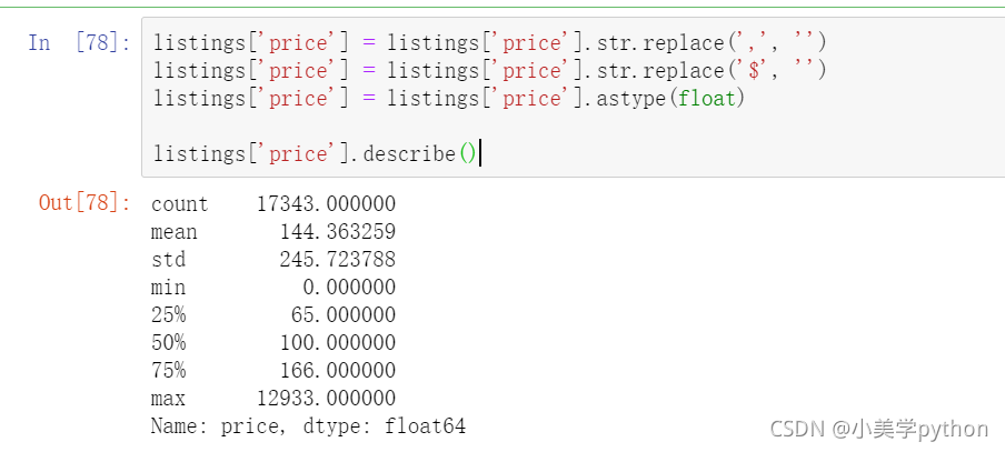
listings['price'] = listings['price'].str.replace(',', '')
listings['price'] = listings['price'].str.replace('$', '')
listings['price'] = listings['price'].astype(float)

listings['price'].describe()
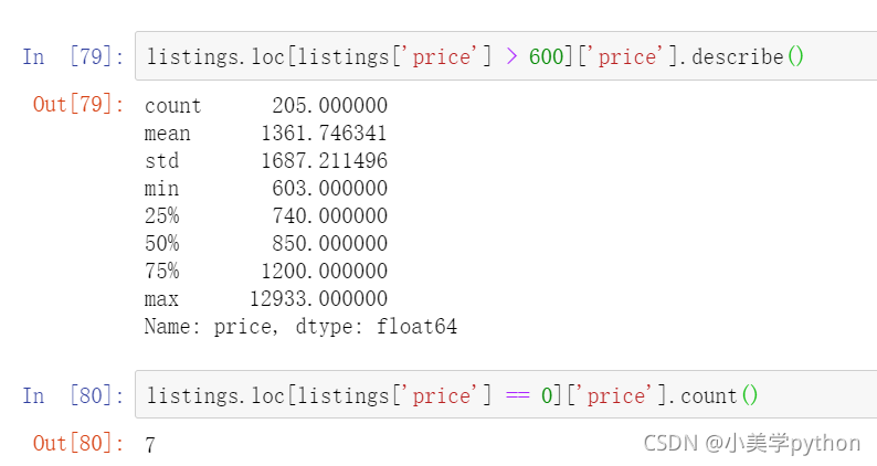
多伦多最昂贵的Airbnb房源价格为$ 12933 /晚,以下是房屋的链接 https://www.airbnb.ca/rooms/16039481?locale=en. 通过链接可以发现之所以比平均价贵出约100倍,主要是因为这处房屋是多伦多最时尚的社区中的艺术收藏家阁楼。(这些艺术收藏的价值大幅的拉高了这处房源的价格,使其和平均值有100倍的差距)
查看一下最大值或者最小值对应的记录,可以使用argmax或者argmin如下代码
listings.iloc[np.argmax(listings['price'])]
由于在数据分析中,我们需要服从正态分布的原则,对于这样极端情况的存在,我们需要进行清理,所以把异常的价格的数据进行过滤,最终选择的价钱是保留0-600之间的数据。具体要选取某一数值,需要看一下当前数值以上对应的房源信息数量占全体的比重,这里选取大于600以上的房源仅有200+套,占总比1w+的比例很小,而且房源免费的只有7套。
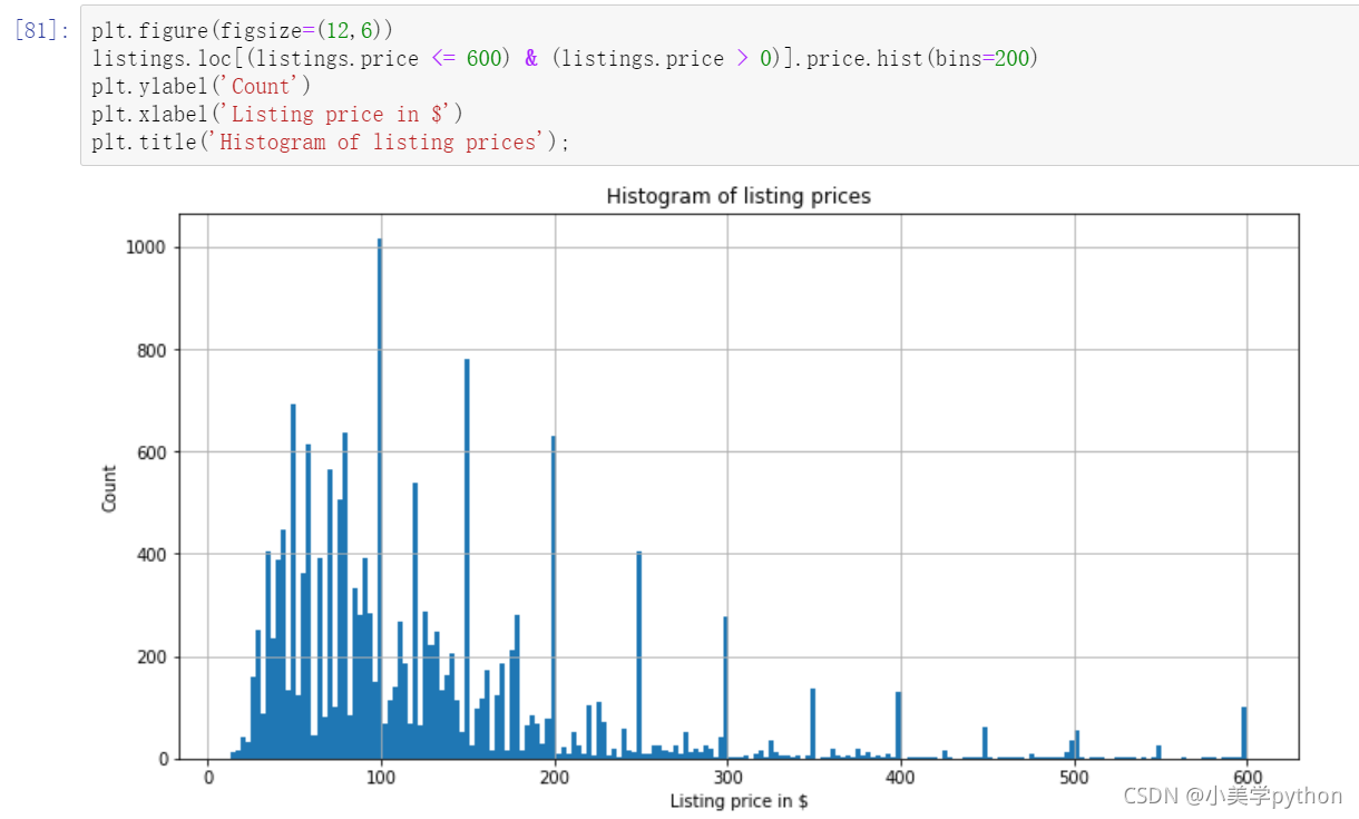
去掉极端值后我们继续观察现在的价格分布状态,绘制直方图
plt.figure(figsize=(12,6))
#分箱数量bins,调太小就看不出来了。
listings.loc[(listings.price <= 600) & (listings.price > 0)].price.hist(bins=200)
plt.ylabel('Count')
plt.xlabel('Listing price in $')
plt.title('Histogram of listing prices');
可以看出价格主要是在30-200之间
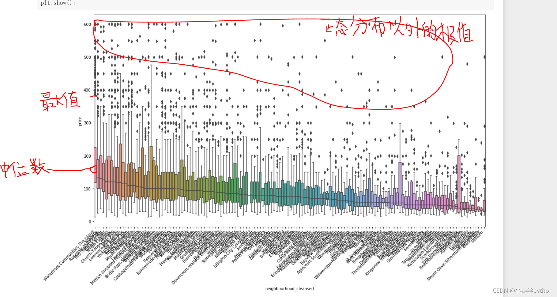
2.2.6 不同社区与房源价格的关系
前面探究了不同社区和房源数量之间的关系,这里可以进一步探究不同社区和房源价钱之间的关系
plt.figure(figsize=(18,10))
#用社区价格的中位数做x轴的价格排序。
sort_price = listings.loc[(listings.price <= 600) & (listings.price > 0)]\
                    .groupby('neighbourhood_cleansed')['price']\
                    .median()\
                    .sort_values(ascending=False)\
                    .index
sns.boxplot(y='price', x='neighbourhood_cleansed', data=listings.loc[(listings.price <= 600) & (listings.price > 0)],
            order=sort_price)
ax = plt.gca()

ax.set_xticklabels(ax.get_xticklabels(), rotation=45, ha='right')
plt.show();
最好的社区不仅房源的最高价高,而且平均价格也是所有社区中最高的,很有代表性
2.2.7 高级房和普通房
host vs. price 接下来我们来观察Superhost 标记信息,带有这个标记的房产为高级房,需要满足一定的评级要求,比如100次以上成功的预定,好评率超过90%等。我们看带有这个评级的房屋与不具备这个标记的房屋在价格上是否有差别。
sns.boxplot(y='price', x='host_is_superhost', data=listings.loc[(listings.price <= 600) & (listings.price > 0)])
plt.show();
通过分析可以看出,高级房的价格是会略微高于普通房。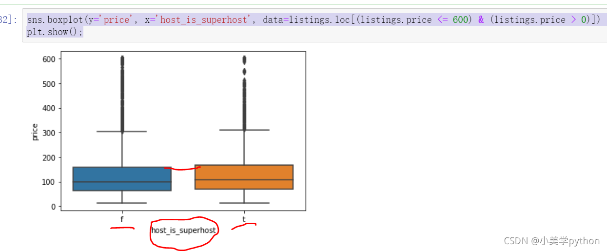
2.2.8 房屋的软装特性和价格的关系
property type vs. price
免费wifi 地铁近 烘干机 洗衣机 晾衣架 早餐 医疗包 免费停车等等软装部分
plt.figure(figsize=(18,10))
sort_price = listings.loc[(listings.price <= 600) & (listings.price > 0)]\
                    .groupby('property_type')['price']\
                    .median()\
                    .sort_values(ascending=False)\
                    .index
sns.boxplot(y='price', x='property_type', data=listings.loc[(listings.price <= 600) & (listings.price > 0)], order=sort_price)
ax = plt.gca()
ax.set_xticklabels(ax.get_xticklabels(), rotation=45, ha='right')
plt.show();
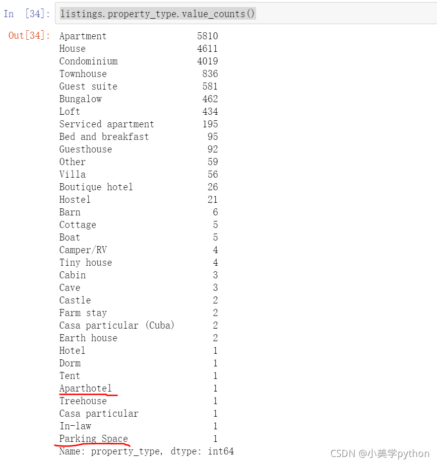
从这个图中可以看到在数据处理时,如果对于极端值不进行处理,则会显示出这样怪异的情况,例如Aparthotel 公寓式酒店 这个关键词的价格最高,但是通过boxplot我们又可以看出,其实只有一套这样的房产,所以数据并不完整。tend(帐篷)和parking space (停车位)这样的关键词也是数量很少的,导致了数据结果显示不准确。希望把圈出部分去掉。
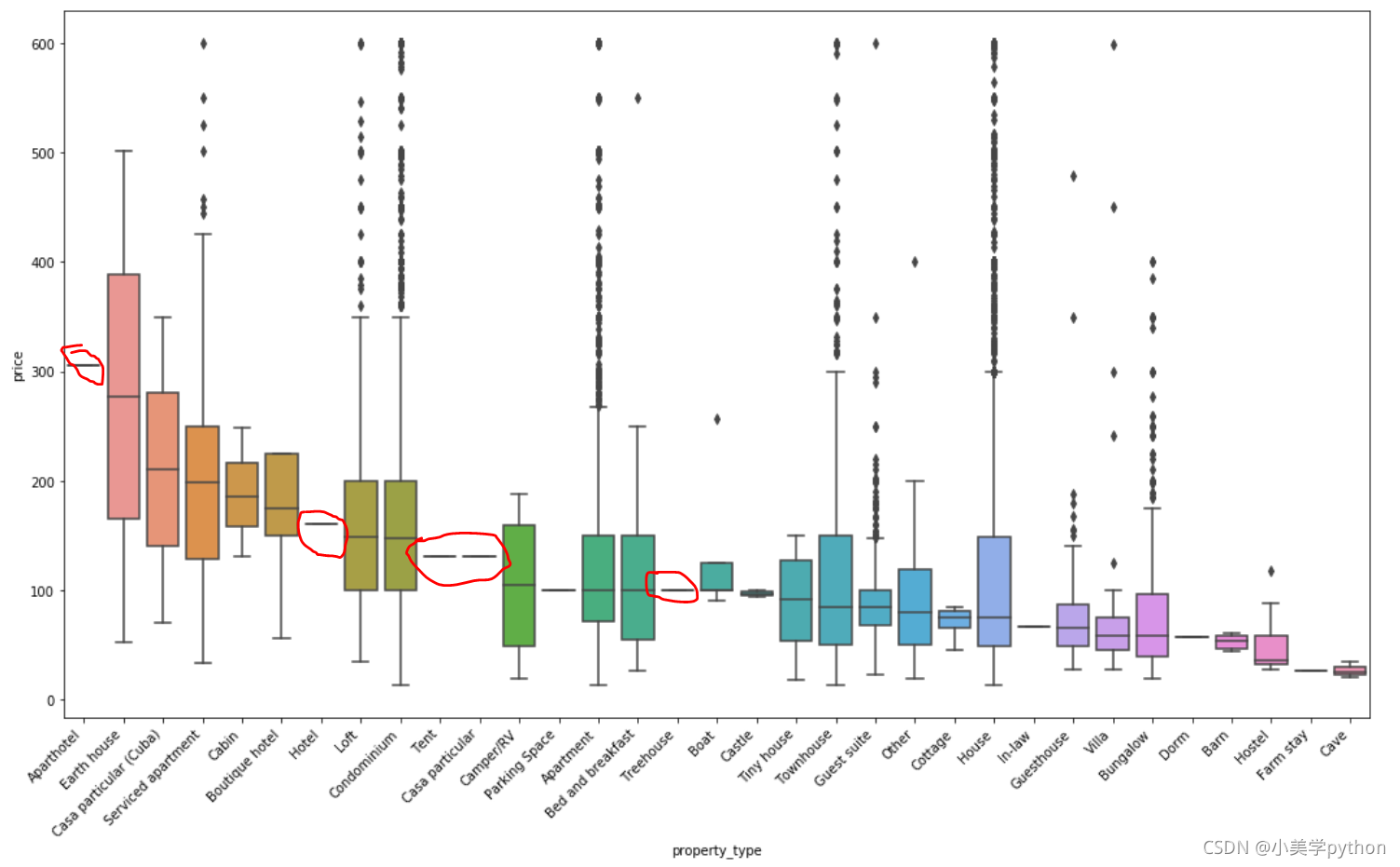
根本原因就是分类中的数据值太少了,可以通过value_counts()进行查看。对于这种数值偏少的分类也可以设定一个数值作为分界点进行提取,或者根据展示需求直接提取前5、前10、前15的数据
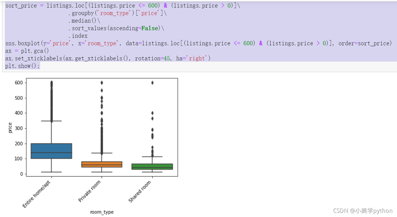
2.2.9 房型和价格的关系
sort_price = listings.loc[(listings.price <= 600) & (listings.price > 0)]\
                    .groupby('room_type')['price']\
                    .median()\
                    .sort_values(ascending=False)\
                    .index
sns.boxplot(y='price', x='room_type', data=listings.loc[(listings.price <= 600) & (listings.price > 0)], order=sort_price)
ax = plt.gca()
ax.set_xticklabels(ax.get_xticklabels(), rotation=45, ha='right')
plt.show();
整租价格最贵,其次是合租,最便宜的就是多人共用
2.2.10 房型和价格的关系
#pivot 透视表  , stacked:布尔值。如果取值为True,则输出的图为多个数据集堆叠累计的结果
listings.loc[(listings.price <= 600) & (listings.price > 0)].pivot(columns = 'room_type', values = 'price').plot.hist(stacked = True, bins=100)
plt.xlabel('Listing price in $');
有个明显的分界线,就是在100前后整租房的出租的数量和其它两种房型存在着较大的差距,100之前合租占据较大的比例,但是100以后就是整租的绝对优势了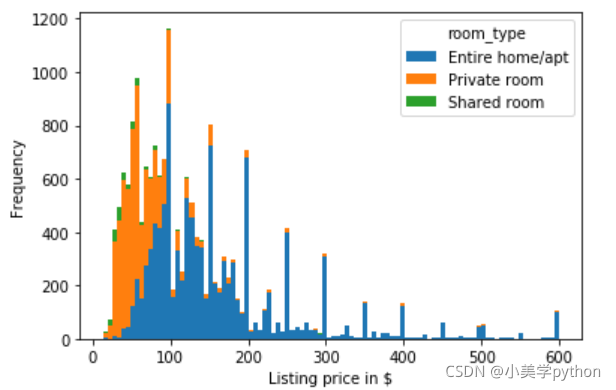
2.2.11 房屋的便利设施和价格的关系
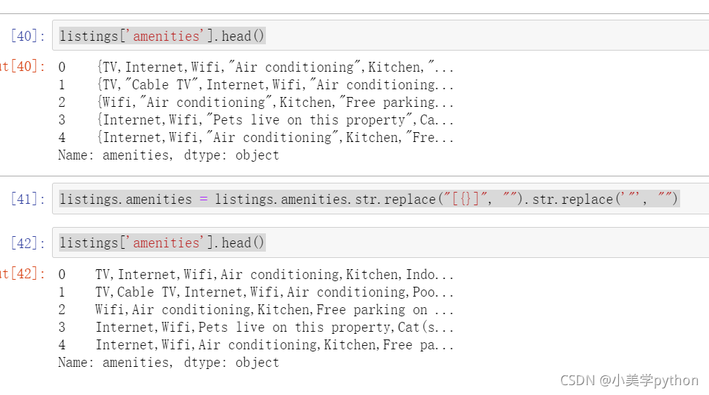
数据整理:需要对花括号和引号进行去除,最后就是按照逗号进行分割
listings['amenities'].head()
listings.amenities = listings.amenities.str.replace("[{}]", "").str.replace('"', "")
listings['amenities'].head()
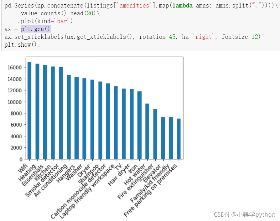
找出前20个最重要的便利设施
用value_counts()做相关值的过滤。
# np.concatenate 能够一次完成多个数组的拼接为list
pd.Series(np.concatenate(listings['amenities'].map(lambda amns: amns.split(","))))\
    .value_counts().head(20)\
    .plot(kind='bar')
#plt.gca() 获取当前子图
ax = plt.gca()
ax.set_xticklabels(ax.get_xticklabels(), rotation=45, ha='right', fontsize=12)
plt.show();
Wifi 暖气 厨房等便利设施是最重要的部分
前20的便利设施和价格间的关系
好好研究下前三段代码。
#获取字段中的唯一元素
amenities = np.unique(np.concatenate(listings['amenities'].map(lambda amns: amns.split(","))))
#对包含的元素进行统计求平均值,排除空值
amenity_prices = [(amn, listings[listings['amenities'].map(lambda amns: amn in amns)]['price'].mean()) for amn in amenities if amn != ""]
#按照元素作为索引,平均价格作为值
amenity_srs = pd.Series(data=[a[1] for a in amenity_prices], index=[a[0] for a in amenity_prices])

#绘制前20的条形图
amenity_srs.sort_values(ascending=False)[:20].plot(kind='bar')
ax = plt.gca()
ax.set_xticklabels(ax.get_xticklabels(), rotation=45, ha='right', fontsize=12)
plt.show()
把600以上的过滤掉结果会不一样。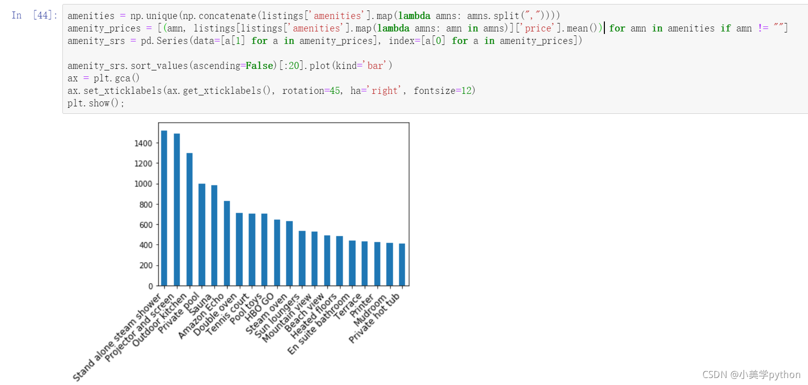
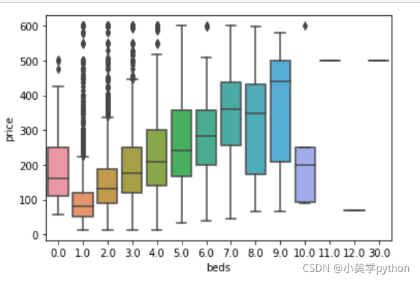
2.2.12 床的数量和价格的关系
listings.loc[(listings.price <= 600) & (listings.price > 0)].pivot(columns = 'beds',values = 'price').plot.hist(stacked = True,bins=100)
plt.xlabel('Listing price in $');
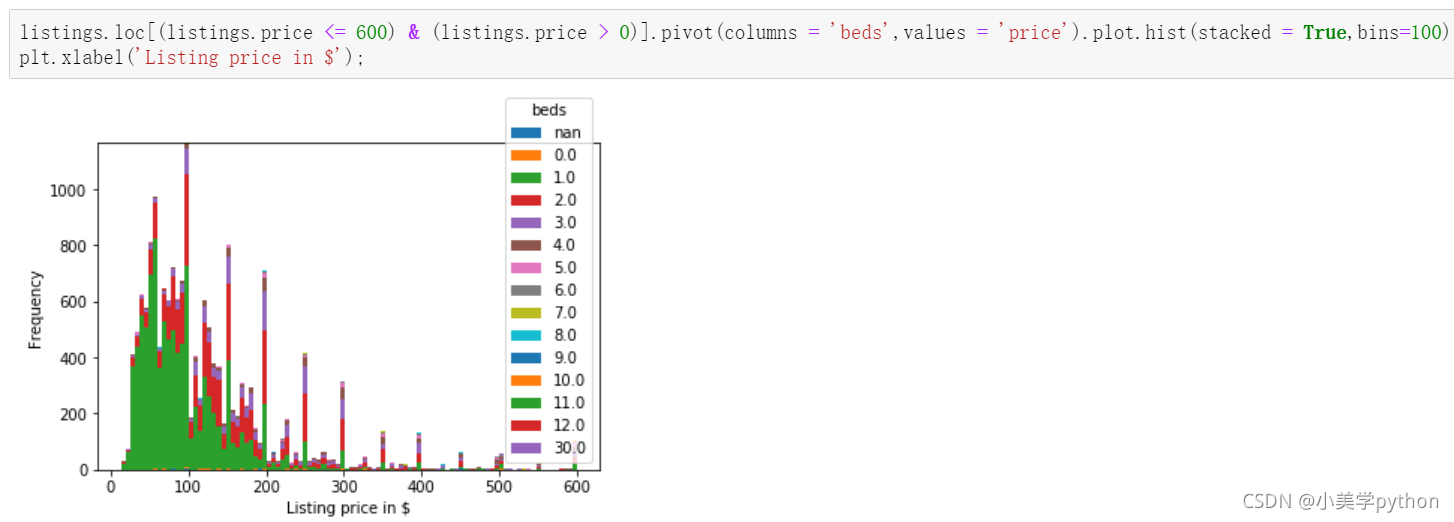
sns.boxplot(y='price', x='beds', data = listings.loc[(listings.price <= 600) & (listings.price > 0)])
plt.show();
在这份数据中惊人的发现居然没有床的房屋价格比有2张床的房屋价格还要贵。
2.3 关联性探讨
两两单独挑出来的字段进行分析就是基于常识,日常中都已经在大脑中潜意识认为这两个字段可能有所关联,如果一直使用这种方式很难挖掘出潜在的有价值信息,因此就可以借助pairplot绘制多字段的两两对比图或者heatmap热力图探究潜在的关联性。
1.pairplot方式
#col挑选了一些字段进行关联探讨
col = ['host_listings_count', 'accommodates', 'bathrooms', 'bedrooms', 'beds', 'price', 'number_of_reviews', 'review_scores_rating', 'reviews_per_month']
sns.set(style="ticks", color_codes=True)
sns.pairplot(listings.loc[(listings.price <= 600) & (listings.price > 0)][col].dropna())
plt.show()
斜对角不用看,

2.热力图方式
plt.figure(figsize=(18,10))
corr = listings.loc[(listings.price <= 600) & (listings.price > 0)][col].dropna().corr()
plt.figure(figsize = (6,6))
sns.set(font_scale=1)
sns.heatmap(corr, cbar = True, annot=True, square = True, fmt = '.2f', xticklabels=col, yticklabels=col)
plt.show();
数字越接近1,说明字段之间的相关性越强,主对角线的数值不用看都是1
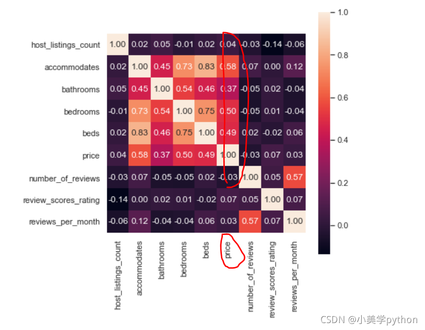
3.详细探究
比如上面相关性图中可以看到价钱price字段和bathrooms床位以及bedrooms字段都有较强的关联关系,就可以使用热力图将三者的关系表现出来。
价格的次数来看:
plt.figure(figsize=(18,10))
sns.heatmap(listings.loc[(listings.price <= 600) & (listings.price > 0)]\
                .groupby(['bathrooms', 'bedrooms'])\
                .count()['price']\
                .reset_index()\
                .pivot('bathrooms', 'bedrooms', 'price')\
                .sort_index(ascending=False),
            cmap="Oranges", fmt='.0f', annot=True, linewidths=0.5)
plt.show();
该热力图探究的是洗漱间和卧室的数量与房子价格的关系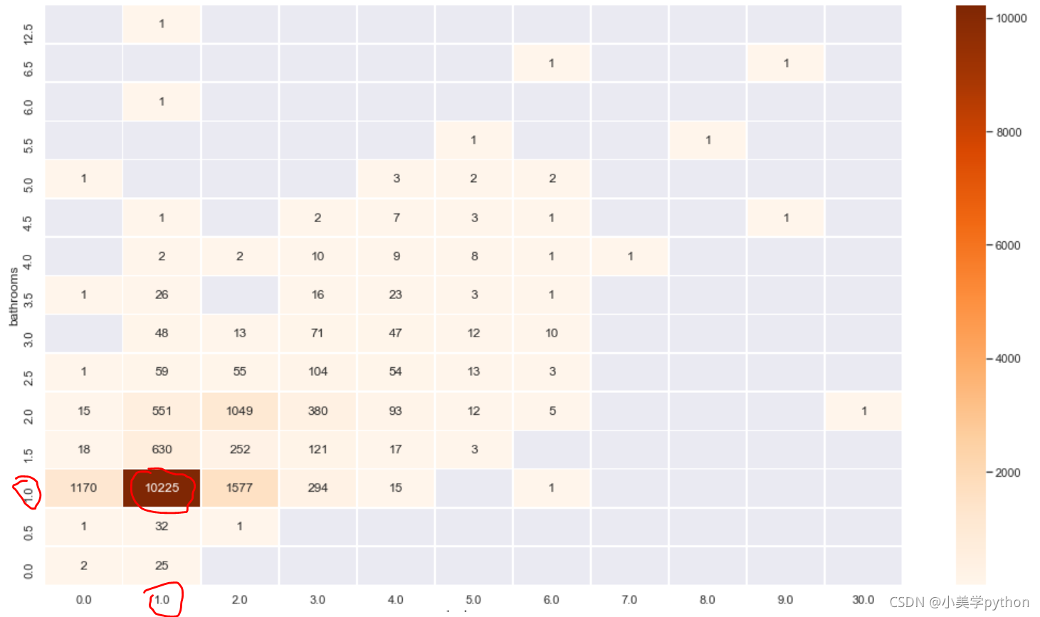
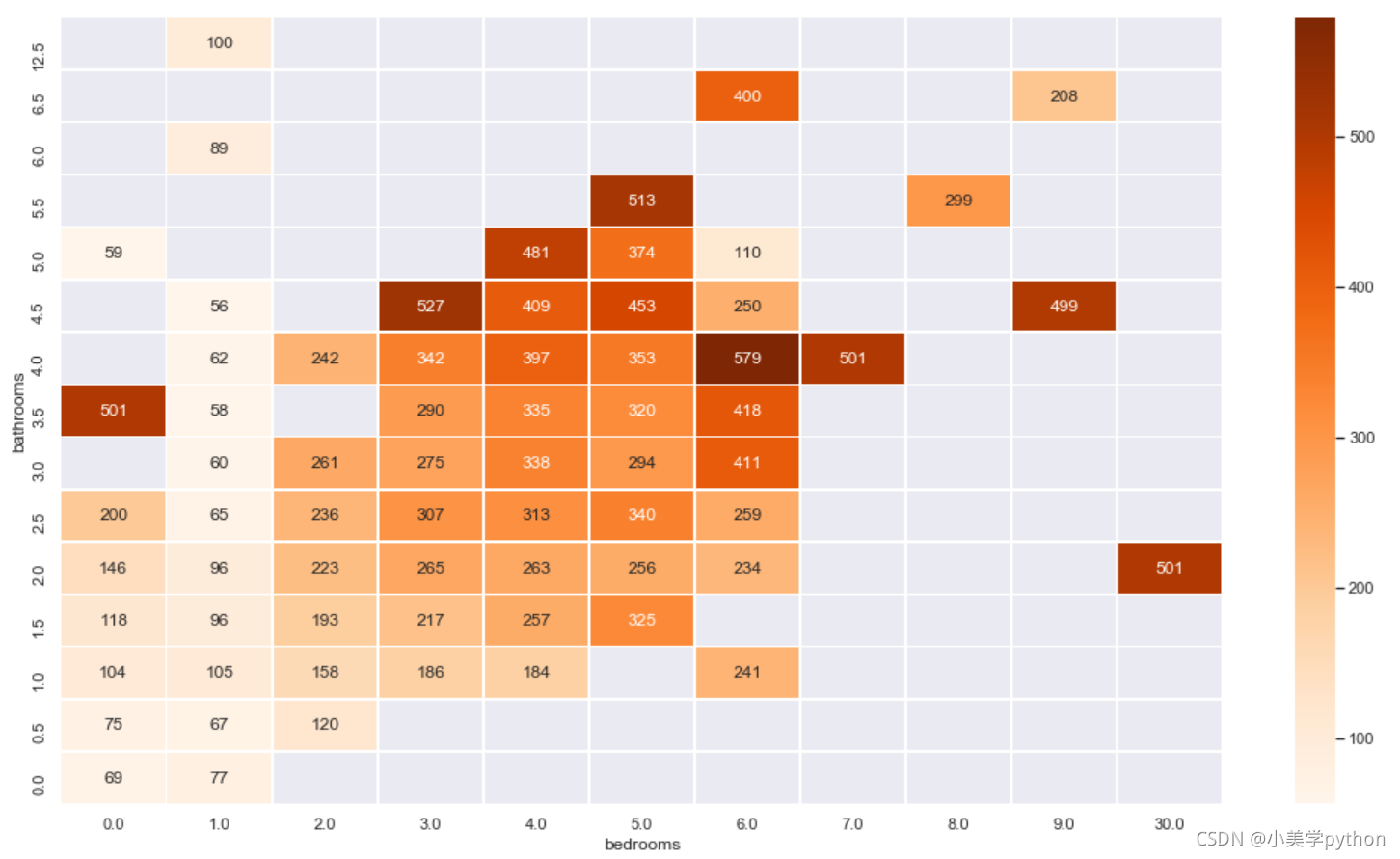
价格的平均值来看:
plt.figure(figsize=(18,10))
sns.heatmap(listings.loc[(listings.price <= 600) & (listings.price > 0)]\
                .groupby(['bathrooms', 'bedrooms'])\
                .mean()['price']\
                .reset_index()\
                .pivot('bathrooms', 'bedrooms', 'price')\
                .sort_index(ascending=False),
            cmap="Oranges", fmt='.0f', annot=True, linewidths=0.5)
plt.show();
3 特征工程
以上的内容就是传统的数据分析要完成的内容,分析的过程依赖于数据分析师本身的经验,而且结果都是以图表的形式进行展现,有一个痛点就是字段较多时候,要进行分析时就需要很多很多的图像,比如三个字段的分析,热力图就需要很多很多。此时就可以借助机器学习模型来探究,但是探究之前需要处理字段数据,进行特征工程。
listings = pd.read_csv('toroto/listings.csv.gz')
listings['price'] = listings['price'].str.replace(',', '')
listings['price'] = listings['price'].str.replace('$', '')
listings['price'] = listings['price'].astype(float)
listings = listings.loc[(listings.price <= 600) & (listings.price > 0)]
listings.amenities = listings.amenities.str.replace("[{}]", "").str.replace('"', "")
listings.amenities.head()
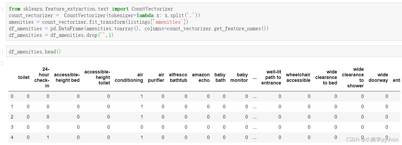
划重点
先处理文本数据,将文本数据特征化,导入处理文本数据的模块,进行词向量转化。
将amenities字段中所有的分类进行独热编码,然后形成DataFrame数据类型
from sklearn.feature_extraction.text import CountVectorizer
count_vectorizer =  CountVectorizer(tokenizer=lambda x: x.split(','))
amenities = count_vectorizer.fit_transform(listings['amenities'])
df_amenities = pd.DataFrame(amenities.toarray(), columns=count_vectorizer.get_feature_names())
df_amenities = df_amenities.drop('',1)
处理二分类字段,将true和false的分类替换成计算机识别的1和0分类。当存在多个二分类字段时候可以进行for循环统一进行数据转化。
columns =  ['host_is_superhost', 'host_identity_verified', 'host_has_profile_pic',
                   'is_location_exact', 'requires_license', 'instant_bookable',
                   'require_guest_profile_picture', 'require_guest_phone_verification']
for c in columns:
    listings[c] = listings[c].replace('f',0,regex=True)
    listings[c] = listings[c].replace('t',1,regex=True)
接着对价钱相关的字段进行缺失值填充和噪音数据的清洗,最后不要忘记将数值的字段转化为浮点数。
listings['security_deposit'] = listings['security_deposit'].fillna(value=0)
listings['security_deposit'] = listings['security_deposit'].replace( '[\$,)]','', regex=True ).astype(float)
listings['cleaning_fee'] = listings['cleaning_fee'].fillna(value=0)
listings['cleaning_fee'] = listings['cleaning_fee'].replace( '[\$,)]','', regex=True ).astype(float)
在进行热力图判断字段之间的相关关系时,有些字段之间的相关关系的都是0,这些字段就可以直接被舍弃,选取有相关关系的字段重新组成一个数据集
listings_new = listings[['host_is_superhost', 'host_identity_verified', 'host_has_profile_pic','is_location_exact',
                         'requires_license', 'instant_bookable', 'require_guest_profile_picture',
                         'require_guest_phone_verification', 'security_deposit', 'cleaning_fee',
                         'host_listings_count', 'host_total_listings_count', 'minimum_nights',
                     'bathrooms', 'bedrooms', 'guests_included', 'number_of_reviews','review_scores_rating', 'price']]
这些字段中是不是还存在缺失值,上面只是进行了部分字段的处理,这里重现选取字段后仍然要进行缺失值的处理
for col in listings_new.columns[listings_new.isnull().any()]:
    print(col)
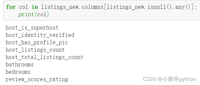
处理这部分字段的缺失值,按照中位数进行填充。当字段为分类字段时,填充的方式为中位数填充,前面处理的价格字段为连续字段,使用均值进行填充
for col in listings_new.columns[listings_new.isnull().any()]:
    listings_new[col] = listings_new[col].fillna(listings_new[col].median())
对分类字段(自己指定 除了这些也可以指定 一般就是数量较多的(对价格有影响的))进行独热编码处理,并将编码后的结果与新数据进行和并.
for cat_feature in ['zipcode', 'property_type', 'room_type', 'cancellation_policy', 'neighbourhood_cleansed', 'bed_type']:
    listings_new = pd.concat([listings_new, pd.get_dummies(listings[cat_feature])], axis=1)
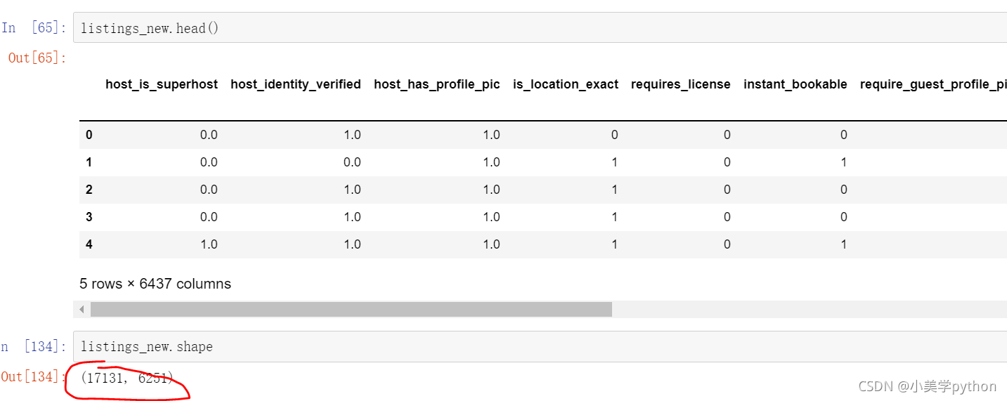
不要忘记最开始对文本编码的DataFrame数据,也需要进行合并,合并的方式为取交集,最终的到特征工程处理后的数据。数据只剩下约1.7w,但是字段数量增加到了6000+
listings_new = pd.concat([listings_new, df_amenities], axis=1, join='inner')

listings_new.head()

listings_new.shape
4 机器学习
4.1 随机森林
from sklearn.model_selection import train_test_split
from sklearn.metrics import r2_score
from sklearn.metrics import mean_squared_error
from sklearn.ensemble import RandomForestRegressor
y = listings_new['price']
x = listings_new.drop('price', axis =1)
X_train, X_test, y_train, y_test = train_test_split(x, y, test_size = 0.25, random_state=1)
rf = RandomForestRegressor(n_estimators=500,
                               criterion='mse',
                               random_state=3,
                               n_jobs=-1)
#模型创建
rf.fit(X_train, y_train)
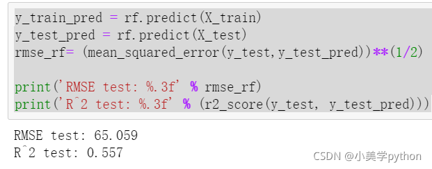
x是没有价格的字段,y就是价格字段,切分数据集一般就按照七三开,这里按照训练集75%,测试集25%,随机种子状态设定为1。最后决策树模型设置500棵树,评价方式为均方差mse,随机种子状态为3,-1代表选择处理器性能全开。
训练过程会和选用的机器的性能相关,运行需要一定的时间,待运行完毕后就可以使用模型进行预测。
注意传入predict括号中的变量,传入X_train就对应得到训练集计算出来的预测标签,传入X_test就对应着测试集计算出来的预测标签,通过比对最终训练集和测试集的结果可以计算出最终的预测结果。R2一般在0.4-0.8之间
y_train_pred = rf.predict(X_train)
y_test_pred = rf.predict(X_test)
rmse_rf= (mean_squared_error(y_test,y_test_pred))**(1/2)

print('RMSE test: %.3f' % rmse_rf)
print('R^2 test: %.3f' % (r2_score(y_test, y_test_pred)))
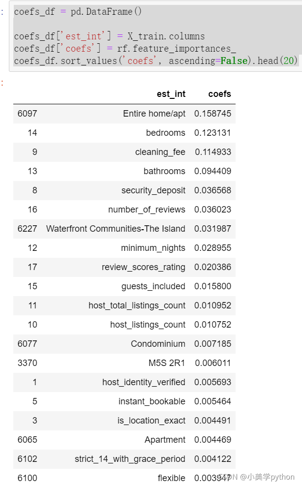
通过模型计算出不同数据特征的权重。
coefs_df = pd.DataFrame()

coefs_df['est_int'] = X_train.columns
coefs_df['coefs'] = rf.feature_importances_
coefs_df.sort_values('coefs', ascending=False).head(20)
4.2 LightGBM
只用一个模型建模获得结果没有对比性,无法判断最终的预测结果是好还是坏,因此在进行预测时候往往都不是只使用一个模型进行,而是采用至少两个模型进行对比。
from lightgbm import LGBMRegressor

y = listings_new['price']
x = listings_new.drop('price', axis =1)
X_train, X_test, y_train, y_test = train_test_split(x, y, test_size = 0.25, random_state=1)
fit_params={
    "early_stopping_rounds":20,
            "eval_metric" : 'rmse',
            "eval_set" : [(X_test,y_test)],
            'eval_names': ['valid'],
            'verbose': 100,
            'feature_name': 'auto',
            'categorical_feature': 'auto'
           }

X_test.columns = ["".join (c if c.isalnum() else "_" for c in str(x)) for x in X_test.columns]

class LGBMRegressor_GainFE(LGBMRegressor):
    @property
    def feature_importances_(self):
        if self._n_features is None:
            raise LGBMNotFittedError('No feature_importances found. Need to call fit beforehand.')
        return self.booster_.feature_importance(importance_type='gain')


clf = LGBMRegressor_GainFE(num_leaves= 25, max_depth=20,
                         random_state=0,
                         silent=True,
                         metric='rmse',
                         n_jobs=4,
                         n_estimators=1000,
                         colsample_bytree=0.9,
                         subsample=0.9,
                         learning_rate=0.01)
#reduce_train.columns = ["".join (c if c.isalnum() else "_" for c in str(x)) for x in reduce_train.columns]
clf.fit(X_train.values, y_train.values, **fit_params)
y_pred = clf.predict(X_test.values)
print('R^2 test: %.3f' % (r2_score(y_test, y_pred)))
结果:R^2 test: 0.610
重要特性:
feat_imp = pd.Series(clf.feature_importances_, index=x.columns)
feat_imp.nlargest(20).plot(kind='barh', figsize=(10,6))
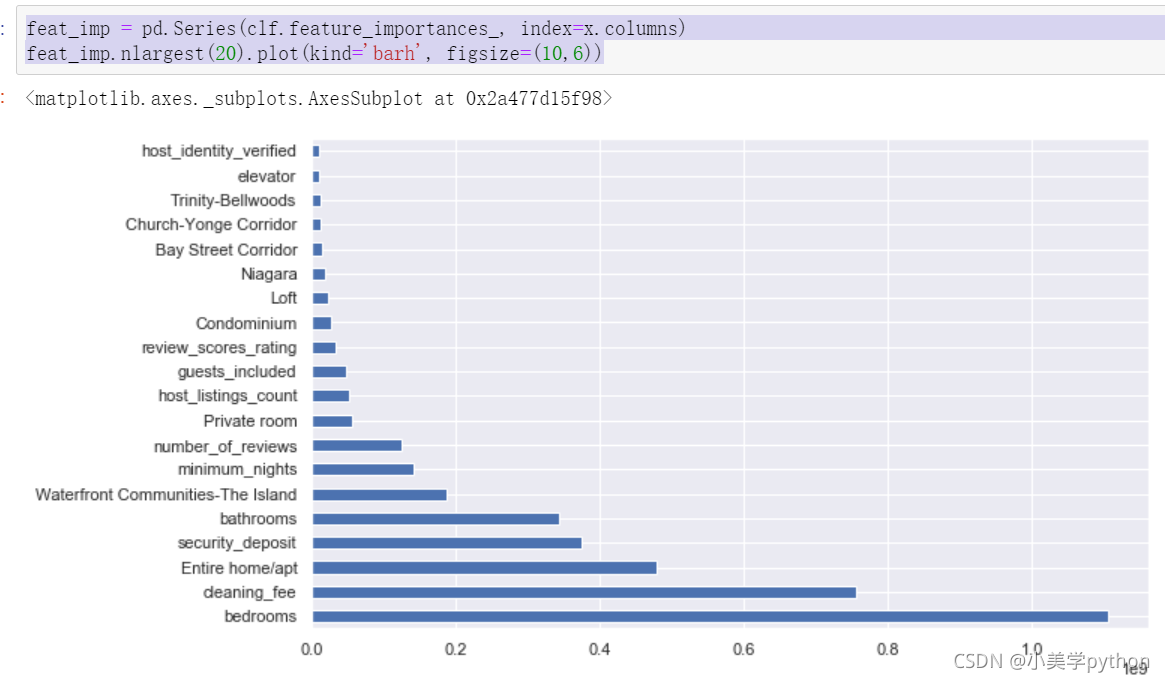
后对比两个模型最终给出的重要影响因素,可以发现前五个都是一样的,只是顺序上存在着不同。此外关于模型具体的讲解会在后续的机器学习部分详细介绍,这里就是明确数据分析案例的流程,知道如何进行模块的调用创建模型和预测。
2021年9月25日周六创作。